
 Color is one of your best tools for creating visual impact on the scrapbook page. Quite often this work is done with a bold and rich palette of strongly contrasting colors.
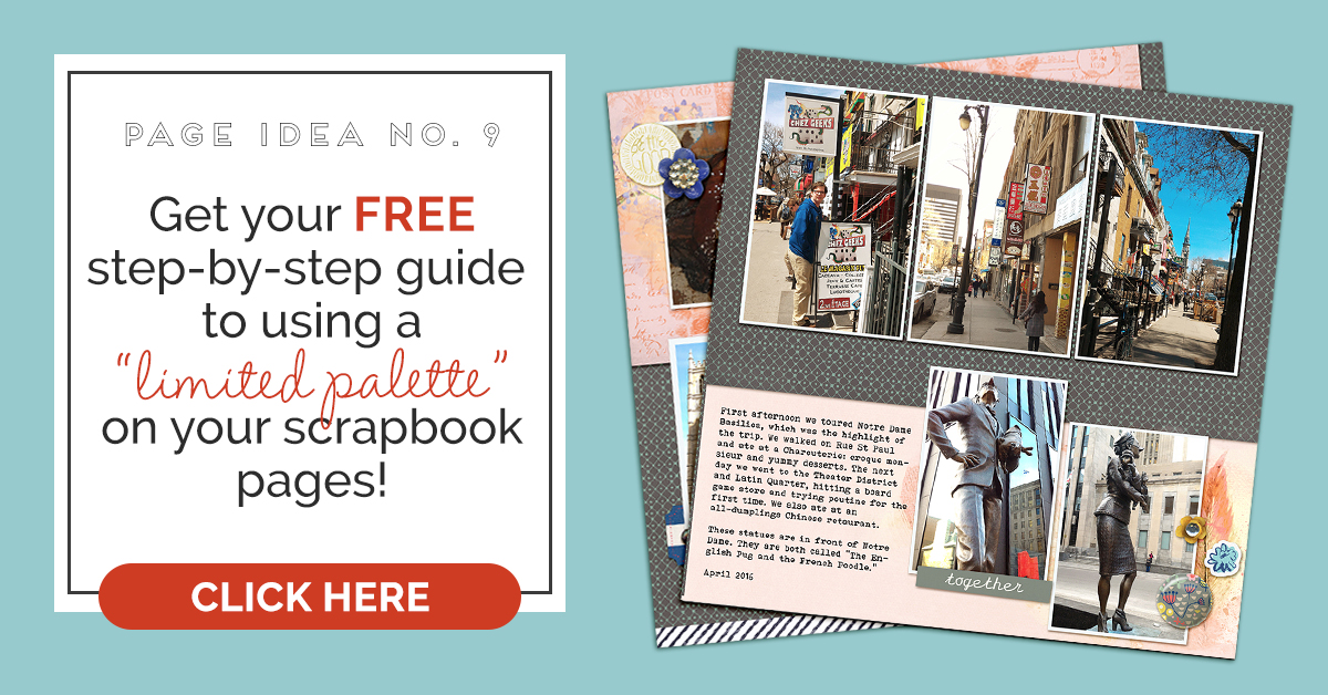
You can also create impact with a subtler, limited color palette when you use variations in color tone and value to get looks that are just as powerful as multi-colored designs.
CLICK ON THE IMAGE BELOW TO SIGN UP FOR OUR EMAIL LIST AND GET YOUR FREE PAGE GUIDE
Kelly Prang says, “These photos are from a photo walk I took with my daughter almost 10 years ago. We were exploring the Civil War Battlefield in Fredericksburg, VA. Mollie was two years old and just becoming independent and ready to explore without holding on to me at all times. I loved this new independence of hers.”
“The palette here has shades of peachy-pink against neutrals. I wanted to show the airy lightness we felt that day in early spring and represent the freedom Mollie was experiencing as she walked around and explored the battlefield. Since I used a limited color scheme, I added interest with texture and layers. The pink ruffled trim and flower are the darkest shades on the page, and all items lighten as they radiate out from the center of the layout.”

#Beautiful by Kelly Prang | Font- Traveling Typewriter; Lynn Grieveson- Marina del Rey- template, Vintage Inches- frame; Sahin Designs- Woodnote- papers and elements; Tracy Martin- December 2016 freebie- flower, Missing You- trim, Acc. 19- label; Wendy Tunison- Grandma’s Junk Drawer- flashcard, Take Note add-on- ticket; American Crafts-Maggie Holmes- Gather- elements; Little Lamm and Co- Blackboard- paper
Kristy T. says, “This page documents my son’s desire to see a turtle and overcome any apprehension to go snorkeling.”
“I worked with the limited color palette of mostly blues and greens as they worked with the photograph and the story of my page. I used a mix of colors with the darker print providing some contrast to the lighter coloured papers and elements. The variety of tone on tone prints in combination with a variety in the density of the patterns also provides interest but keeps within the color palette. I used dark stitching and blue inking to add definition to the edges of my papers to provide a more contrast and therefore strengthening the design of the page.”

He Jumped Right In by Kristy T | Supplies: Patterned Paper: October Afternoon, Echo Park; Alpha: American Crafts; Paper embellishments: Kaisercraft, October Afternoon; Chipboard Frame: Simple Stories; Sticker: Bo Bunny.
Deborah Wagner says, “This is a page for a good friend. I’m making a book for her as a present for her son’s high school graduation. She loves the song by John Lennon, Beautiful boy, and asked me to incorporate the song into a layout of her son when he was a little boy.”
“Using all neutrals on the page created a serene and tranquil mood, harmonious the with lyrics. To create a focal point, I used stronger values on the blended photo. The slightly darker/lower values on the torn page and Jake’s necklace add contrast. The varying textures of the embellishments and the brushes keep the page from becoming monotonous.”

Beautiful Boy by Deborah Wagner | Supplies: KimB – Salty Kisses, Fish On; Anna Aspnes – Art PlaArt Play Palette Salty Living; Lynn Grieveson – Hint at it Love; Studio Rosy Posey – Dance; Katie Pertiet – Swimmies: Splash Clusters, Coastal; Sugarplum Paperie – Juse Bee; Wishing Well Creations – Summer Beach Cottage; Traci Reed – Clip It To Me Vol. 4
Ronnie Crowley says, “My son doesn’t share many pictures but his girlfriend is good about sharing so I’m able to grab them from her social media. On Valentines Day, she posted a sweet tweet that I saved. It was the starting point for my page.”
“A grey chromatic base palette is a perfect complement to black-and-white pictures, especially since she’d used a black-and-white filter with high saturations of black. The shades and patterns in my papers add visual interest without additional colors. To support the love theme I added a little bit of muted pink, but was very careful to ensure that the shade of pink was more grey than pink.”

You + Me by Ronnie Crowley | Supplies: K Aagard – Page Borde rStitches; Anita Designs – Documented templates; Sahin Designs – L’Amour, Tranquil
Kelly Sroka says, “This page documents a day that I took to do shopping just for me. The weather was exceptionally warm for winter, and I enjoyed visiting my favorite shopping mall.”
“The photographs have blue and grey as dominant colors, so I used a limited color palette of light pink and black with just a touch of gold to highlight the pictures. I played off the triad color scheme of red, blue, and yellow with the light pink, sky blue, and gold. The addition of black echoes the grey pavement in the photo which grounds the pictures as the black grounds the patterns, colors, and elements on the page.”

Retail Therapy by Kelly Sroka | Supplies: Cardstock: Bazzill; Patterned Papers: Pink Paislee and Citrus Twist Kits; Die Cuts: Crate Paper and Elle’s Studio; Stickers: American Crafts
Nicole Mackin says, “The story of this page is of how we discovered Snapchat this year and how much I love the photos and memories the app creates.
“The palette here isn’t necessarily limited but the values are. The three colors are all rendered in bold tones. Because I used such a fun photo, I thought these colors presented on a neutral background with black-and-white accents made the photo pop.”

The Best by Nicole Mackin | Patterned Paper: Pink Paislee, American Crafts, Fancy Pants, My Minds Eye; Thickers: American Crafts; Flair: My Minds Eye; Die Cut: American Crafts; Labels: Pink Paislee; Word Stickers: Teresa Collins; Buttons: Teresa Collins; Wood Veneer: Studio Calico; Enamel Dots: My Minds Eye; Color Shine: Heidi Swapp.
Debbie Hodge says “This two-pager is the complete documentation of a quick spring-break roadtrip with my youngest son.”
“Because I wanted to get so many photos that included several busy scenes onto one spread, I used just two colors: pink and blue. I took my embellishing color–blue–from the photos, and used it in small bits to accent. The background is grey and a pale pink. The prints have a vintage look that I liked for the old-town Montreal scenes.”
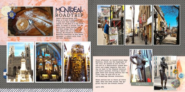
Montreal Roadtrip by Debbie Hodge | Supplies: Snug as a Bug by Lynn Grieveson; So True by Melanie Ritchie; Flip Flops by Forever Joy; Dear Heart by Basic Grey; Bohemian Typewriter, Trend Rough Slab fonts.
