 While complementary colors can give a design punch, they can also present challenges since their strong contrast has them competing with one another–and even with your photos.
The Get It Scrapped Creative Team shows you how they worked with three solutions for giving this bold and traditional color combo a fresh look on holiday scrapbook pages. Those solutions include:
- Adding an unexpected color into the mix.
- Creating variation with shades and tints of the complementary colors.
- Incorporating plenty of neutrals to create a visual barrier between complementary colors.
“Playful” color solutions like these are included in the Playful Scrapbooker Learning Track in the Get It Scrapped Membership.[hr]
Christy Strickler says, “This is my son’s first photo with Santa at a just a few months old.”
“Pretty much all of my holiday pages utilize red or green in some way. However, I generally can’t use just those two colors. I like to add hints of pink, light blue or even turquoise to provide a pop of nontraditional color while at the same time softening the tone of the page.”
“This approach usually means I stray from traditionally styled embellishments, instead using motifs and embellishments with a more whimsical tone. Using a nontraditional palette allows me to more easily add in product from other kits and collections (even those that are not holiday themed). I have a tendency to use bold patterns and colors. I use cardstock mattes to help define the different elements on the page and to keep the photo from getting lost in the mix.”
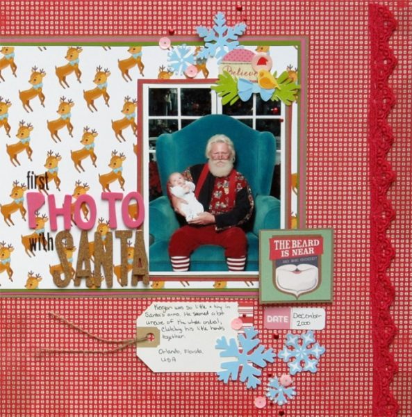
First Photo with Santa by Christy Strickler |Supplies Patterned Paper: Crate Paper; Letters: American Crafts, Lilybee Designs; Digital Image pack by Lesya Skripak/Creative Market; Die Cuts: Elle’s Studio, Basic Grey, Chic Tags: Other: Lace,Twine
Cynthia T. says, “I didn’t get to properly Document My December last year, so I am finishing up some pages now to be ready to do this December. We put up the tree with my daughter, and one of our little traditions is that we always do this a bit late, but still take pride and enjoy our trips to get little new decorations at the pound store. We even shop for food on the very last day. I wanted to take a different approach for this page so I included the decorations and a candid photo of my daughter opening the tree. I really like the angle of the photo and the close-up of the decorations”
“For years, I used predominantly red and green on holiday pages–until 2014, when one of the kits I used had a lot of pink in it. I would have never thought of putting pink together with red, but I loved it, and from then on I started looking for other colors that could play well with the reds and greens and still not look too plain or too bold. Here, I used aqua and light blue for the doodled tree, paint strokes and the title. I find the addition of blue or pink lifts the feel of a holiday page.”
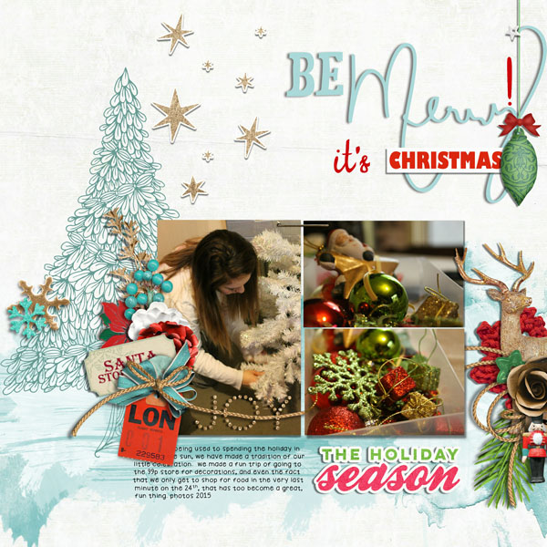
2015 be Merry by Cynthia T. | Supplies: Fiddle Dee Dee Designs: Merry + Bright: Color Me Happy: Trees, Pink Reptile Designs: The Sparkly Season Elements & Counting the Days Elements, Mommyish : Holiday Cheer Elements, Little Butterfly Wings: December Delights Elements, HGD by Laurie Ann: Vintage Christmas & A Merry Little Christmas- Just Jaimee Storyteller December 2013 & Merry & Bright Word Bits- Background Paper Kim Jensen: Shabby Christmas Papers, Paints from ViVa Artistry: Spring Love.- Journaling font: Mel’s Little Dude.
Kristy T. says, “This page shows a photograph that I adore of my son at Carols by Candlelight a few years ago.”
“I often use red and green to document Christmas stories. Here, though, I used a black background which is unexpected for a Christmas themed page. This worked well as my photograph is at night and I could use the background to make a shimmery sparkly background with a sense of magic and wonder that captures the experience of the caroling event. It works to extend the photograph into the background.”
“I also used touches of blue and teal to give the page a greater variety of color. I used only minimal red elements in the background, keeping the red mainly around the photograph. I wrote the journalling on a tag tucked behind the photograph so I could keep lots of white space in the design.”
Tip: Red is eye-catching so use red items or papers around whatever you want to be the focus of your page.

Magic by Kristy T | Supplies: Card: Bazzill; Kaisercraft; Patterned Paper: Jillybean Soup; Mists: Perfect Pearls; Paints: Ranger, Heidi Swapp Texture Paint;; Ink: Versamark; Glitter Paste: Bo Bunny; Chipboard: Bo Bunny; Stickers: Unknown.
Deborah Wagner says, “This is a page of my granddaughter on her first Christmas. You can see the look of awe in her eyes.”
“I enjoy using red and green because they add vibrancy, and festivity to my Christmas pages; but they do have to be used with a careful balance of daring and moderation. Here, a neutral, wood background gives the eye a place to rest, and keeps the viewer from being overwhelmed. The medium value green allows the page to remain colorful, but without the harshness caused when complimentary colors are used at the same high level of intensity.”
“The most striking and sophisticated designs often incorporate complementary colors because when the eyes are overwhelmed with one color, both the eye and the brain seek the respite associated with the color’s compliment. The artist, Marc Chagall, said it eloquently: All colors are the friends of their neighbors, and the lovers of their opposites!”
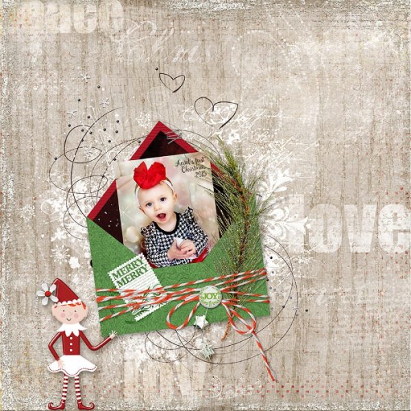
Special Delivery by Deborah Wagner | Supplies: KimB – Handmade with Love, Traditionally; Creashens – Beat; Anna Aspnes – Magic Sprinkles 2; Inside Pixels – Winter Wonderland; K Pertiet – Envelop Layered Template, Away We Go, Carte Post, Posted Words Holiday 1, Jack Frost, Holiday Foliage 2, Elfin Magic
Marie-Pierre Capistran says, “This is day 25 in my December Daily 2015. We celebrate Christmas on the 24th so the 25th is always a very slow and lazy day with kids playing with their toys.”
“I typically use red and green on my Christmas pages, but this year I liked playing with products that have a watercolor feel to them. The reds are more pinkish, and the greens are not so intense, even though they are pretty dark. It softens the layout significantly. I added just small touches of ice blue, yellow, and black in the middle my die cut cluster. It breaks down the red-and-green combo.”
“Another thing I did to soften the layout was to dedicate a whole 4″x6″ pocket to write my journaling. I used a paper that looks like ruled paper for that. It makes a big neutral space on my layout and gives a space for the eye to rest. Finally I used gold numbers and placed them right across the photo with the glowing tree. Together, they create a whole band of sparkle which distracts from the large use of green and red.”
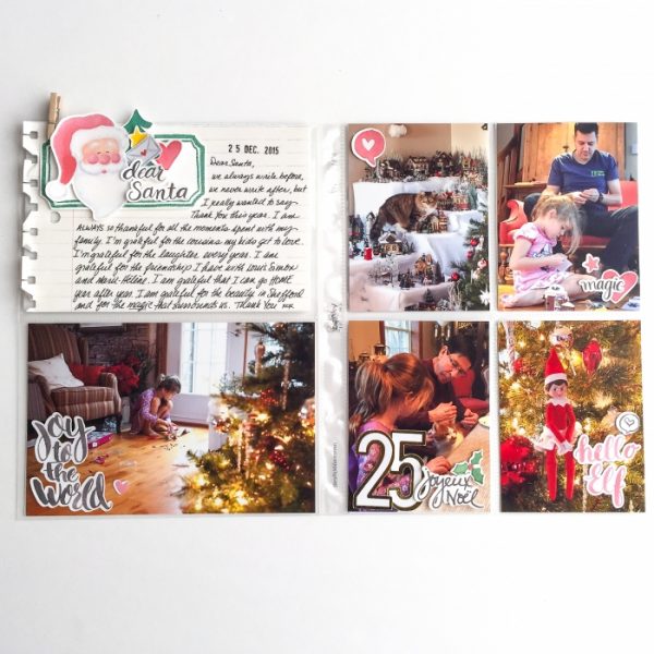
December Daily Day 25 by Marie-Pierre Capistran | Supplies: Paper: Pretty Little Studio; Die Cuts: Pretty Little Studio.
Stefanie Semple say, “Christmas 2015 lunch was followed by gift swapping and gift openings. My Mom was visiting from the old age home and things were a little tense.”
“I don’t always stick to traditional Christmas colors and motifs, since it’s summer for us in South Africa, so the snow and cold elements don’t really work. We don’t have access to the Christmas PJs and many of the photos I take are un-traditional.”
“I added a dark woodgrain and white into the mix and love the result. Woodgrain patterns have become my new favorite neutral, and white just adds a fabulous lightness and breathing space. I used embellishments to add to the festive feel so that the theme and time of year is quite apparent.”
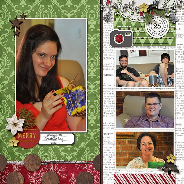
Christmas 2015 by Stefanie Semple | Sipplies: Debbie Hodge: Scrapbook Coach Half and Half Template; Christmas Traditions kit (retired) : LJS Designs; Dear Santa: Sahin Designs, Dawn Inskip: Honesty Stitches, Charmbox Studio: Resize for web action.
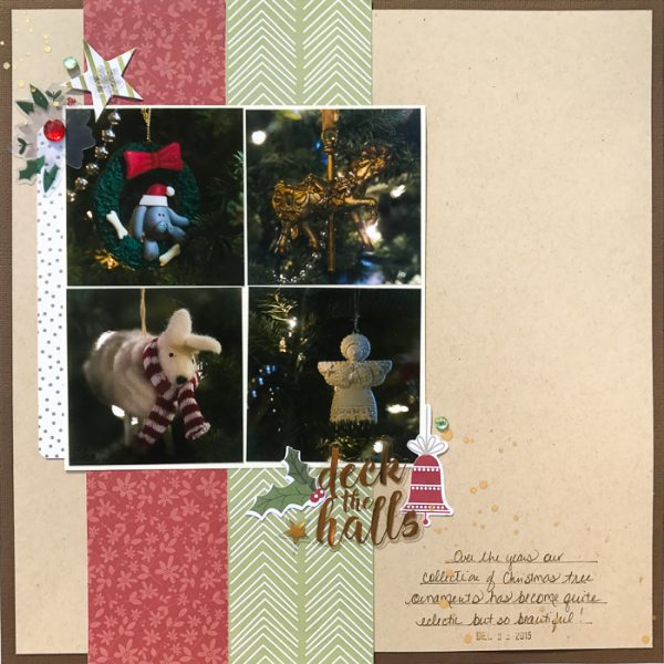
Kelly Sroka says, “Over the years, my family’s Christmas tree decorations have changed. I love to document the new items we collect each year. This layout features just a few of the ornaments that we placed on our tree last year.”
“I love the traditional colors of red and green for Christmas. However, using the same colors year after year on scrapbook pages can get a bit monotonous. For this page, I took a cue from my own holiday decorating and incorporated the neutral colors of kraft, gold, and brown into the mix of red and green. I live on a farm and my home has a decidedly farmhouse feel. I often use kraft as a neutral in my holiday decor. For example, I will use kraft paper to wrap my presents and then tie them up with red and green ribbon and gold jingle bells.”
“As a result, this page is fresh and new to me even though I used very traditional hues of red and green. I love that the page reflects my own holiday decorations. To give new life to your holiday pages I suggest two things. One, use red and green but with a neutral that you love. Two, look to your own holiday decor for inspiration and use color combinations that you enjoy in your Christmas collections.”

