by Debbie Hodge
When you’re working with four photos there are basic photo cropping and sizing choices you make again and again:
- crop all photos the same size or create emphasis with a larger photo?
- crop with same orientation? works great for stacked or side-by-side.
- crop to same width-to-height proportions? try a a grid.
- crop the photos in different sizes and orientations? fill a block with photos and other elements.
Here are 5 approaches that work with those basic combinations when you’re scrapbooking four photos:
- row or column
- grid
- blocked
- layered cluster
- 1 larger with 3 accenting
Take a look at 3-photo pages you’ve made in the past. Do you have a typical approach or have you used one or more of these? Next time you’re ready to scrapbook 3 photos, consider: side-by-side, stacked, one featured with two supporting, blocked, and clustered designs.
1. Arrange 4 photos in a row or column
When your photos are of similar size and the same orientation, putting them in a row or column is a quick way to get started. You can do many things to “shake it up” and keep this configuration from looking the same all the time: tilt a photo or two, take things off center, or stagger photos to begin with.
Summer Fullerton. Cropped four portrait-oriented shots of her son, rounded the corners and matted them on a white mat for a clean and graphic look that goes well with the trendy talk bubbles. Summer says, “I cut my word bubbles using my Silhouette cutting system and a free font named talk. You could also do this by hand and top them off with your favorite alpha stickers.”
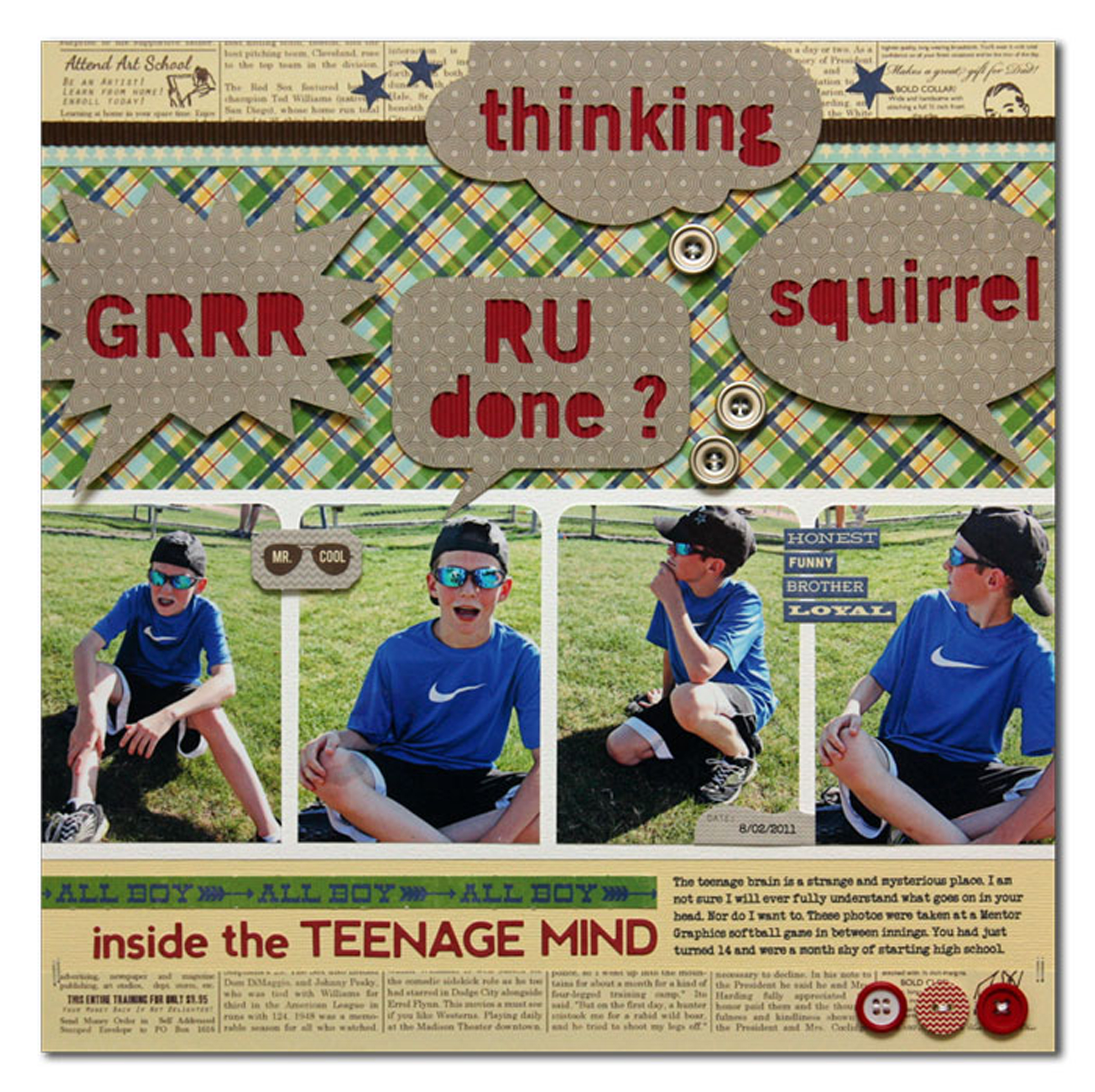
Inside the Teenage Mind by Summer Fullerton | Supplies: Supplies Used: Cardstock from Bazzill, Jillibean Soup patterned paper/corrugated paper / diecuts/ alphas/ buttons, DMC white floss, Silhouette Cutting System, Corner Rounder, and fonts Talk (title), OldSansBlack (title) and Veteran Typewriter (journaling) downloaded from the internet
Adriana Puckett says, “a series of four photos is the perfect ways to feature a series of objects, like these Lego figures that my daughters made. I cropped each and slightly staggered and overlapped them to reinforce the “series” feeling. I chose bright, primary colors that echoed those found in Legos. My journaling is printed out from the computer. I dry-brushed green paint around the outside of the page, and splattered it in the title block area. I wanted to soften the straight lines with some organic shapes, so I added the scallop circle at the top and the green paisley flower coming from the lower right side.”
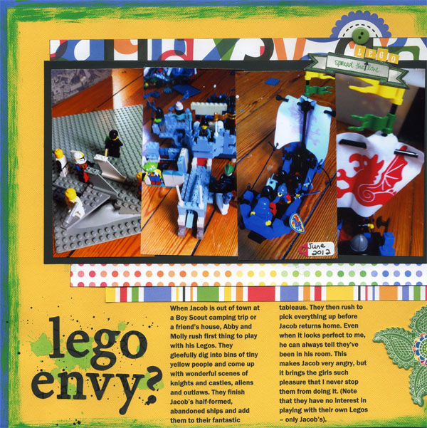
Lego Envy? By Adriana Puckett | Supplies: Patterned Paper and scalloped circle:Doodlebug; Cardstock:Bazzill; Stickers:Amy Tangerine; black letters:Imaginesce; Paint:Making Memories; Button:unknown.
Meghann Andrew says, “When I have multiple photos that are similar in content, I often line them up in a column or row to show a progression. In this case, it was my brother slowly sliding into the pool! To keep white space on the page, I cropped the photos to 2.75″ square — the perfect size to allow them to fit vertically with some space in between.”
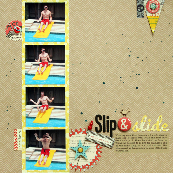
Slip & Slide by Meghann Andrew | Supplies: Kit: Studio Calico Elmwood Park + Twisty Slide add-on; Patterned paper: Lawn Fawn (kraft chevron), Basic Grey (yellow dot & red and teal dot); Die-cuts: October Afternoon (‘Ace’ circle, teal star, ‘Hampden’ circle, herringbone flag, ‘all in a day’s work’ banner & text scalloped circle) Basic Grey (‘Oh Fun!’ rectangle, pennant); Date tag: Elle’s Studio; Pin: Basic Grey; Badge: October Afternoon (ampersand); Button: Queen & Co; Brads: My Mind’s Eye; Wood veneer bird: Studio Calico; Chipboard/fabric letters: American Crafts; Font: Pacifico (‘slide’), American Typewriter (journaling); Die cut shapes: Starburst Seal Set by Lori Whitlock
Other: Silhouette Cameo
2. Arrange 4 photos in a grid
Arrange your photos in a grid that fills the page or just a part of it. Make the design interesting with placement on the page and layering beneath the grid.
Christy Strickler snapped a photo of her son with the Instagram app. She says, “He had a grin and seemed to be ducking his head down in a humble manner. Since the photo wasn’t of great quality, I added a pop art filter from another app called Picsart. It automatically creates a grid of four photos each with a different color filter.”
Christy printed the photos on a 4″ x 6″ photo paper and trimmed them down to a 2 by 2 grid that’s 4″ square. She says, “I feel like the repetitions reinforce my son’s mannerisms in the photo and that’ more important than the poor quality of the photo.”
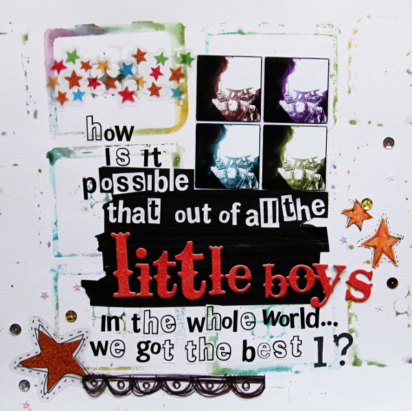
Little Boys by Christy Strickler | Supplies Cardstock: Colorbok; Alphas: Paper Trunk, Pinks Paislee; Transparencies: Fancy Pants, Mists: Tattered Angels; Markers: Ranger; Other: Electrical tape, Sequins, Stencil
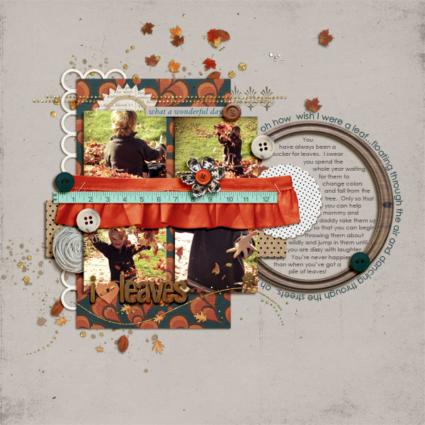
I Love Leaves by Amy Kingsford | Supplies: Sara Gleason: Petunia; Sahlin Studio: Pretty Trims No. 1, Autumn Moon Papers, Autumn Moon Elements,
Whispers: Fall, Fresh Collab with One Little Bird, Worn Collab with One Little Bird; Katie Pertiet: Wooden Alpha No. 3; Anna Aspnes: Woodshop Frames.
Kiki Kougioumtzi‘s page includes four 4″ high photos in a grid–with two of the photos wider and placed diagonally from one another.
Kiki says, “As I saw my daughter playing with her art supplies the other day, the idea for this page came to mind. Every woman in our family is a crafter of some kind. Crochet, knitting and stitching is what I remember my mother and my grandmothers doing at their free time.”
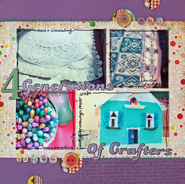
4 Generations Of Crafters by Kiki Kougioumtzi | Supplies:Cardstock:Bazzill; Patterned paper:Basic Grey; Alphas:7Gypsies, QuicKutz; Other:Buttons Jenni Bowlin and various, thread, We R Memory Keepers Sew Easy Stitch Piercer.
3. Arrange 4 photos in a blocked design
When your photos are of varying sizes and orientations, place them on the canvas and fill in a block around them with patterned papers and elements..
Christy Strickler filled the canvas with four photos alongside patterned paper blocks, journaling, embellishments and titling. Christy says, “We often take walks around our neighborhood. We live on a tiny island and the view from the center of it is very different from the outer edges. These photos were taken on one of our walks. I wanted to show the difference between the two environments we encounter.”
“The top row on the page represents the inner part of the island. I used the photo of the pond and floral print paper to represent the woody environment surrounding the pond. I clustered the beach photos on the lower right side. The scallops on the paper reminded me of waves and the pink worked well with the yellow and brown. In addition to that, the color palette I chose reminds me of sunset which is often when we take our walk.”
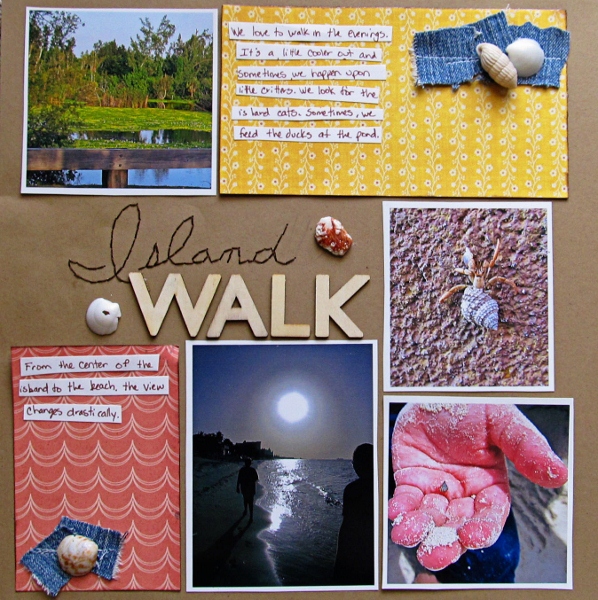
Island Walk by Christy Strickler | Supplies Patterned Paper: Sassafrass, My Mind’s Eye; Alphas: Pink Paislee; Other: Seashells, kraft paper, DMC floss, denim
Debbie Hodge arranged four photos of different sizes in a block that incorporates ephemera and vintage images much like the cluttered pawn shops she’s scrapbooking.
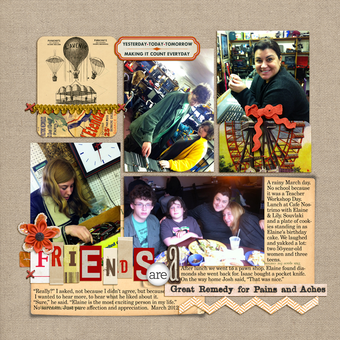
Great Remedy by Debbie Hodge | Supplies: Double Takes, Greatest Curiosity Gesso 3, ATC Tangerine Dreams by Tangie Baxter; Scissored Chevron, Artplay Chevron Crazy Life by Anna Aspnes; Postcard Journalers, Old Time Christmas 2, Oiselet Rouge Elements by Katie Pertiet; Just Another Day by Karen Lewis; Relocate Alpha by ViVa Artistry; Autumn Moon Elements by Sahlin Studios; Sweet Nothings Alpha by Lisa Sisneros; In a Word 2 by Pattie Knox
4. Arrange 4 photos in a layered cluster
Shake up the grid and overlap and tilt, take things off off the grid line and create a cluster of photos.
Adryane DriscollI arranged four photos to overlap and mirror each other. She says, “Two of the photos were converted to black and white to break up the page a bit and to help keep the gold and brown of the leaves in the photos from overwhelming the page. I used leaf images as embellishments because they fit with the photos and because they emphasized both the season (fall) and the end-of-life tone of the page. I used a heavy cluster at the top of the page and tried to balance it with my journaling block (which I aged with the burn tool and a creased transfer).”
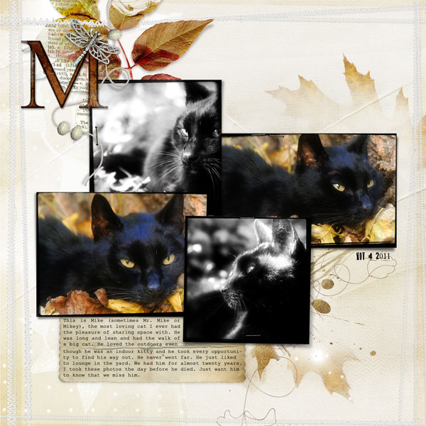
Mike by Adryane Driscoll | Supplies: Anna Aspnes: ArtPlay Palette Autumn Haze, FotoBoost Templates No.1, ArtPlay Palette Pumpkin Spice, KrissKross Stitches White No.1, LoopdaLoop Leaves, WoodShop Alpha and Number Set No.1, Gold Painted Leaves No.1, ArtPlay Palette Epic (beads).
Tanyia Deskins says, “My youngest daughter is a ham for the camera and a great poser! She absolutely loves to tilt her head this way and that, put a hand under her chin, look surprised, etc. Using 4 photos on a page is a great way for me to get in a few good shots of her beautiful little face and the precious looks she gives me. These are just for fun pictures to celebrate the every day moments of love with her!”
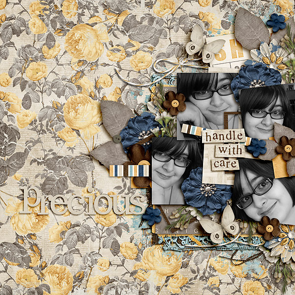
Handle with Care by Tanyia Deskins | Supplies: Made Of Glass by Krystal Hartley and Meghan Mullens, Double Latte by Little Green Frog Designs
5. One larger photo with three accenting
Emphasize one photo and use three smaller photos to support your story, to accent, and provide context
Debbie Hodge likes context on her pages and one photo is usually not enough. On “Change of Address” one photo — the group shot with everyone in it — is larger and the focal point. Three smaller photos, all cut to the same size, are arranged in a framed series.
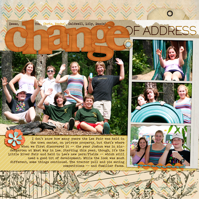
Change of Address by Debbie Hodge | Supplies: Circus by Ashlee Wall; Seedpods by Sara Gleason; Harlequin Knockouts by Splendid Fiins; Basic Paper Alpha Orange, Artistry de Azul Element Kit by Katie Pertiet; Pedal Pusher by One Little Bird; Everyone has a Story by Captivated Visions; Ransom The Frames by Vicki Stegall; Bittersweet by Amy Wolff; Brad Bonanza by Pattie Knox; Raleway, Bohemian Typewriter fonts.
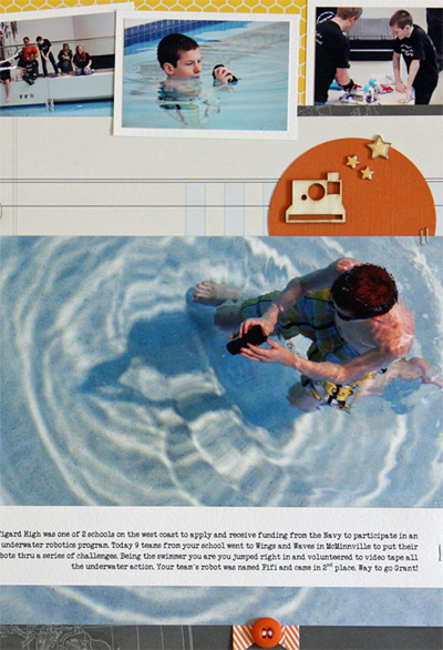
Summer Fullerton made “Underwater Robotics” inspired by an article opener in Eating Well magazine. Summer says, “I liked how the graphic designer incorporated the text and subtitle directly on the photo.” The enlargement is big enough for the viewer to understand what’s going on — a boy is in a pool controlling an under-water robot. Three smaller photos in a series at top right provide context.
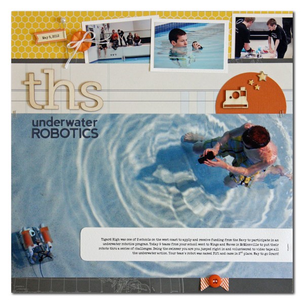
THS underwater robotics by Summer Fullerton | Supplies: Cardstock from Bazzil, Patterned Paper from Studio Calico and Pebbles, Alpha Stickers from Jillibean Soup, Wood Alphas from Pink Paislee, Wood Embellishment from Studio Calico, Buttons from Jenni Bowlin/Crate Paper, Star Brads from Making Memories, Soup Label Sticker from Jillibean Soup, DMC white floss, Die Cut from My Minds Eye, Tim Holtz Tiny Attacher, Circle Punch from Marvy, Stick Pin from JoAnns, Corner Rounder, and font Veteran Typewriter downloaded from the internet
Take a look at 4-photo pages you’ve made in the past. Do you have a typical approach or have you used one or more of these? Next time you’re ready to scrapbook 4 photos, consider: side-by-side, stacked, one featured with two supporting, blocked, and clustered designs.
[hr]
[designclass]

