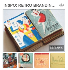
 See the Retro Branding pins on the Get It Scrapped Pinterest Boards for scrapbooking ideas you can use on your own layout designs.
why retro branding.
Take a look at branding these days and you’ll see plenty of vintage or retro images, typefaces, and layouts. Retro is trendy and retro branding is aimed at offering comfort, of reminding us of a time when things were better.
go deeper.
These Get It Scrapped articles show you exactly how you can use retro branding as inspiration on scrapbook pages:
- Find Scrapbook Page Ideas Using the 3 Elements of Retro Branding
- Ideas for scrapbooking retro photos and memories from the 60s, 70s, and 80s
- Scrapbook Page Storytelling with Retro Filtered Photos
see it done.
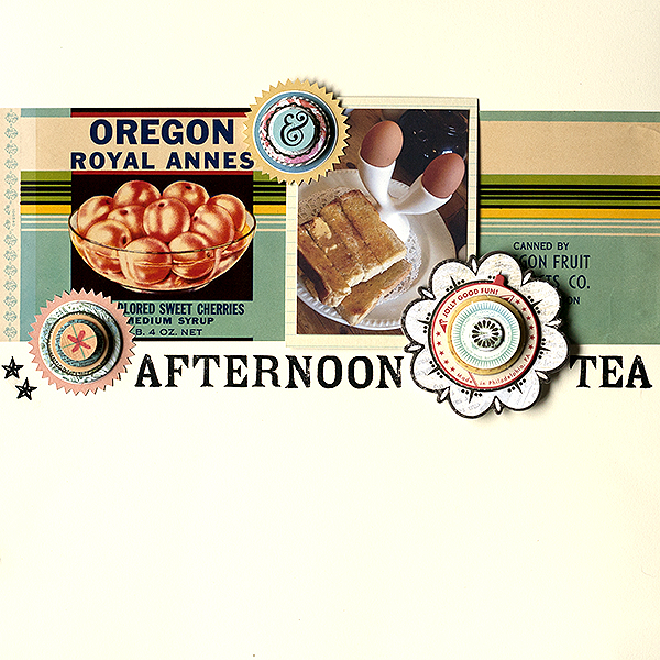
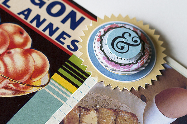
Amanda Robinson took inspiration for her page from the layered circle designs used in these retro badges found on Graphic River and created her own layered circular embellishments. She also used a vintage fruit label on her page as inspired by this vintage apple crate label.
Amanda says, “Get It Scrapped’s Retro Branding pinboard is full of things like labels, packaging and other printed material. Things like the color schemes, typography, arrangement of elements and even ideas for literally using similar found or vintage items on a page make this a great resource for scrapbookers.”

Afternoon Tea by Amanda Robinson | Supplies: Cardstock – Bazzill Basics; Patterned paper – Jillibean Soup; Die cuts – Basic Grey, Teresa Collins Designs, Ormolu; October Afternoon, Crate Paper, Pink Paislee; Rub-ons – Jenni Bowlin Studio; Other – Vintage label.
your turn.
Pick an image that speaks to you from the Get It Scrapped Retro Branding Board, use the links and inspiration above for examples, and put this trend to work on your next page.
Amanda Robinson
Blog | Challenge Blog | Facebook | Pinterest
Amanda lives in Devon in the UK with her husband and 9 year old son, Lewis. She has an eclectic scrapbooking style–in which one day she will find herself creating a very minimal, graphic project and the next a textured project with layers of pretty papers and embellishments. One thing that is almost always present in her layouts is ample white space and, lately, she seems to have been bitten by the electronic die-cutting bug!


