
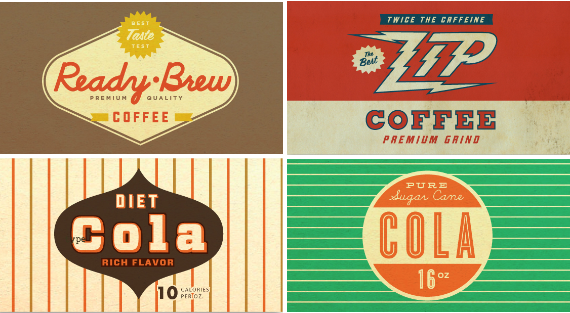
source: Wallis Design House
by Debbie Hodge
The vintage labels to the left were designed by Wallace Design House and exemplify the three basic elements of “retro” or nostalgic branding:
- limited and tonal color schemes
- simple shapes (circles, diamonds, scalloped edges, simple modifications that add curves)
- retro typography
Take a look at branding these days and you’ll see plenty of vintage or retro images, typefaces, and layouts. Retro is trendy and retro branding is aimed at offering comfort, of reminding us of a time when things were better.
This month, our Creative Team took the challenge to design pages incorporating those 3 elements of nostalgic packaging, signage and advertisements.
[hr]
Leah FarquharsonThe Cranky Pressman
‘s layout celebrates things about her husband for which she is thankful. She says, “My design is completely inspired by the graphic design for shown below. The clean edges and styling along with primary colors can be a stunning combination – especially when you’re going for a masculine tone.”

YOU ARE by Leah Farquharson | Red, white and black cardstock: bazzill. Patterned paper, vintage buttons: Jenni Bowlin Studios. Stamps, Page Gems: Studio Calico. Pigment Ink: American Crafts. Fonts: marketing script, BEBAS.
[hr]
Christy Strickler‘s page about her pregnancy cravings was inspired by retro-look Sprite soda 12-pack packing featuring an old fashioned wood crate and burst (another retro motif). She kept things simple to reflect the basic color scheme and design on her inspiration piece. See the inspiration from nostalgic soda packaging.
Christy says, “The wood crate inspired the canvas for my layout, and the burst became my photo foundation. I inked photo edges in black and distressed the cardstock to resemble the worn label on the crate.”
Letter Stickers mounted on white and cut with a border echo the type treatment on the inspiration piece, and Christy used a white Signo pen for journaling, replicating the look of the white wording on the green portion of the label. To add dimension to the design Christy added punched scalloped circles and buttons.

Cravings by Christy Strickler Supplies| CardStock: Coredintaions; Patterned Paper: Pebbles: Alphas: American Crafts; Ink: Clearsnap;Pen: Signo; Punch: Fiskars; Other: Electrical Tape
[hr]
Sue Althouse says, “This page is about childhood memories of my dad and his love of bowling. The photo, from 1960 with its white scalloped border, set the tone for my retro design. “Looking for inspiration, I searched Pinterest for retro bowling signage and the Silhouette store for retro bowling shapes. Keeping a simple design, choosing a limited color scheme, and selecting appropriate typography all combined to achieve the retro look I desired.”

Bowl-O-Drome by Sue Althouse | Supplies: Cardstock: Bazzill; Patterned Paper: My Mind’s Eye; Alphabets: American Crafts; Stamps: American Crafts Date Stamp; Inks: Hero Arts, Jenni Bowlin; Mini Pearls: Doodlebug; Tools: Silhouette Cameo
[hr]
Katie Scott says, “We were in Durango, Colorado during Geek Fest and couldn’t wait to go to the Connect Four Tournament – little did we know it was in a bar full of 20 somethings and the three of us (me and my two kids) were the oldest and the youngest ones there.”
“To get a look inspired by retro branding, I used a patterned paper with a retro font by Crate Paper and cut the letters out. I used a dartboard chipboard element in the shape of a circle to place the letters.”

Connect Four Geekfest by Katie Scott | Supplies: Cardstock; Patterned Papers from Crate Paper and American Crafts; chipboard element from Basic Grey.
[hr]
Amy Kingsford says, “For ‘On the Move,’ a page about my son starting to walk, I combined inspiration from a number of retro graphics that I found on Pinterest. A retro feel was in keeping with my subject, evoking a sense of looking back.”
Amy made a foundation using simple shapes created with a bold and grungy circle brush and small burst accent. They are layered over classic intersecting stripes. She used just two colors, desaturated red and blue, and a neutral cream along with a black-and-white photo. Amy says, “I played around with my blending modes and opacity on a few of the page elements to get a two-tone look.”

One the Move by Amy Kingsford | Supplies: Karla Dudley: Change Kit Full and Shape Shifters – Circles
[hr]
Doris Sander says, “Working with a two-color palette was a refreshing change of pace. I chose several tone-on-tone small-motif patterned papers to add variety while still keeping a simple, graphic style. The look was good for the photo here, since the book my son is showing has a similar artistic style–featuring one color, two neutrals and a burst motif.”

Pow by Doris Sander | Supplies: patterned paper – Jenni Bowlin Studio, My Mind’s Eye, Basic Grey, chipboard frame, alphabet, brads – American Crafts, brads – Pink Paislee, word stickers – October Afternoon, acrylic flowers, word tabs – Heidi Swapp, stickers – Crate Paper
[hr]
Brenda Becknell says, “These photos are from a vacation at the beach many years ago, when we just enjoyed playing in the water and ‘riding the waves’ on rafts.”
“Retro logos often feature the brand name or slogan in a circle with a bar through the center, and I used that design for my title and layered sticker embellishment at bottom right. I used blue and yellow with a neutral cream, rounded corners, retro-style typography, and round embellishments.”

Fun in the Sun by Brenda Becknell | Supplies: Patterned paper: October Afternoon, Doodlebug Designs; Cardstock: Bazzill, DCWV; Journaling box and stickers: October Afternoon; Alphabet stickers: Doodlebug Designs; Corner rounder punch: We R Memory Keepers; Border punch: EK Success; Die cuts: Provo Craft Cricut “Accent Essentials” and “Life’s a Party” cartridges
[hr]
Adriana Puckett‘s page is an exploration of her relationship with her husband. She got a retro look on the page with vintage typography (using the Lobster font to cut her title) classic dot and chevron patterns, and a limited color scheme of reds and oranges with desaturated teal and neutral white. Rounded corners and scallop-edged shapes complete the look.

You and Me by Adriana Puckett | Supplies: Patterned paper and embellishments: Studio Calico; journaling spot is die cut from Echo Park paper; Silhouette cameo (die cut the title and journaling spot); Sketch: Pagemaps.
[hr]
Debbie Hodge found the retro-branding look well-suited to her page about downtown “Niagara Falls.” It’s been a international honeymoon and tourist destination since the early 1800s. The combination of natural beauty at the falls site and a purposefully kitschy tourist downtown is a big part of Niagara Falls’ character.
Debbie says, “I used green, red, and yellow with dark neutrals and a “souped-up” title treatment that reminded me of vintage signage. Adding the “rise” to “Niagara” and the ornament below “Falls” makes this title especially evocative of older type treatments.”
Type treatment notes: The typeface for “Niagara” is Mercury Script, from MyFonts.com. To get the type to “rise” or step upward: In Photoshop CS,
- Target your type layer.
- Select: >Edit >Transform >Warp.
- From the top toolbar, where it says, “Warp: None” click to get drop down menu and then select “Rise.”
- In the box next to it enter the amount of rise you’d like to add — this example is about 34 degrees.

Niagara Falls by Debbie Hodge | Supplies: Is It Friday by Paislee Press; Ann Innocent Heart by Sugarplum Press and Tracey Martin; Genealogy, Sprinkles 9 by Valerie Wibbins; Made of Awesome by Gennifer Bursett; Almost There by Katie Pertiet; Mod Pop Cardstock by Robyn Meierotto; Bare Necessities by Creashens; Vintage Bling by Jenni Bowlin; Mercury Script, Mercury Ornamental, Return to Sender, Bohemian Typewriter fonts
[hr] [getinspired]
