by Debbie Hodge
Bursts were a big part of 50s and 60s packaging, used as a way to grab attention, to say, “Hey, here’s some important information!”
Retro branding is aimed at offering comfort, of reminding us of a time when things were better, and if you look around, you’ll see plenty of vintage or retro images and typefaces in the world around you today. Mad Men is a popular television series set in the 1960s. The Captain America movie goes back to the 40s. Coke and Tide are two companies with recent retro packaging campaigns.
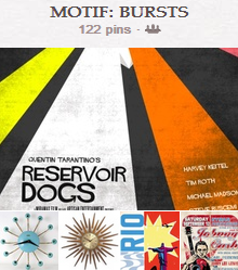
Check out a fun look at The History of the Graphic Burst. Travel on over the Get It Scrapped “bursts” board on Pinterest where we’ve collected bursts on scrapbooking pages, in the form of clocks, on packaging, home decor and more. There’s great inspiration for putting together bursts on your own work.
On your scrapbook pages, use bursts
- as base/canvas
- as foundation or mat
- as embellishment
- as eye-catching punch.
Get bursts on your pages with
- burst-print patterned paper
- hand-cut “rays”
- misting, painting, stamping through stencils
- clipping to digital masks
- die-cutting
- stitching
Francine Clouden says, “It took me over six months to use this photo on a page because it’s such a treasure to me. I printed it out in January and made this page in late August. It just goes to show! The photo was taken in Grenada, my childhood home and it was the first time that Kieran had been to my favourite beach. The title says it all.”
Francine’s burst of patterned paper rays represent the sun and radiate out from the title which is layered on the photos.
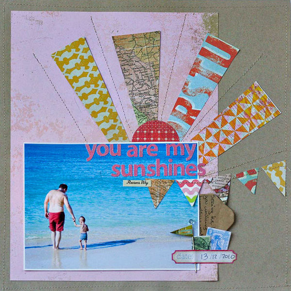
You Are My Sunshine by Francine Clouden | Supplies: Cardstock: Bazzill Basics Paper, Patterned papers: Crate Paper, BasicGrey, Sassafras Lass, Studio Calico, letter stickers: Sassafras Lass, label sticker: My Mind’s Eye, Miscellaneous: flag pin, stamp ephemera, envelope
Betsy Sammarco created her burst by cutting rays from orange paper and layering them over a grey base. The orange rays are stitched down and a circular chipboard embellishment sits at their origin. The bursts and this embellishment layered on the center photo make it the focal point of the page.
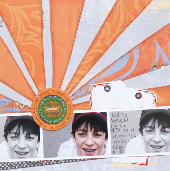
Brought Me the Sun by Betsy Sammarco | Supplies: Little Yellow Bicycle patterned paper, chipboard embellishment, sticker, rubons, plain white shipping tags, sequins, stamps: PSX, ink: StazOn
Stefanie Semple‘s page is the story of her being the photographer and capturing a day’s fun in and around the river. She used two pieces of “burst” print paper, rotating the two to meet in the middle, like two spotlights shone on her family, with the action recorded from every angle.
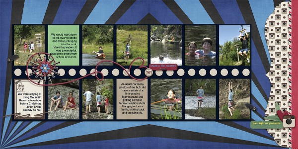
On this day by Stefanie Stemple | Supplies: Crossbone Cuts – Instagram, keepscrappin designs: Double Up v2 Template.
Ashley Horton used her personal die-cutter cut an asterisk shape. She folded each of “burst” lines down the center and added faux stitching with a white Sakura pen. Small arrows extend off each ray, emphasizing the idea of a brst. She says, “Working with this type of burst was challenging, so I only added part of the burst shape, layering my photos and title over the left side of it.
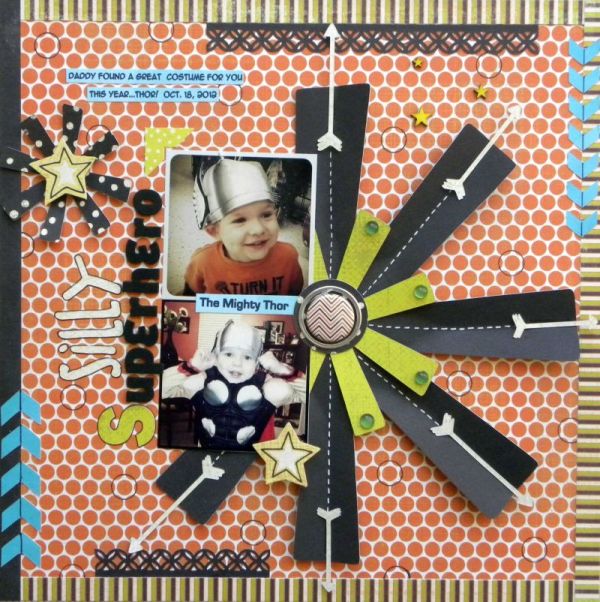
Silly Super Hero by Ashley Horton | Supplies – Patterned Paper: My Mind’s Eye & Amy Tangerine; Tin Pin: October Afternoon; Thickers: American Crafts; Fonts: Eurostyle & Anime Ace; Mini Round Gems: Recollections; Punch: Martha Stewart; White Pen: Sakura; Wood Veneers & Spray Mist: Studio Caico
Chris Asbury scrapbooked a photo of her little dog, tangled up in Christmas lights, and, thus, a perfect candidate for dressing up in holiday attire–although, he might not think so. She says, “I used multiple pinwheels to frame and anchor the photo. The resulting cluster has a triangular shape.”
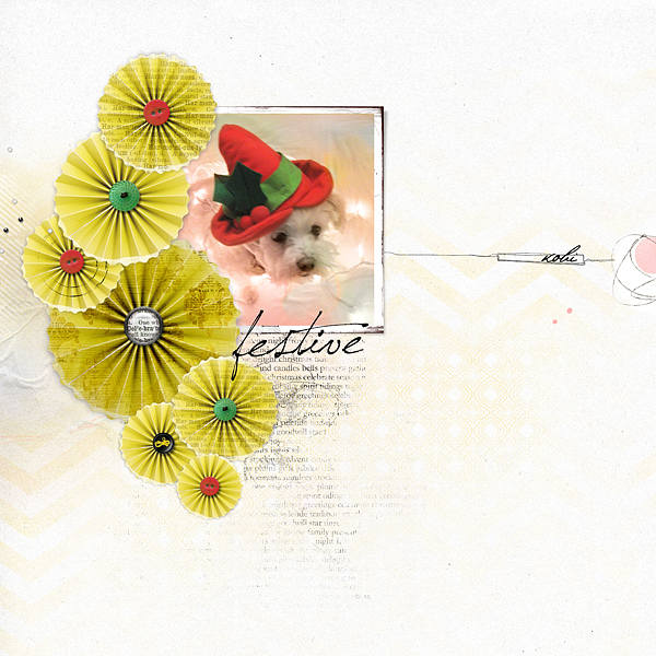
Festive by Chris Asbury | Supplies: Anna Aspnes Designs: ArtPlay Palette SunFun (paper, pink circle transfer), ArtPlay Palette Birthday (PinWheel), Boxed Art Strokes No.1, Script Tease Christmas No.1, Antiquated Frames No.1, Painted Circle Splatz, ArtPlay Palette Concerto (paper clipped to pin wheel), ArtPlay Palette Metro Graffiti (black button), ArtPlay Palette Christmas Elements No.1 (green, red buttons), Festive Moments (ArtFrame Shadow, WordArt, Celebrate brad), Magic Sprinklez No.2, Font: Pushkin.
Adryane Driscoll says, “This page is all about those cool sunglasses. I used paper that already had a burst on it, then stitched a second, partial burst. The pinwheels are a third burst. When I hear the word “burst” I think of an explosion, so I have the photos, word art, and stitching all radiating out from the center of the page. By having the stitching and the splatter used with the word art extend beyond the borders of the central grouping I emphasized my idea of what burst is.”

Wild side by Adryane Driscoll: Supplies: Anna Aspnes: ArtPlay Palette Epic (background), ArtPlay Palette Wild (word art), StraightLine Stitched White No.3, ArtPlay Palette Birthday (pinwheels); Something Blue Studios: Radiant Paper Pack
The lines of Meghann Andrew‘s stiched burst are subtle, and, yet, the viewer doesn’t miss them. They radiate out from the photo cluster, giving the page its “center.”
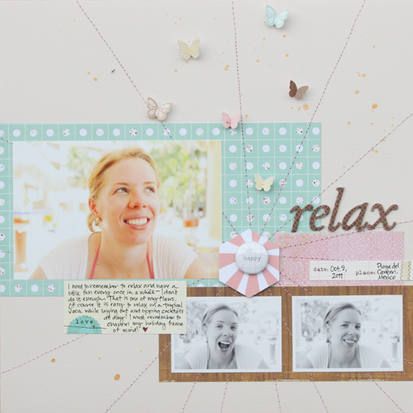
Relax by Meghann Andrew | Supplies: Cardstock: Bazzill Basics; Patterned paper: Dear Lizzy by American Crafts (teal dot), Crate Paper (pink & woodgrain); Journaling/date tags: Elle’s Studio; Die cut shape: Studio Calico; Alphabet stickers: American Crafts; Butterfly cardstock stickers: Sassafras Lass for Studio Calico; Badge: Hello Forever by Marcy Penner; Pen: Stampin’ Up!; Mistable ink: Studio Calico; Other: Thread & sewing machine
On this page about my son learning to ride his bike, Amy Kingsford says, I’ve used a stitched burst background to establish the foundation for my page. The shape itself reminds me of the spokes of a bike. Because the lines radiate from behind this extracted photo, the burst shape also creates a sense of energy and motion. The patterned triangles that I’ve placed along the lines add to this feeling and help to emphasize the burst in my background.”
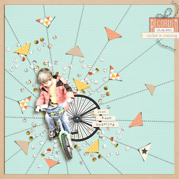
Cyclist in Training by Amy Kingsford | Supplies: Pedal Pusher by One Little Bird Designs, For the Record Collab by One Little Bird and Paislee Press, Build It Up by Agnes Biro, Oh Happy Day Collab by Erica Zane and Jenn Barrette, Simple Stitches by Karen Funk.
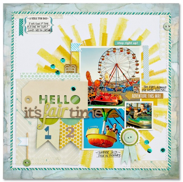
Kim Watson painted a large burst foundation with two shades of yellow on “Hello, It’s Fair Time,” giving the page focus and energy while, at the same time, setting a “sunny” tone that goes with the page subject.
Leah Farquharson says, “I loved capturing the joy of Christmas on our boys’ faces here. Even looking back at the photos myself, it brings an immediate smile. I’ve created my burst from strokes of green ink to back up my focal cluster and accented it with a sparse sprinkling of sequins.”
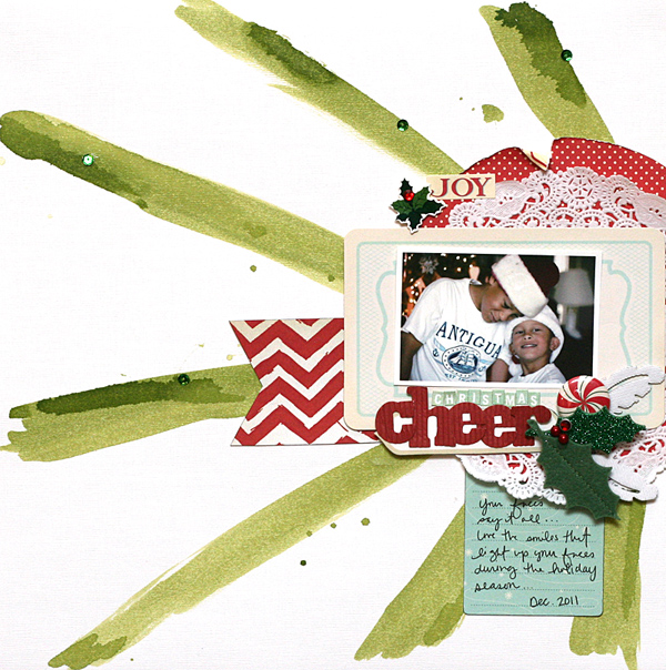
Christmas Cheer by Leah Farquharson | Supplies: Cardstock: Bazzill. Polka dot patterned paper, flair button, joy sticker, green ink, journaling c ard: October Afternoon. Chevron paper, canvas feathers: Studio Calico. Corrugated letters, 3D stickers, felt accent: American Crafts.doily and sequins: Craft supply
Katie Scott used the Mini Sunburst Stencil from Crafter’s Workshop with a Stampin Up Yellow Ink Pad on plain white paper to render several bursts onthe canvas of “Love.” She says, “I wasn’t sure what I was going to do with the paper while I was making it, but as it came together I thought I’d use it for the background of a page about the Artist/Nun Corita Kent. I found some images of the Boston Gas Tanks that she painted in 1971 on the internet (photo credits: Photo by Derek Johnson / Drawing by Captain Parker). I also found information and other images by Corita Kent online including the heart with Love (which was later adapted to a postage stamp). I handpainted the heart and love with a paintbrush and acrylic paint; I used the left over red and black paint to create a painted mat for my photo. I used a medium black Sharpie to do the journaling.”

{Corita Kent} Love by Katie Scott | Supplies: Stencil: Mini Sunburst Stencil from Crafter’s Workshop; Ink: Stampin Up Yellow Ink Pad; Paper: Plain White (unknown); Acrylic Paint and Paintbrush: Unknown.
Debbie Hodge used a sunray-like burst on the background and in a second foundational block on “Learning to Rise and Shine,” a page about getting high-school boys out of bed at the end of summer in preparation for school starting. Debbie “clipped” digital paper with a diagonal pattern to a burst mask. The result is that those colored diagonal lines appear to make a burst crossing every other ray of the foundational burst.

Learning to Rise and Shine by Debbie Hodge | Supplies: You Are Here by Allison Pennington; Circus by Ashlee Wall; Retro Mod by Sahlin Studio; Painted by Robyn Meierotto; Journaling Strip Masks by Katie Pertiet; PageKraft by One Little Bird; Darling Dear by Creashens; Glitter Thread Stitches, Fall Festival, Distressed Solids 3 by Lynn Grieveson; Cookie, Bohemian Typewriter fonts
[ontrend]

