 The next time you’re layering on your scrapbook layouts, add “peek-a-boo” elements, pieces you can see through or that have cut-out-openings. Try transparencies, mixed media, digital blending, punches and negative cuts. are
Layers that let you see through to the layer below add eye-catching dimension and are a great way to incorporate patterns, colors, and textures in interesting ways.
Layer a full-page transparency over patterned paper.
Anja de Dobbelaere says, “I took this picture of my daughter one summer evening.
“I love the evening light and enhanced this soft feeling in the photo with the Pink Frost Photoshop Action from Jennifer Valencia. Then I picked a beautiful flower paper and put one of Mye De Leons Chevron Transparancies on top of it. I added very few extra elements, because the page would be too busy for my liking. But I like how the flower paper shines through the transparent parts, I like the extra effect it has.”
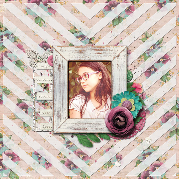
Wildflower by Anja de Dobbelaere | Supplies: Jen Barrette, I’m a Wildflower; Mye De Leon: Transparancies and My Belle (frame); Jennifer Valencia :Pink Frost Photoshop Action
Laminate flat elements to make a see-through canvas.
Lise Mariann Alsli says, “I love this picture of my daughter when she was almost two years old. The way she’s holding the Christmas tree ornament reminds me of Hamlet and his “to be or not to be” soliloquy. Thus, the title: ‘To decorate or not to decorate.’
“When I got this assignment, I thought: why not make the whole layout see-through? I laminated glitter glue, silver glitter, and colorful sequins to make a see-through, but still-fun background. I painted the edges white with a dry brush to make the edges visible. Almost all of my other layers are also see-through including: lace, cool flowers and page pebbles backed with see through mesh, kitchen plastic, and die cuts.
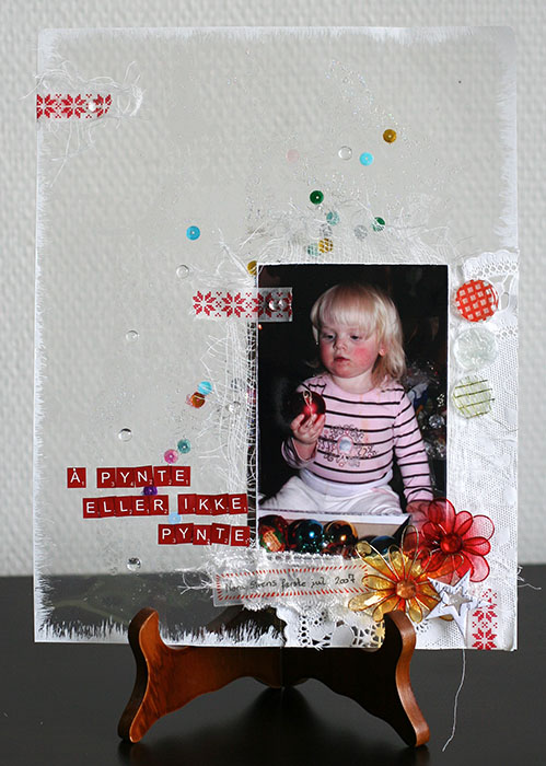
Å pynte eller ikke pynte… (To decorate or not to decorate…) by Lise Mariann Alsli | Supplies: Background: Peach laminating plastic; Page pebbles: Making memories; True love die cut shapes: Basic Grey; Chipboard star: Pink Paislee; Flora Doodles: Petaloo; Stickles Star Dust: Ranger; Beadazzles discoball: Suze Weinberg; White gesso: Grene art; Alphabet: Glitz Teeny alpha; Other: Doily, sequins, lace, washi tape, cheese cloth, raindrops, green metallic mesh. kitchen plastic wrap.
Cover your journaling with a flap but use a cutout to point the way to it.
Sian Fair says, “This page is recording of and personal reaction to nineteenth century words from George Eliot’s Middlemarch:
The fragment of a life, however typical, is not the sample of an even web.
“When I came across this recently, I thought – how modern! how right for today, when many of us who maintain an online presence sometimes wonder about how much of ourselves we should be revealing and how much of what we read is really the truth.”
“To make a design in which I peel back the layers and reveal the quote seemed like a good way of emphasizing the idea of different realities. I partially hid my journaling under a flap, but I made sure you could see that it was there with a cut-out (the scalloped heart). I have also used this technique, with much bigger flaps, on layouts where too much journaling on display would look intrusive. It’s easy to find if you point the way with a cut out or two. I added more see-through layers with transparencies and frames and a glassine bag of confetti pieces: having your reader wonder what’s in the bag is a good way to engage and draw someone in.”
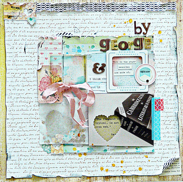
By George by Sian Fair/ Supplies: Patterned Paper: Crate Paper, Echo Park; Alphas: American Crafts; Embellishments: Crate Paper photo overlays, Fancy pants label stickers, Lilybee Designs stickers; Maya Mist gold ink
Use digital extractions and blending modes for see-through layers.
Deborah Wagner says, “This quote inspired me to make a page for my nephew.”
Here’s Deborah’s digital process for layering background and figure so that you’re looking through one to the other.
- I digitally extracted my nephew’s figure from the original photo, and dragged it to a canvas holding the sunset and clouds photo–to a layer above the sunset and clouds.
- I set the layer with the extraction to darken mode at 100% opacity.
- I duplicated the extraction layer and set it to hard light at 38% opacity.
- I still wasn’t getting the background photo to show through as much as I wanted so I duplicated the background, and placed it at the top of the layers palette (OVER the extracted figure).
- Using a layer mask, I erased all of the background photo except for the part over the extraction. Then I lowered the opacity to about 10%.
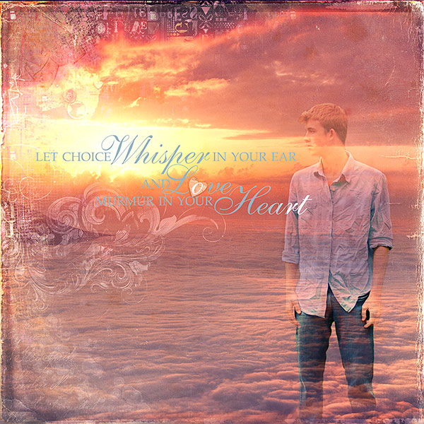
Whisper by Deborah Wagner. Supplies: Katie Pertiet Life Word Art No. 1, Edge Overlays No.1, Letterbox Overlays No. 5, From My Bookshelf No. 2, Blendable Photo Cards No. 3, Winter Peony Kit; Lynn Grieveson Worn Page Edges
Andrea says, “I used two techniques to show off a couple of my favorite spring flower photos. There is a combination of digital cut work and translucent layers on this layout.”
“The circle outlines are backed with paper circles in different colors. Where the circles overlap the see-through aspect of these pieces is emphasized.”
“At top right I layered a translucent copy of the flower.” Andrea’s how-to for this technique:
- Duplicate the photo.
- Set the lower layer to linear burn mode at 21% opacity.
- Set the upper layer hard light mode at 58% opacity.
- Use a layer mask to cover parts of the photo you don’t want to be seen.
- If you have a textured paper you can get great effects with blending modes.
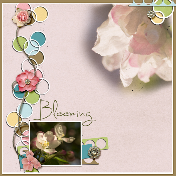
Blooming by Andrea | Supplies: Anna Aspnes ArtPlay Blossom; Katie Pertiet Yarn Swirls, Botanist paper no 15, Oiselet Bleu paper; Amy Martin Cutwork Designs.
Create a lacy see-through layer with Silhouette cut script text.
Marie-Pierre Capistran says, “This is a page I made about my grand-mother, Marie-Blanche, listing the primary things I remember about her.”
Marie Pierre’s page includes lots of see through layers in a variety of mediums, with the die-cut scripty journaling taking center stage. Here is her process:
- I started with a ruffled background from Dear Lizzy.
- I stenciled with white acrylic paint over the ruffled background.
- I misted the whole page with Heidi Swapp Color Shine in pink. I sprayed more at the bottom to give the background an ombre effect.
- Over the pink I sprayed gold Color Shine for shimmer.
- All of these layers of paint and spray mist let you see what’s below.
- Next I add the journaling, which I wanted it to be a central part of the page. I hand wrote the journaling with a Sharpie on white paper (making sure that the words and lines are touching each other and overlapping; i.e., welded). I scanned this and handcut the journaling with my Silhouette to create a lacy see-through layer.
- I layered the photos over this die-cut text and added see-through embellishments made of velum and transparency.
- I also used a glassine bag (to the left of the photos) to hold my journaling, which is the same text as the cut out journaling layered behind my photos.
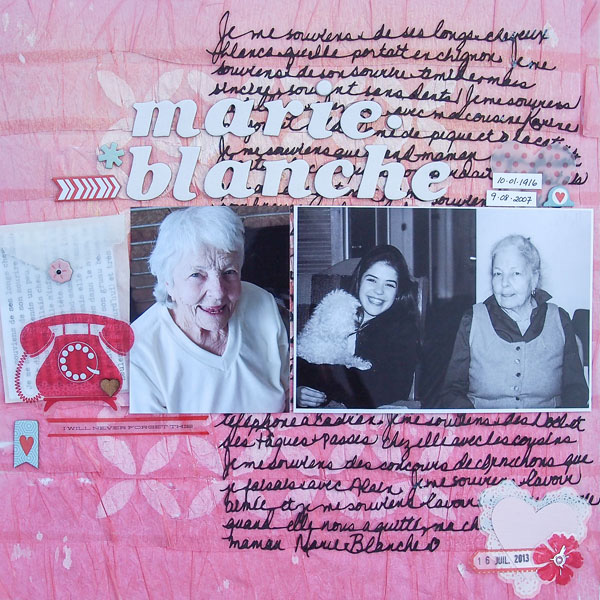
Marie-Blanche by Marie-Pierre Capistran | Supplies: Background paper: Dear Lizzy for American Crafts; Velum heart: Dear Lizzy for American Crafts; Heart Punch: Stampin’UP!; Chipboard accents: Dear Lizzy for American Crafts, Echo Park; Transparent embellishments: Little Yellow Bicycle, Studio Calico; Wooden heart: Studio Calico; Spray Mist: Heidi Swapp; Stencil: Heidi Swapp; Others: Silhouette, acrylic paint.
Use negative space cuts for embellishing and titlework.
Celeste Smith says, “My son had the honor of participating in the Inter-El town wide elementary band and he was able to play at a large local theater.”
“I used a few techniques to create see-through layers. The cutouts include circles backed with pie charts, the title backed with patterned paper, and triangles in the top left corner also backed with patterned papers. I added vellum in a stack behind the main photo, and it lets the library card underneath barely show through. Finally, I made sure one of the dots showed through the circle in the top of the tag. The openwork treble clef allowed me to have the date peeking out at well.”
Not sure how to get started with this digital technique? Check out Tiffany Tillman’s How to Creatively Punch Holes in Digital Paper.
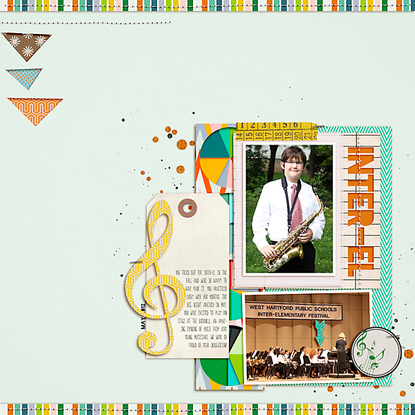
Inter El by Celeste Smith| Supplies: Pink Reptile Designs: One of a Kind; Allison Pennnigton: La Di Da; Emily Merrit Selfie Journal Cards; Laurie Ann: Little Charmed elements; Paislee Press: Downtime; Valorie Wibbens: Sprinkles v16; Peeps & Milo Pieces of Me Pie Chart template; Robyn Meierooto: In Stitches Neutrals, Clip It Up Masks, Tag You’re It; Polka Dot Ixels: Musical; Fonts; blackout, Canoe
Layer printed transparencies over photos.
Rosann Santos-Elliott says, “A flower fell off a hibiscus bush and my immediate reaction was to put it behind my ear. My friend grabbed my camera and told me to smile. I do a lot of selfies but very rarely does someone else photograph me. And she did a nice job.”
“I had transparent floral die cuts that fit perfectly with the motif, and I clustered them on the bottom corner. I was at a party so I was inspired to use the banner and balloons. I really do love summer and this mat was perfect. It’s my favorite season.”
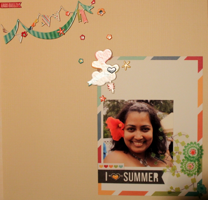
I Love Summer by Rosann Santos-Elliott | Supplies: Simple Stories: I {Heart} Memories: Chipboard Stickers,,Quote and Photo Mat Elements; My Mind’s Eye: Penny Lane Transparent Die Cut
Use a grid of cutouts for a rich dimensional foundation.
Amy Kingsford says, “This page is about my niece’s first tea party.”
“I used see-though elements in a couple of different ways to create interesting layers and add rich dimension to my digital page. The foundation of my page is made up of a handwritten script patterned mat with circles cut from it. Behind some of the circles I layered fun patterns and stamps and let the tulle layered beneath show through. The tuft of tulle with realistic shadowing adds softness. In the end, the see-through layers were a great way to include color, pattern and texture without sacrificing the delicate, girly feel I was going for.”
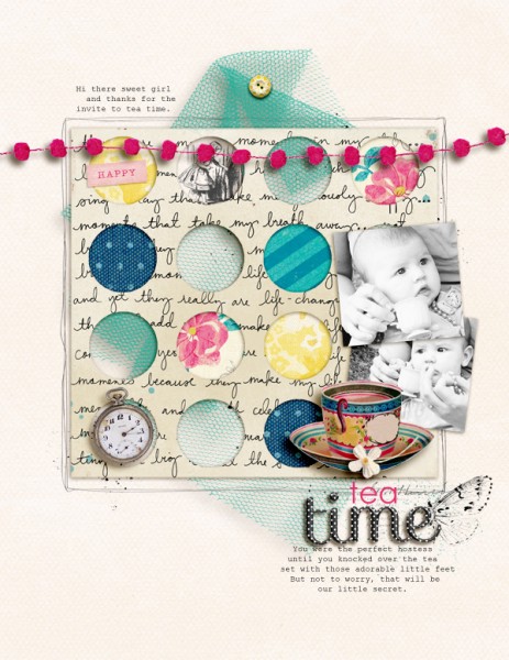
Tea Time by Amy Kingsford | Supplies: The Ardent Sparrow: Jane Vol. 2 and Alice in Wonderland; Crate Paper: Maggie Holmes Collection; Creashens: Hello Alpha and D’Inks; Karen Funk: Dare to Dream Solids.
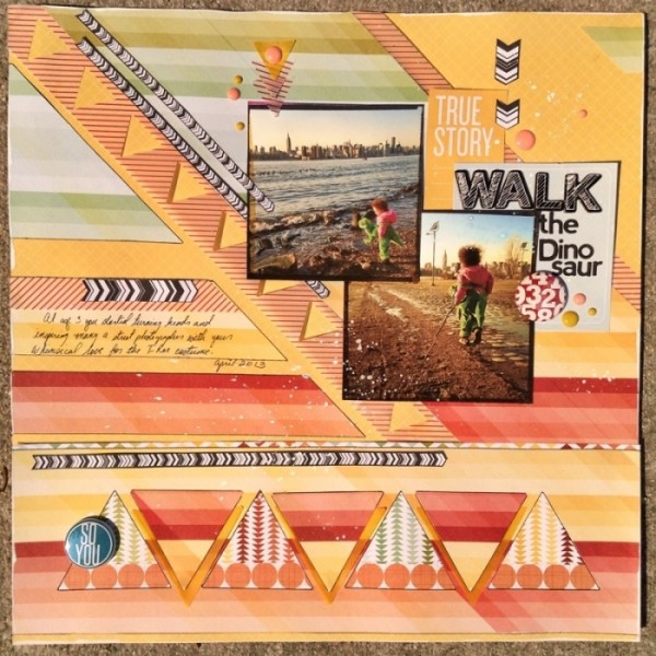
Punch a series of one shape from a paper strip.
Michelle Hernandez says, “Lola loves her T-Rex costume and wears it as often as weather allows. I think it makes for awesome photos encourage it.”
“I wanted to sunset colors and a geometric-inspired design for this page. I used a triangle punch to make two window strips and layered papers on top of the background to add depth. I also created triangles at the bottom and outlined them in black so they stood out a bit more.”
Lower layer opacities on digital pages
Terry Billman says, “This layout is about my son-in-law calling Craig and asking him for his blessing to marry our only daughter. When Craig asked him when they were going to get married, he said, ‘In about 30 minutes. We are on our way now.’ Christy and Jason had a private wedding on the beach in Destin.”
“I wanted the photos to be the focal point of this layout. Since their love for each other shines in the photos, the title “love” did not need to be prominent. I used acrylic letters with a slight drop shadow placed over the journaling, and a script word art over the photo. I lowered the opacity on the script word art to make it transparent. I lowered the opacity of the photo of their joined hands to make it transparent, and placed the word art over it to highlight their union.”
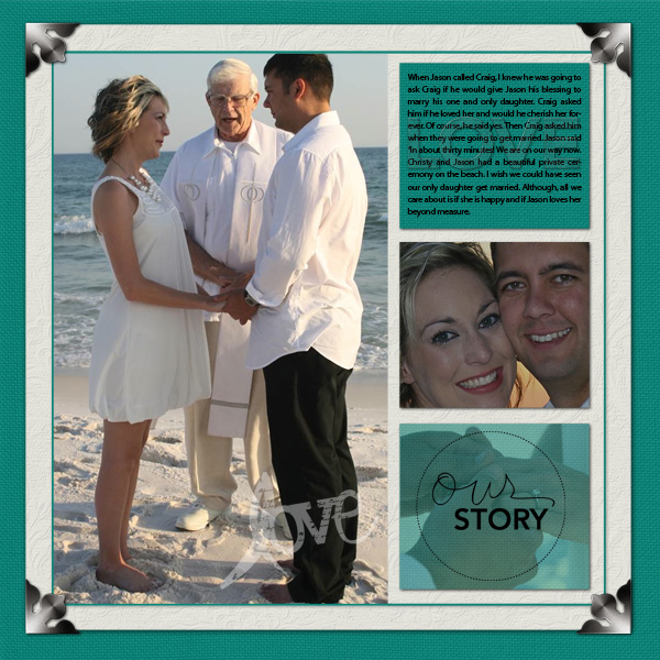
Love created by Terry Billman| Maplebrook Studios: Just Linens No. 31; Anna Aspnes: Art Play Palette Woodland; Ali Edwards: The Story Word Art, Christmas Words; Cathy Zielski: Lovefest 01; Patti Knox: Corner Its
Layer vellum over a busy print for a photo mat or foundation.
Debbie Hodge use a vellum block as the foundation for these photos of her husband headed out on a bike ride.
Debbie says, “I like how this striped vellum tones down the colorful and energetic background paper so that the photos stand out. I made this vellum simply by lowering the opacity of the layer with the white striped print and then adding ‘vellum’ shadowing. I use Tracie Stroud’s Rock the Shadows styleset. Other ‘openings’ that let the viewer see through to the layer beneath are the cut-out heart in the ‘hey’ label, the open circle in the ‘hello’ ring, and even the openings in the titlework letters layered over my photos.”
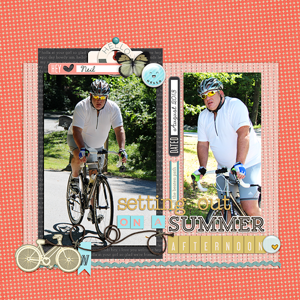
Setting Out by Debbie Hodge | Supplies: Sup?, Mellow Yellow, Peach Alphas by Karla Dudley; Coconut by Sara Gleason; This Week The Good Stuff Alpha, Happiness Lies Within by Mye de Leon; Sketchbook by Amy Tan; Trailblazer by One Little Bird; Feedsack by Splendid Fiins; Basic Paper Alpha Yellow 2 by Katie Pertiet; Rock the Shadows Shadow Styles by Tracie Stroud; Sullivan, Amelie fonts

