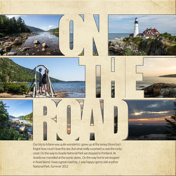
With the rise in popularity of digital cutting machines the word “weld” has come to have a new meaning for papercrafters.
Welding has come to refer to when elements are connected so that they can be cut as one piece even though there are openings. The resulting “cut” usually has thin borders around proportionally bigger openings. It appears flimsy and yet it all holds together. These cuts are great for layering because the elements beneath show through and they can be backed up with elements that can add texture, pattern and color.
Our team and Masterful Scrapbook Design teachers have ideas and examples for you to “weld” in digital or paper formats.
welding at its simplest
Step one in getting a welded look is to make sure everything is of one piece even thought there are multiple elements. To that end, when you overlap your alphas in a word or a series of images (like cutout paperdolls in a row) you are welding them.
[twocol_one]Brenda Becknell says, “My four year old granddaughter is going through a “no pictures” phase, but she posed for one photo at a family cookout, so I knew I wanted to scrap it. I used my Cricut and Design Studio to cut out the Polaroid-style frame and to weld the three hearts together.”
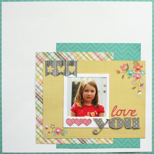
Love You by Breda Becknell | Supplies: Cardstock: Bazzill and Neenah; Patterned Paper and banner stickers: Simple Stories “Vintage Bliss”; Cricut cartridges: George & Basic Shapes, Cursive 101, and Cindy Loo
[/twocol_one] [twocol_one_last]Terry Billman says, “Bailey, our newest miniature dachsund, is adorable when sleeping. I used two fonts for the title, Adorable and Palatino, and “welded” the letters and the two words. Sweet in cursive already had all letters touching but for “dreams,” I set the font to size 120 and the horizontal leading to -125. After clipping different patterned papers to each word, I merged the two word layers together.”
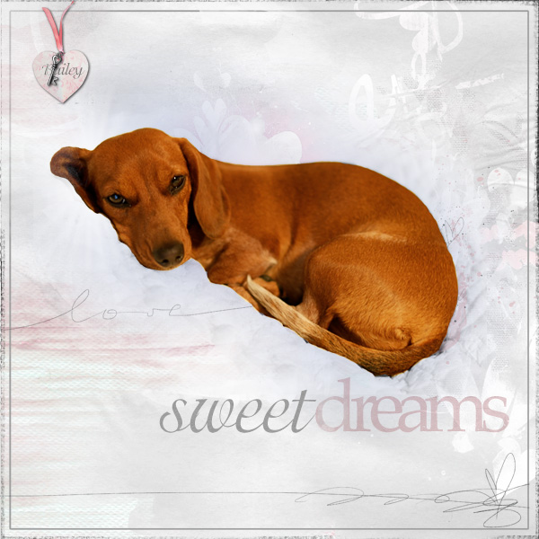
Sweet Dreams created by Terry Billman | Supplies: Anna Aspnes: Art Play Palette Infatuated, Art Play Palette Genuine, Love Glows 1, Cool Glows 1, Foto Glows 4, Art Play Solids Friends, 12 X 12 Artist Edge
[/twocol_one_last]
welded titlework
titlework: words + circle frame + line
Summer Fullerton says, ““Instagram” is one of my current favorite layouts. I raided my daughter’s Instagram account and took a bunch of her self-portraits to create this project. I love seeing how she sees herself thru her camera lens. I wanted this layout to be playful and fun just like the photos I was featuring.”
Summer’s welded title was made with a digital die-cut from Technique Tuesday and her Silhouette cutting machine. Cutting it from a yellow chevron print and bleeding it off the page adds great energy.
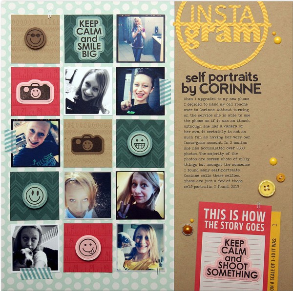
Instagram by Summer Fullerton | Supplies: Cardstock Bazzill, Patterned Paper Pebbles, Alphas Jillibean Soup, Buttons Fancy Pants, Washi tape Bella Blvd, Enamel Dots My Minds Eye, Decorative brad Making Memories, Die Cut Pebbles, Tim Holtz Tiny Attacher, Silhouette Cutting System and Image, Digital Die Cuts Technique Tuesday, Clear Stamps Technique Tuesday, Ink Black VersaFine/VersMagic, misc twine and font Veteran Typewriter downloaded from the internet
partial title or wordart: word + ellipse
Debbie Hodge says, “These are simply pretty pictures from one of our days vacationing in the Northwest.” I’m always looking for ways to get contrast into my titlework, and, lately, I like welding a scripty word into a frame.” “The is a digital page and my process was as follows:”
- Add each letter of the word “welcome” to its own layer in Photoshop with Corinthia Pro script font
- Arrange the letters so that they overlap but add subtle tilts or moves off the baseline for a more handwritten look. Merge all layers with letters and then rasterize (or simplify the layer) and warp it a touch.
- Draw an ellipse, then rasterize (simplify) and select a smaller area within the ellipse and delete/cut it away for an open frame. Overlap word and circle. In this case I erased parts of the letters that went outside the ellipse but you can get a great look by leaving them in, too.
- Merge the circle and and word layers, clip patterned paper, and then add a drop shadow. Put the drop shadow on its own layer and warp the circle + word just a bit.

Welcome to Lummi Island by Debbie Hodge | Supplies: Easy Living Papers by Mye de Leon; Torquay Elements by Kaye Winiecki; Flags and Stars, Playful Embellishments by Jenni Bowlin; Anchored Papers by Gennifer Bursett; Bits and Baubles by Rebecca Wagler; Eclectic Easter Alpha by Just Jaimee; Aztec Summer Elements by Sahlin Studio; Gel Dots by Valerie Brown; Corinthia Pro, Bebas Neue, Bohemian Typewriter fonts
titlework: heart + font + arrow
Ashley Horton says, “I’ve wanted to get these photos of me with my grandparents, on a trip to the mountains, on a layout for years and thought they would be perfect with the Travel Girl collection from October Afternoon. I used a welding technique to create the title for my page, by using a mix of words and shapes. Since the patterns and masking were on the busy side, I chose a solid Red cardstock, to cut my title from and to help it stand out from the background. The great thing about this technique, is that it gives you the opportunity to create your own individual title or shapes for your layouts. I wanted to make my title stand out, by using more than just words, so I incorporated a GeoTag shape with a heart center and an arrow. This helps to reinforce the travel theme on my layout.
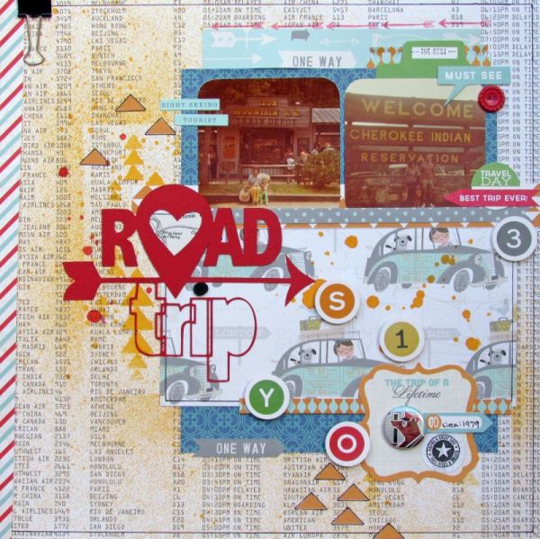
Road Trip by Ashley Horton | Supplies: Patterned Paper, Button, Tin Pin, Stickers, TIdbits: October Afternoon; Mask: The Paper Bakery; Spray Mist: Studio Calico; Punches: EK Success & Marvy; Die Cut Machine: Silhouette Cameo; Stamps: Dear Lizzy & Heidi Swapp; Font: Abadi MT Condensed Extra Bold
titlework: fussy-cut welding of hand lettering and concentric circle outlines
Michelle Houghton says, “This layout shows my daughters under VERY close supervision learning how to shoot with Dad and Grandpa. I created the title by hand. I drew out my design idea of a target with the letters overlapping the rings, then I inked over the entire design and fussy cut my image out. I backed the rings with colored cardstock and finished by punching a ‘direct hit’ at dead center.”
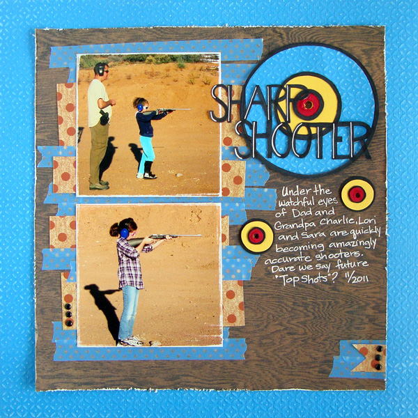
Sharp Shooter by Michelle Houghton | Supplies: cardstock; Bazzill, patterned paper; Basic Grey and American Crafts, washi tape; Queen and CO., ink; Sharpie and Signo, brads; unknown
welded frames
frame: clouds + airplane add scene and words add titlework
Kiki Kougioumtzi says, “This page is talking about how, no matter the vehicle or the destination, we are a family who enjoys traveling.
“I made the frame in the Silhouette Studio program and used the Cameo to cut it. I had a Silhouette cut file design that I used as a frame (which already had the clouds). Another design was the little aeroplane with the banner. I typed the words from my title (journey and destination), using a script font and making the letter spacing really tight so that every letter is overlaping somewhere with each other. Then I arranged everything the way I wanted and made sure that every design intersected somewhere with each other.Then I used the weld option of the program.”
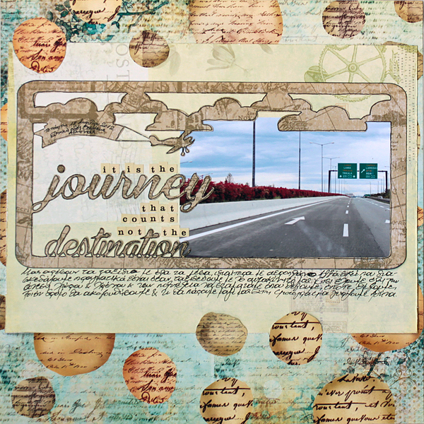
Journey by Kiki Kougioumtzi|Supplies:Patterned paper:K & Company,Prima;Alphas:Cosmo Cricket;Other:Silhouette Cameo.
frames: rounded corner frames with attached images & words backed up with strips
Lisa Dickinson
says, “One of the few times we get a family photo together is during our beach vacations to Mexico. I wanted to highlight this year’s photo on a definitively beachy, sunny page.”
She cut two 3″ x 4″ frames with welded images and words (the large heart at bottom left and the word blessings with a heart at top right) using a Silhouette die cut machine and her own design made in Adobe Illustrator. Both of these are backed up with strips of washi tape and patterned paper. Notice how just the heart is backed up on one of them while the complete frame is backed up on the other.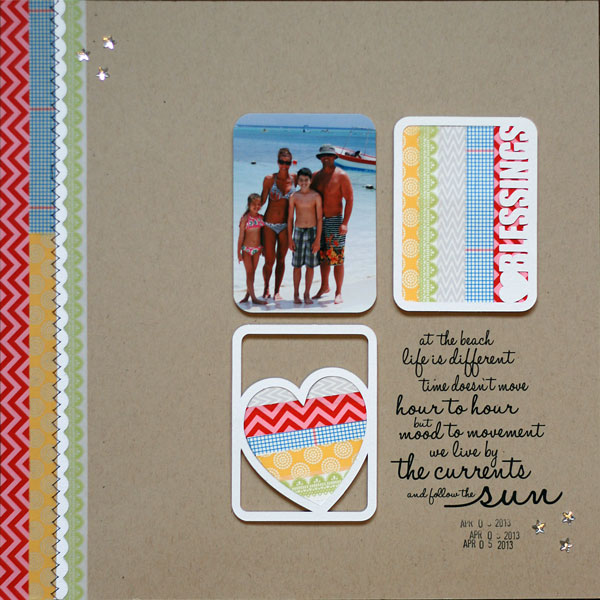
weld embellishments & foundational pieces
photomat: alphas + heart + square corner frame
Alexis Aragona says, “I created the wordart/clipping mask by playing around with a cutout heart element and an alpha. I positioned them to spell out love, substituting a heart for an “o” then added a frameusing Photoshop’s custom shape tool. I then merged all those layers and used the resulting single layer as a clipping mask. Since the rest of the layout is fun and colorful, this goofy photo of me and my sister works really well with it.”
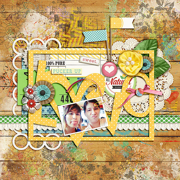
Love by Alexis Aragona | Supplies: One Little Bird Designs and Sahlin Studio: Fresh; Studio Basic Designs: Basic Addiction: Brushes1 and 2; Katie Pertiet: Painted Accents No 1 and 3
embellishment clusters: doodled star outlines
Celeste Smith says, “My father attended my youngest son’s special person’s day at school. This was a big deal as he lives in Florida and we don’t see him much.”
She’s got both a welded title and clusters of welded stars for layering and embellishment. She says, “In Photoshop, I selected a serif font and sans serif font. Then I typed the two words as separate layers. I adjusted the kerning so the letters were touching. I sized the words to the same width and stacked them on top of one another to create my welded title.”
“The star clusters were made with free clip art of a hand drawn star. I resized, skewed, flipped, rotated and duplicated the stars. Then I layered them so they were touching each other in a cluster to weld them. I merged all the layers, then duplicated the cluster to use on the top left and bottom right of my page – giving my page some diagonal flow. I clipped papers to these layers and added a shadow to give a digital cutter look to the elements.”
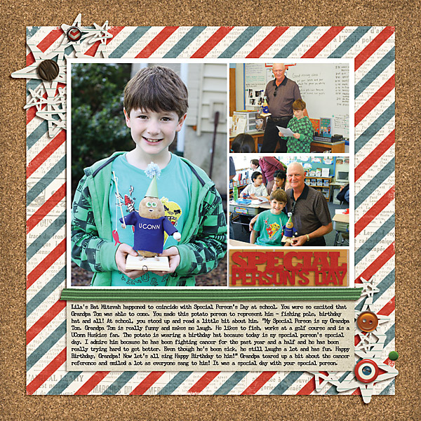
Special Person’s by Celeste Smith | Supplies: Jenn Barrette: Book Smarts kit, Puddlejumper kit; Allison Pennington: Pops Brads.
titlework and page frame: font + full page cardstock
Andrea says, “I started with an image from Paula Gilarde’s Inspiration Series. When I saw that title I knew I wanted to use it on a page from our vacation. At first I struggled with the welding and how to make it appear seamless. Then it occurred to me to merge the text layers together. That way I could clip paper to the welded title. I used a bevel and emboss style on the merged text to create dimension.”
foundation: touching stars with open centers and a square frame
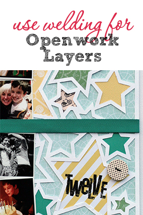
On Lisa Dickinson‘s birthday page she has layered several patterned papers behind a die cut of star shapes welded to one another and to the surrounding squard frame.
She says, “I did this to add both color (many of which also appear in my photos) and pattern. In the largest star, I’ve applied a rub-on title in black. Then I placed the die cut with filled stars on another piece of patterned paper – a subtle blue – to give the die cut a base and add a subtle contrast when placed against my white background.”
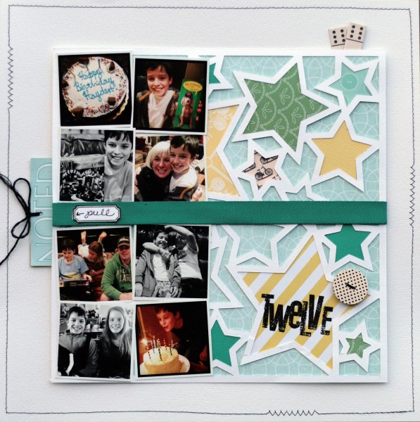
Twelve by Lisa Dickinson | Supplies: cardstock (Bazzill Basics); patterned paper, tags, rub-ons, chipboard, digital die cut file (Jenni Bowlin Studio); twill (May Arts); die cut machine (Silhouette); pen (American Crafts); machine stitching; twine
[current]

