by Debbie Hodge | Apr 17, 2013 | Design Your Story, Feature, Journaling, Titles
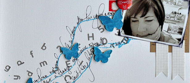
by Debbie Hodge At Get It Scrapped, we frequently share ideas for what we call the 5 different parts of a scrapbook page: photos, title, journaling, embellishments, and canvas. Any time the content of one or more of those elements are closely linked your page has more...

by Debbie Hodge | Mar 13, 2013 | Composition, Design Your Story, Feature, Journaling
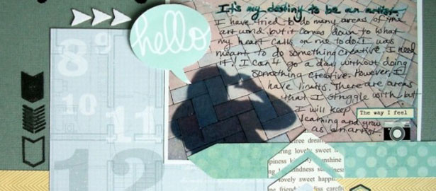
by Debbie Hodge The space your journaling fills has a shape it and it a particular amount of visual weight. A block with tight line spacing will be dense and, thus, heavier than a few staggered lines. Pay attention to the shape and weight of your journaling and use it...

by Debbie Hodge | Dec 11, 2012 | Design Your Story, Feature, Journaling, Photos
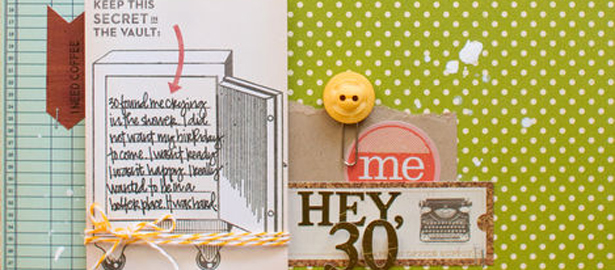
A big part of scrapbook page layout is allocating space on the canvas, finding a place for journaling and photos and titlework. White space within your photo offers a good home for your journaling. When Jennifer Matott was walking near a marina in her hometown, she...

by Debbie Hodge | May 14, 2012 | Design Your Story, Journaling
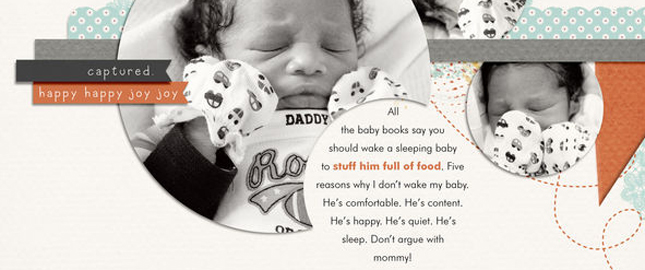
by Debbie Hodge While journaling is an important part of many scrapbook pages, there are times when minimal journaling works just fine. Here’s a look at 6 of those instances in which titles, design, lists, and photos do the work typically expected of scrapbook...

by Debbie Hodge | Mar 7, 2012 | Design Principles, Design Your Story, Journaling
by Debbie Hodge Alignment refers to how text is arranged into blocks or columns with hard or soft edges. There are four basic approaches to alignment: 1) Left, 2) Right, 3) Centered, 4) Justified. Check them out below — as well as a fifth option. Flush Left...

by Debbie Hodge | Feb 20, 2012 | Design Elements, Design Principles, Design Your Story, Journaling
by Debbie Hodge Texture is tactile. When you add texture and dimension to your scrapbook page, you engage the viewer’s sense of touch — another sense in addition to sight. As a result you draw your viewer in on another level. It’s an obvious design...
