
 by Debbie Hodge
At Get It Scrapped, we frequently share ideas for what we call the 5 different parts of a scrapbook page: photos, title, journaling, embellishments, and canvas. Any time the content of one or more of those elements are closely linked your page has more unity, your story has more power, and you charm the viewer.
Today we’re showing you pages in which the journaling and title are rendered so that both content and design merge.
run your journaling into the title — and out the other side
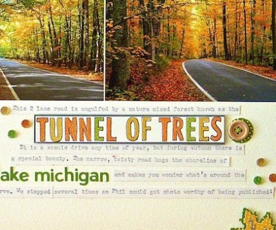
Sue Althouse says, “‘Tunnel of Trees’ is about a part of our trip to northern Michigan last fall.”
“I made the title by stamping and heat embossing, then outlining the letters with a Sharpie pen. I matted the title on colored card stock and used raised adhesive to assure it stands out from the rest of the words. I used small letter stickers for noting key locations on our drive and filled in the rest of the journaling with my typewriter. I placed some of the journaling above the photos and some below to create a flow that takes the eye right through the pictures.”

Tunnel of Trees by Sue Althouse | Supplies: Cardstock: Bazzill; Patterned Paper, Letter Stickers: Jillibean Soup; Border Punches: Fiskars; Stamps: Studio Calico; Ink: Versamark; Buttons, Embossing Powder: American Crafts; Twinkle Goosebumps: Queen & Co.; Floss: We R Memory Keepers; Black Marker: Sharpie; Leaf Punch, Circle Punch: EK Success
Ashley Horton says, “In the south, Spring usually comes a little early, and this year I found tulips blooming in February. I merged title and journaling on this page, by starting my journaling and using part of the text as my title. To make the title stand out from the rest of the hand-written journaling, I used Thickers, which were in a larger font and different color.”

Find Spring by Ashley Horton | Supplies Used: Cardstock: Bazzill; Patterned Paper: Dear Lizzy; Thickers & Date Stamp: American Crafts; Wood Veneers & Spray Mist: Studio Calico; Doily: Hobby Lobby; Flair Button: The Paper Bakery; Vellum: Fymark; Washi Tape: Freckled Fawn & Recollections; Other: Staples, Paper Clip, & Shipping Tag
Stefanie Semple says, “Hubby and I are celebrating our 25th wedding anniversary soon, and I’m feeling contemplative about our courtship and years together. Happily ever after isn’t newlyweds riding off into the sunset, it’s choosing every day to stay together to nurture children together, to go to work and provide for the family.”
“I wanted to include the phrases ‘Once upon a time’ and ‘Happily ever after,’ and this kit included both as word art strips. I placed the word arts strips within the context of our story. Their placement and high visual contrast add tension and inject tongue-in-cheek humor.”

Once upon a time by Stefanie Semple | Supplies: Memory Clips by Ramona (kit) : Ever After; Little Bit Shoppe Designs (template) : Christmas Gift.
Michelle Houghton says, “I had these amazing photos of my daughter driving the 4 wheeler on Grandpa’s lap and wanted to do something fun with them.”
“As I thought about my journaling, I pulled out the key phrase ‘into the sunset’ to be my title. I wanted all of the lettering to have weight so I did the simple journaling in small sticker letters and then used larger chipboard letters when I came to the title.”

Into the Sunset by Michelle Houghton | Supplies: cardstock; Bazzill Swiss Dots, patterned paper and canvas elements; SEI, metal brads and flowers Tim Holtz, sticker letters; Cosmo Cricket, chipboard letters; American Crafts, ink; Copic, ribbon; unknown
Barb Brookbank says, “After watching the videos in the ‘Tension, Story, Focus and Flow’ class, I am working on telling my stories to make more meaningful layouts. Thank you, Debbie! This story is about how I decided to let my grandson wear whatever he wanted – whether or not I thought it made for a good photo. As it turned out – the photos could not have been better! I’ve giggled over them countless times. I extracted the hat to emphasize how big it was.”

Go With It by Barb Brookbank | Supplies: Kit: Dandelion Days, an Oscraps Collaboration; Fonts: DJB My Mood Ring Says Blah by Darcy Baldwin, and Punch Label
two-part title from the journaling
Lisa Dickinson integrated title, journaling, and her design on “Father Daughter Love” emphasizing the words in her journaling that make her title –even though they’re not exactly together in the journaling. The shape of her text/journaling block feels like an extension of her photo and foundation, with string and flowers spilling into it and uniting all of the elements.

Father Daughter Love by Lisa Dickinson | from MSD Typography 03/12 | Supplies: cardstock (Bazzill Basics) + patterned paper (Lily Bee Design) + stamps (Studio Calico) + flowers (Petaloo) + ink (Jenni Bowlin Studio, Stampin’Up) + twine (The Twinery) + date stamp (Office Max) + font (Typenoksidi) + misc. buttons
Doris Sander says, “Merging the title and journaling can be a fun trick to incorporate into the design process. The title will encourage the journaling process. The trick for me is to remain flexible about the wording so the title fits nicely into the designated space.”

Ice Cream Smiles by Doris Sander | Supplies: patterned paper – October Afternoon, Dear Lizzy, washi tape – Bella Blvd., chipboard shapes – Dear Lizzy, word stickers – Bazzill, plastic letters – Heidi Swapp, other – sequins
Terry Billman says, “Every parent dreads that phone call, ‘Mom, my car is totaled.’ The story of this layout is about me receiving that dreaded phone call and just being thankful everyone survived.”
“I have to admit, I am title challenged. I have the hardest time coming up with a cute, catchy title. When I am really stumped for a title, I select key words in my journaling become the title. I used a different font , different color, and added a dramatic drop shadow for the title words. In addition, I like to highlight a few key words in the journaling. Using a different size font and a different color add interest and dimension to the journaling, especially if the journaling is lengthy.”

Thankful They Survived created by Terry Billman| Cathy Zielski: DYL Layered Template 12; Katie Pertiet: Classic Cardstock Hoops; Ali Edwards: Painted Thanksgiving Words
layered song lyrics
Vicki Walters says, “The journaling is part lyrics, part my word play on the lyrics of the song ‘Time In A Bottle.’ The page is representative of that time that I would want to save in that bottle. I layered the title and used different fonts with varied opacities to make it stand out but not totally draw away from the journaling. The “bottle” on the page is a line drawing of a jar with the photo of the lighthouse placed behind it, trimmed to fit, and using an clear overlay layer with a little bit of outside embossing to give it a hint of a glass look with a little depth.”

Time in a Bottle by Vicki Walters | Supplies: Anna Aspnes: 12 x12 Zig Zagged Stitched Frames White, ArtsyClocks no 1, Find My Way FotoFrames no 2, GoldPaint no 1, Multicolor, MagicFlares no 1 Overlays, Scripttease Summer Frames no 1, Vintage FotoCorners,and ArtPlay Palette Crazy Life; JopkeDesigns @ Pixel Press-Six Pack and Vision; Font: Mandevilla, Alex Brush, Jonze, Jonzi and Palantino Linotype
Deborah Wagner says, “Seven years after her adoption, my daughter is still unsure of our love, but my husband never tires of telling her she has found her forever home. I used the chorus of the song, Home, as my title, and placed it on a separate layer on top of the lyrics. This page design is inspired by Jana Morton’s beautiful layout, ‘First Love.'”

Home by Deborah Wagner. Supplies: Katie Pertiet – Letterbox Simplicity No. 1, Littlest Farmer Kit, Clean Stitched White No. 3, Elfin Magic Kit, Grassy Edgers, Luscious Paper Pack, Powder Mountain Kit, Wood Shop Papers, Chandra Kit; Pattie Knox – Victory Garden Kit; Lynn Grieveson – Worn Page Edges No. 5
let your title be your journaling
Rosann Santos-Elliott says, “This layout captures the silliness of my son and the popularity and trendiness of fake mustaches.”
“Because the title and journaling are one in the same, I wanted to bring attention to the words by changing up the alphas I used and bringing in a tag that already had word art on it. I also tried to do something a little differently by inserting an actual mustache die cut into the journaling instead of the word. I used pop dots under the die cut to make it more obvious.”

Behind Every Moustache… by Rosann Santos-Elliott | Supplies: Teal Dot/Notebook: Simple Stories; FabUlous Pink; Flower/Ledger: Simple Stories; Good Day Sunshine Boys; Accessory Kit: My Mind’s Eye; Circa 1965 Digital paper and embellishment: Cosmo Cricket
[current]
