
 by Debbie Hodge
The space your journaling fills has a shape it and it a particular amount of visual weight. A block with tight line spacing will be dense and, thus, heavier than a few staggered lines. Pay attention to the shape and weight of your journaling and use it as an integral part of your design.
Our team and teachers have ideas for you from making sure your blocky journaling is spot-on, to framing, working in circles and even extending the journaling out from your photos to make it a dynamic element on the page.
1. In blocks, attend to spacing, typeface, and alignments.
Most of your journaling will probably be in square or rectangular blocks. Choose typefaces and alignments that give your page unity and flow.
Celeste Smith‘s journaling is a part of the “shelf” her elements sit upon.
four-line block of journaling is left aligned and long. Its shape echoes that of the strip above and it becomes a part of the “shelf” foundation of her page.

You Make Me Smile by Celeste Smith | Supplies: Little Things paper & elements by Valorie Wibbens, Have Fun elements by The Hidden Heart, Findings by Traci Martin, Flanners by and Random Stitches by Chere Kaye, Soho collaboration kit by One Story Down Designers, Soho Bits & Bobs by the Ardent Sparrow. All from One Story Down.
Tara took an editorial approach
Tara McKernin says, “This layout is about Ian becoming a big brother. The journaling is from my journal back in 2009, and, to focus on it, I used an editorial format with a clean, san-serif font. The layout is long, 6″ x 12″, with no embellishments and a single supporting image. I even softened the image focus to emphasize the journaling.”

Becoming Big Brother | Tara McKernin | Supplies: Template Ali Edwards; Font BEBAS and Avenir Book.
Debbie Hodge used her block as a part of a larger vertical band.
Debbie says, “On this page about my nephew setting up a self-timed camera shoot with his tape recorder, I started with a blocked background, and layered a narrow vertical band over it on the right. That band is defined by shapes and alignments: the titlework the bird card, the photo and . . . the journaling! Keeping the journaling to the same with as all those other elements means it not only has its own rectangular shape, it is also a part of a larger rectangle.

Self-timer by Debbie Hodge | Supplies: Teak by Sara Gleason; Make it Mean by Vinnie Pearce; Snippets Alpha by Gennifer Bursett; A New Day by Mye de Leon; Embroider Me by Pink Reptile Design; Artistry de Blanco by Katie Pertiet
Deborah Wagner used columns of centered journaling for a formal and clean look.
Deborah used two columns of journaling to keep the lines clean on this page recording her daughter’s faith statement. Each of the columns use center-aligned text, not always a first choice for setting type because of its formality. For this subject, though it’s fitting, and the focus of the page is on Deborah’s daughter’s lovely words.

Faith Statement by Deborah Wagner. Supplies: Designer Digitals – Pattie Knox: Speed Byte Layered Template No. 153, Very Merry No. 3; Katie Pertiet: Glory to Be Brushes, Blitzen Solids, Sweet St. Nicholas Kit, Crowning Affair Vibrant, All Done Up Frames No. 4, Artistry de Azul Kit
Debbie Hodge’s journaling curved around other page elements.
Debbie’s journaling on “Summer Music” sits on a rectangular 3″ x 4″ journaling card. The journaling is right aligned and the top and right side follow the shape of the card – nice and straight. Along the left edge, though, she made each line shorter and shorter in order to follow the curve of the doily printed on the card. The journaling is short and it’s a small touch, but one that gives the page unity and balance.

Summer Music by Debbie Hodge | Supplies: Artplay Palette Concerto (paper, brad, sax), Artplay Chevron (paper), Word Label (banner) Templates by Anna Aspnes; Snippy Alpha by Gennifer Bursett; Hello Summer (wordart) by Ali Edwards; Life 365 (cardstock) by Karla Dudley; Chin Up (frame) by Allison Pennington; Bohemian Typewriter font
Audrey Tan let her journaling’s ragged left edge merge with her imagery.
Audrey split her page vertically, filling the left with images and the right with her journaling. The journaling is right justified and has a ragged left edge that merges with the art-journaling-styled images she used.
Audrey says, “This page is about my life in perspective. As I couldn’t find a suitable photo for my subject, I used art journaling images. I made sure to use font and font-size that easy to read, as it is the focus of the page.”

A New Perspective by Audrey Tan | Supplies: Captivated Visions: I Became Somebody Else, Mish Mash, I Believe In Second Chances; Rebecca Mcmeen: Pipit; Font: Pea Amy
2. Use your journaling to frame other elements
Amanda Jones framed her composition with journaling. She says, “When my son was younger, he couldn’t resist pulling cheesy faces after losing his teeth – now he only loses the back ones which is no fun at all! I framed the cluster of elements with my handwritten journaling to add definition and accentuate the slightly off-balance design.”

No Fun by Amanda Jones | Supplies: Papers: Striped paper from Portrait by Crate Paper; Dotted paper from Paper Reverie by Making Memories. Mr Huey Mists by Studio Calico; Cardstock by Bazzill Basics Paper; Filter paper embellishment by Fancy Pants; Chipboard alphabet stickers by Basic Grey. Electronic die-cutting machine: Cameo by Silhouette.
Tami Taylor says, “When I came across this photo of my dad I started thinking of all the things my dad is. I am at a point in my life where I really admire my dad and now understand his struggles My journaling was a very important part of this page. Yet I really wanted to play with design and have some artistic fun. I think sometimes it’s hard to balance art with a lot of journaling. I completely ‘stole’ the idea to frame my page with journaling. I was scrolling through the MSD Member Gallery and was inspired by a page by our member Karen Poirer-Brode. She uses this text border technique to document the year and place of her layout. I realized that much real estate would easily allow all the journaling I had.”

My Dad. by Tami Taylor | Supplies: Papers and Paper Embellishments – American Crafts Amy Tangerine. Spray Inks – Dylusions. Alphas – American Crafts, My Little Shoebox. Unknowns – cardstock, button, brads, mini tag.
3. Do away with the corners and used rounded journaling blocks
Ashley Horton‘s handwritten journaling fills an oval shape that sits in the center of a Silhouette Cameo die-cut with lots of arrows converging on the center. With all lines pointing to it, the journaling takes on added importance. Ashley says, “I hand wrote the journaling for a personal touch.”

Note to Self by Ashley Horton | Supplies: Patterned Paper: Crate Paper; Wood Veneers & Spray Mist: Studio Calico; Flair Buttons: A Flair for Buttons & Bluebirdchic.com; Fonts: Abadi MT Condensed Extra Bold & Bickley Script; Brads: October Afternoon; Punches: EK Success & Marvy; Baker’s Twine: The Twinery; Silhouette File: Kinsey Wilson; Other: Stick Pins
Amy Kingsford says, “On this page about my unhealthy caffeine addiction I’ve used a half circle (with the help of a digital text path) to journal in the negative space created by the stamped ‘coffee stain’ on the canvas.” The result is that Amy has tied her design to her story in a way that is both meaningful and aesthetically pleasing.

Low Fuel by Amy Kingsford | Supplies: Robynn Meierotto: Caffiene Elements and Papers, Basic Stitches-Neutral; Creashens: Bare + Necessities Papers; Gennifer Bursett: Snippy Alphas; Ardent Sparrow: Madelyn Elements (paint), Scarlett Elements (button); Simply Tiffany: Stuffy Template No. 3.
Lynette Penacho used an unexpected approach for list journaling, shaping it to a half circle that balances her band of photos.

29 Faves at 29 by Lynnette Penacho | Supplies: Apple of My Eye by Jenn Barrette & Micheline Martin; Messy Scallops Clipping Masks by Misty Cato; Oodles of Tags by Julie Billingsley; Delightful alpha by Zoe Pearn; U See Through Me alpha by Penny Springmann; Mini alpha from One for the Boys by Zoe Pearn; Teeny Type alpha by Zoe Pearn (retired); Stitching all by Anna Apnes; Fonts are American Typewriter and 4 Lynnette by Darcy Baldwin


How to make circle journal spots for your scrapbook and journal pages
How to handwrite in shapes on your scrapbook and journal pages
4. Try some non-justified and visually meandering journaling
Amber Ries does away with justification on her journaling for “Gobble Gobble,” creating a more organically shaped journaling cluster, even emphasizing some words with different typefaces, font sizes and colors.

Gobble Gobble by Amber Ries | Supplies: TLP: STUFFED! A collab by Karah, Jacque & Gina, TTTM Collab; CD Muckosky: Wax Werx Harvest, Valerie Wibbens: Cozy; Fruitloop Sally: Retro Harvest; Anna Aspnes: Artplay Palette Thankful Heart & Artplay Palette Thanksgiving
Debbie Hodge let her journaling on “You Relate” flow down and across the page, doing away with any justification but slowly working the cluster down and to the right, moving the eye from the photo down to the title and cluster at page bottom.

You Relate by Debbie Hodge | Supplies: Is it Friday yet? by Paislee Press; Staple Its by Pattie Knox; Rhinestone Buttons and Bows by Jenni Bowlin Digital; She’s a Doll by Vinnie Pearce; Bookworm by Little Butterfly Wings; Vellum Ellies by Snips and Snails; Mini Doilies by Sugary Fancy; Head in the Clouds by Valerine Wibbons; Worn, Westover, Shadow Like Me by One Little Bird; Key to My Heart, A Spring Day, Ephemera Stacks, Worn by Sahlin Studio; I Was Here by Design by Tina; Stringbats by Kim Jenson; Artplay Palette Sunflower by Anna Aspnes; Basic Paper Alpha Yellow by Katie Pertiet; A Very Small Alpha by Allison Pennington; Cut.It.Out by Robyn Meierotto
5. Make your journaling a dynamic extension of your photos
Michelle Houghton‘s “Seaside” is the last in a series of pages from one vacation and it summarizes the trip. Michelle extended the lines from her photo onto the canvas, using inked strips of paper in a color similar to the road her vacationers are walking away on. The pieced effect is like cobblestones, and her journaling is an extension of the road and, metaphorically, of the journey.
Michelle says, “I wanted to show how we packed a week of fun in and the photo was perfect to show all of these fun activities behind us that we accomplished as we ‘walked’ through our week.”
Seaside, OR by Michelle Houghton | Supplies: cardstock and chipboard letters; American Crafts, patterned paper and pinwheels; Echo Park, jewels; Micheal Richards, ink; Sharpie and Tsukineko
Marie-Pierre Capistran‘s page is meant to be a “lift up” for her daughters, a page with many bits of advice she’d like them to have as they move forward and through their lives. Her journaling is a dynamic part of the design, the tiny letters stamped in cloud-like shapes and placed in sky scene along with cloud embellishments. Stitched sun rays emphasize their importance radiating out and pointing to the pieces of advice.
Marie-Pierre says, “When I was thinking about designing my page, I saw a sun created by a photo and stitched sun rays so the clouds came naturally to mind. I kept the bits of advice grouped together in the top third of the page with rays leading the eye toward them, one at a time. I wanted the viewer to be brought to each piece of advice, one by one, so that they had time to thing about them — as opposed to seeing them all at once as they would have if they’d been formatted in a list.”

Let the sun shine by Marie-Pierre Capistran | Supplies: Pattern paper: Basic Grey, Bella Blvd; Mist: Tattered Angels; Chipboards elements: Maya Road, Crate Paper, Bella Blvd; Letters: American Crafts Thickers, Queens and Co.; Rub-on: Prima Marketing; Stamps: Inkadinkadoo, Artemio, date stamp; Rhinestones: Doodlebug; Others: ribbon, slice cutting machine; sewing machine, embossing powder.
Dina Wakley says, “I really love it when the journaling on my page becomes a visual design element. I always make sure my journaling is authentic. I write what is in my heart. But the angels really sing when the journaling itself becomes an integral part of the page’s design and not just an afterthought.”
“For ‘Want,’ I knew I wanted to use the canvas butterflies. I drew right onto the page with the tip of an inkpad reinker bottle. Then I wrote my journaling on the lines I drew. Next I scattered the butterflies along the lines. The lines give the butterflies movement and energy, and the journaling and the lines combine to become an important design element that leads the eye up to the photograph.”

Want by Dina Wakley | Supplies: Cardstock: Bazzill; Ink reinker: Jenni Bowlin Studios; Cardstock: Bazzill; Canvas Butterflies: Studio Calico; Flair: A Flair for Buttons; Tag: Jenni Bowlin Studios; Paper: Jenni Bowlin Studios
On “UnFairyTale,” Debbie Hodge added the journaling in long lines that she rotated and placed to mimic sun rays or even rice thrown at a wedding.

UnFairy-Tale by Debbie Hodge | Fairytale by One Little Bird and Paislee
Press; Wood Bits by Julianna Kneipp; Jeweled Butterflies by Jenni Bowlin
Digi; Little Bits Alpha Chocolate, Flossy Stitches Yellow by Katie Pertiet; I
Was Here by Designs by Tina; Is it Friday by Paislee Press; Retro Spring by
Reverie Atelier; Thankful Heart by Anna Aspnes; Century Gothic font
Sue Althouse‘s journaling is imagined and fun conversation, coming right out of the photos on speech bubbles. Sue says, “This page is about the free Sunday evening summer concerts on Holden Beach, where we vacation. The journaling is rendered in speech bubbles, allowing the people in the photos to tell the story. Their placement guides your eye through the band of three photos and forms a visual triangle. The common elements of color and the butterfly shape tie the photos to the title and bring unity to the layout.”
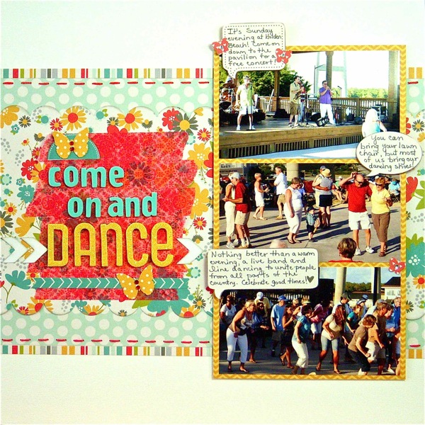
Come on and Dance by Sue Althouse | Supplies: Cardstock: Bazzill; Patterned Paper, Stickers: Pebbles; Border Punch: EK Success; Alphabets: American Crafts; Ink: Jenni Bowlin; Floss: We Are Memory Keepers; Washi Tape: My Mind’s Eye; Jewels: TPC Studio; White Arrows: Silhouette ; Butterfly Punches: Martha Stewart, Tonic Studios
There you have it. Ideas and examples of your the shape and weight of your journaling can be an important part of your scrapbook page design.[current]
