by Amy Kingsford | Jul 11, 2017 | Composition, Feature, Travel
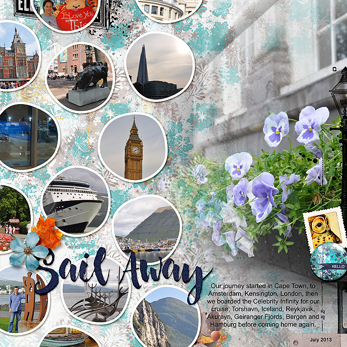
It can be difficult to capture all of the important details of your latest vacation on a single page or spread. To do so, you might have to get a little creative with your scrapbook page design. Our team has made travel pages with 5 or more photos while also including...

by Amy Kingsford | Jun 27, 2017 | Composition, Design Principles, Feature, Page Guides
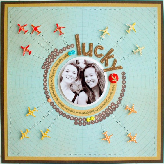
On a well-designed scrapbook page, the different pieces have varying levels of importance–and you impart that visually. Of course one piece will be the most important, “focal point” that catches the eye first and serve as the point of entry into the...

by Amy Kingsford | May 23, 2017 | Design Principles, Feature, Page Guides, Titles
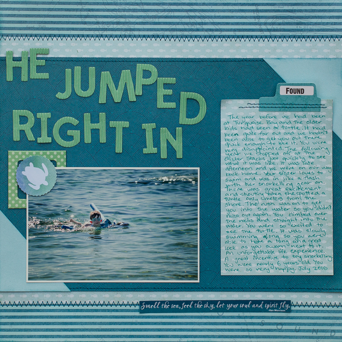
One of the easiest ways to draw attention to your title is to create tension within its type. Something as simple as a tweak to case, color, or placement with in your scrapbook page title can really intrigue the viewer – but remember we don’t want to...

by Amy Kingsford | Apr 25, 2017 | Composition, Design Principles, Feature, Page Guides
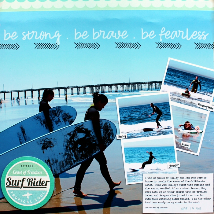
One of the primary tasks of making a scrapbook page is placing your page elements–photos, title, journaling, and embellishments–onto the scrapbook page to tell your story. The Gestalt principle of “proximity” provides a great tool for deciding...

by Amy Kingsford | Mar 21, 2017 | Canvas, Composition, Feature, Page Guides
The Gestalt principle of closure suggests that when people see incomplete objects–like shapes, letters, or pictures, their brains fill in the gaps. You can take advantage of this principle to create interest and even tension on your page, perhaps bleeding an...

by Amy Kingsford | Mar 7, 2017 | Color, Feature, Page Guides
Color is one of your best tools for creating visual impact on the scrapbook page. Quite often this work is done with a bold and rich palette of strongly contrasting colors. You can also create impact with a subtler, limited color palette when you use variations in...
