One of the primary tasks of making a scrapbook page is placing your page elements–photos, title, journaling, and embellishments–onto the scrapbook page to tell your story. The Gestalt principle of “proximity” provides a great tool for deciding how and where to place the pieces of your design.
This principle tells us that the proximity of items to one another on the page cues the viewer to understand which pieces go together. It’s the tool you use to create groupings–even when the elements you’re combining are different in shape or color.
In this post we’re combining design with storytelling, employing the principle of proximity to tell stories of relationships.
CLICK ON THE IMAGE BELOW TO SIGN UP FOR OUR EMAIL LIST AND GET YOUR FREE PAGE GUIDE
Marie-Pierre Capistran says, “This page tells the story of the beginning of my relationship with my husband: we met on a English learning trip in Vancouver, and on that day, I had to go back home, leaving him and our story behind. Our relationship was just beginning, but we already knew we wanted to live our lives together, so it’s a close relationship.”
“On this page, I tried expressing the separation of leaving Vancouver and my future husband behind. I used a photo of us together (I have a very limited number of photos of us at that time, so I worked with a photo of us and two of the close friends we made in Vancouver). I used a photo of the skyline of the city to give the impression of leaving the place. I separated these two photos to accentuate the impression of leaving and I also physically made a line between the two photos with the little airplane and the gold thread crossing the page diagonally. I placed the plane very close to the border of the page to give the impression it was flying away from the photos, from the city and form our relationship.”
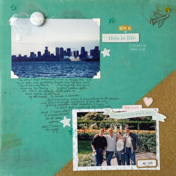
This is our life by Marie-Pierre Capistran | Products: Paper: Crate Paper, Pretty Little Studio; Acetate Die Cuts: Crate Paper; Cardstock Die Cuts: Dear Lizzy, Crate Paper; Flair Button: Pretty Little Studio; Sticker Letters: Pinkfresh Studio; Acrylic stars: Citrus Twist Kits; Paperclip: Webster’s Pages.
Christy Strickler says, “My cat likes to sit as close to me as possible on my craft table. On this occasion, she had fallen asleep with her head on my coffee mug. Since we have a close relationship, it made sense for me to keep the embellishment clusters in close proximity.”
“Texture, pattern and color play an important role as I layer embellishments around a photo. Thicker elements, like the ribbon soften the page, but also add dimension. I like to play with that dimension by adding in layers of thin cardboard behind die cuts and photos, further raising them off the page. I keep the size of the embellishment in mind as well as whether or not their placement contributes to the visual flow or the design of the page. On this page, I started by pulling colors from the canvas upwards into the clusters. Larger floral die cuts and pops of yellow tape help form visual triangles on the page. Though the title is not in close proximity to the photo, these triangles connect it to the main cluster.”
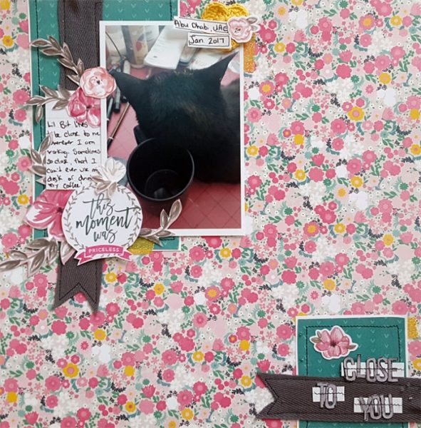
Close to You by Christy Strickler |Supplies Patterned Paper: Pink Paislee, Crate Paper; Letters: Simple Stories; Pocket Life Card: Cocoa Daisy Die Cuts: Pink Paislee; Other: Ribbon, Beads
Anna Aspnes says “I created this layout just prior to the Royal wedding of William and Kate in April 2011. In the whirlwind of fairytale romance, I was inspired to tell the story of my own romantic expectations as a child, share my current views on fairy tales, and make a
tongue-in-cheek recounting of the tale when I met my own Prince Charming.”
“I purposely designed the page to have both the modern-day and childhood photos on opposing sides of the page and separated by journaling. The photos essentially sandwich or snuggle the journaling. Transfers positioned across the bottom of the page create a foundation for the design and lead the eye from the more recent photo to the older version. The childhood photo is also clustered with heritage-themed elements such as the key and love birds to foster sentiment and create variation between the proximity of the various elements.”
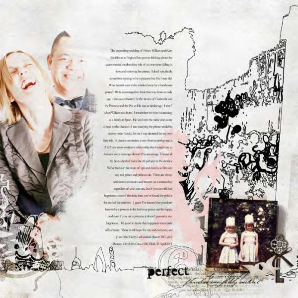
Perfect Happiness by Anna Aspnes | Supplies: ArtPlay Palette English Rose, Descriptive Word Transfers No. 1 by Anna Aspnes Designs at Oscraps.com; Fonts are Arial Narrow.
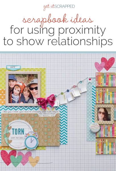
Kristy T. says, “This page is about how my return to studying at university has meant a lot of changes in our family. I sometimes feel torn between family commitments and my studies.”
“The relationship is connected but also in tension with one another as there is only so much time in a day, and sometimes I have to make hard choices. This is represented by separation between the photograph of my family and the single photograph on the page. The layers of patterned paper are clearly separate. The tags and stitching provide a link between the two parts of the page, showing that there is still a connection between the two parts of my life.”
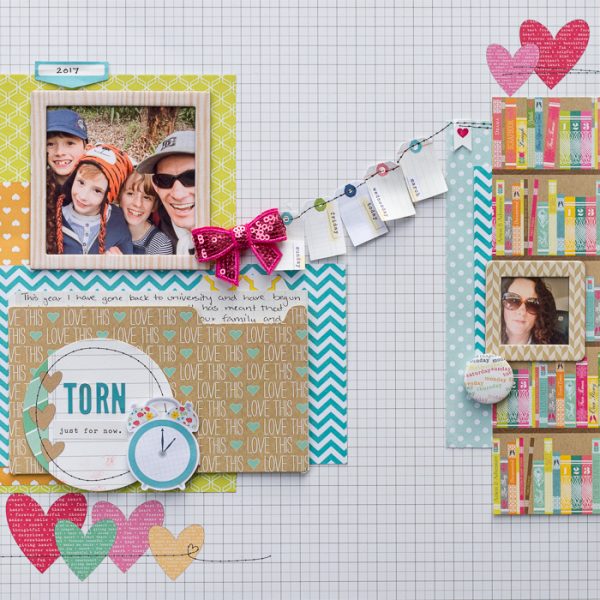
Torn by Kristy T | Supplies: Patterned paper – Websters Pages, Echo Park, Simple Stories; Embellishments – Cocoa Vanilla, Echo Park; Stickers: Simple Stories
Marcia Fortunato says, “Recently my husband, one of my sons, and I (and our cat) spent a relaxing Sunday at home together, each of us doing quiet activities we enjoy – rare because it doesn’t happen often anymore, so I wanted to document it on this scrapbook page.
I wanted to convey the message that although we were spread out throughout our house, we were still together and we have a close relationship.”
You can make a proximity grouping even stronger with a combining element. I included the photos of each of the four of us separately, but used a rectangle around us to combine the photos and give a sense of relationship. I also placed the heart with my journaling over the corners to connect them more directly and to communicate the love between us. Finally, I positioned my title centered over the top the rectangle to hint at the roof of a house.”
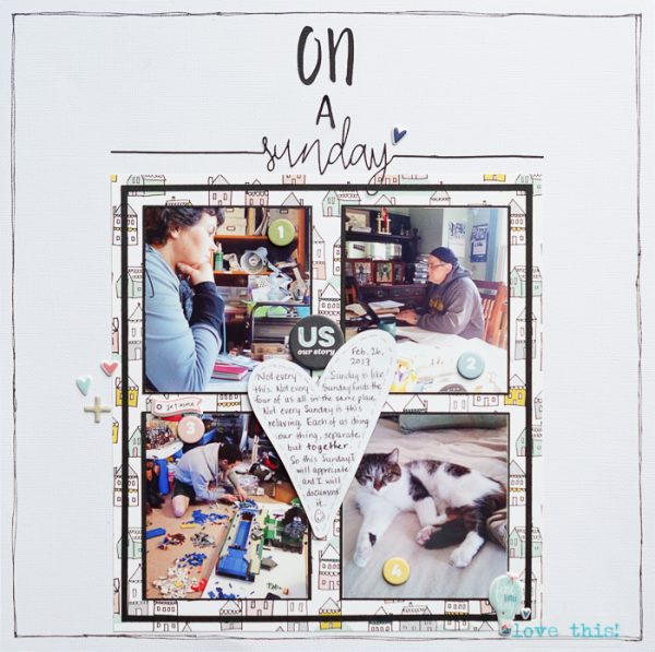
On A Sunday by Marcia Fortunato | Supplies: Cardstock: American Crafts, Neenah; Patterned Paper: Crate Paper; Title: Cut on a Silhouette Cameo using fonts from the Silhouette Design Store (Helsinki, Archer); Journal heart and chipboard embellishments: Ali Edwards story kit; Other embellishments: Dear Lizzy (American Crafts); Washi tape: unknown; Pen: Sharpie.
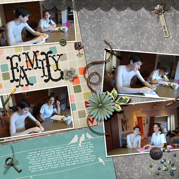
Stefanie Semple says, “I used photos taken on my second son’s 21st birthday to document my children’s relationships. Let’s just say that they are not as close as I would like.”
“I used four photos that are at angles with each other, denoting the tension between them, the two on the right of the layout touch as they bleed off of the page in the same way that I hope and trust as time goes on that they will get closer and closer. The positioning of the photos adds a messiness and a tension, with a feeling of being at odds. The birds on the patterned paper also subliminally add to the feeling of three siblings and yet a feeling of being only one.”

