by Debbie Hodge | Apr 27, 2010 | Composition, Ideas via Product & Technique
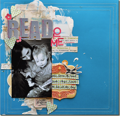
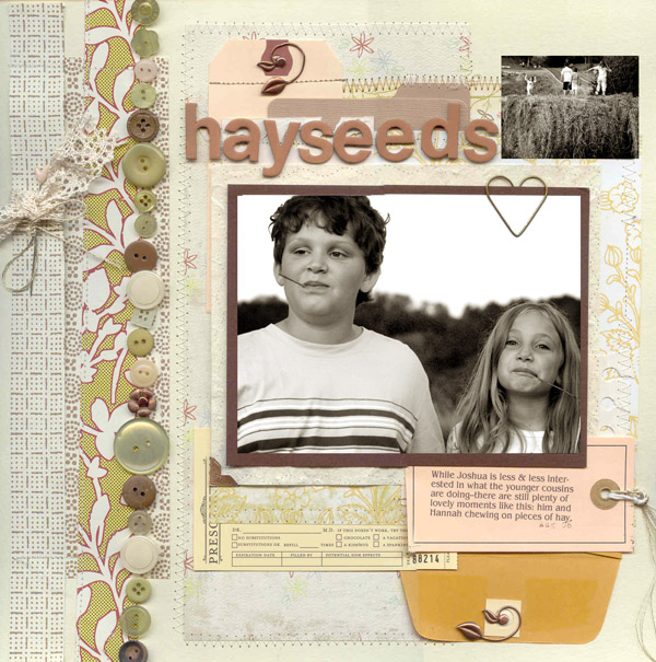
by Debbie Hodge How do you like your pages? Simple and clean? A little busy? Or filled with layers of paper, images, tags, envelopes, fibers and any embellishments you can find to support your subject? Do you layer? Wondering why you should layer or how to get more...

by Debbie Hodge | Apr 9, 2010 | Design Principles, Design Your Story, Journaling
by Debbie Hodge Justification is all about how you’re going to line things up—or, rather, align them. Read more about alignments in Strengthen Your Scrapbook Page Design with Alignments. left-justified journaling Sometimes I left-justify my journaling. Actually,...

by Debbie Hodge | Mar 29, 2010 | Color
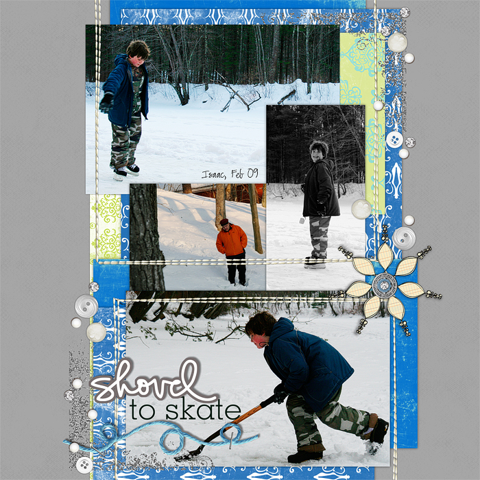
Using and choosing colors is a first step in learning how to scrapbook. What are your go-to colors? Do you use neutrals? A lot? Never? Wondering what neutrals can do for your pages? Want some ideas for using neutrals on your scrapbook pages? Read on. Neutral colors...

by Debbie Hodge | Mar 12, 2010 | Composition
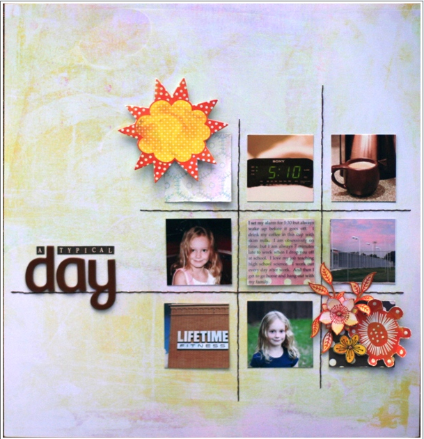
running time: 4mins 30secs/no ads In this episode of “Why It Works,” I’m looking at a page by Leah Allen. Lea has taken all of Doris Sanders’ Product Pizzazz classes as well as Scrapbooking with Fabric from Tania Willis. Leah’s Blog...

by Debbie Hodge | Mar 8, 2010 | Design Elements, Design Principles
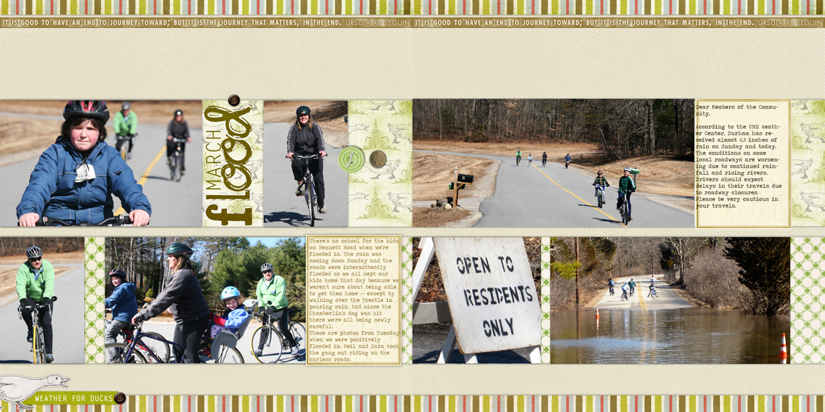
by Debbie Hodge The straight line is a basic element of design. This post shows you how to use it on your scrapbook pages to guide the eye and set tone. Use horizontal lines to guide the eye across a page. Connect the two sides of a two-page layout with horizontal...

by Debbie Hodge | Mar 7, 2010 | Composition
by Debbie Hodge With scrapbook pages, you have the opportunity to convey emotion that the viewer can understand and believe. You can use a combination of photos, color, words, and images to create a mood or tone — for example of comfort, excitement, happiness,...
