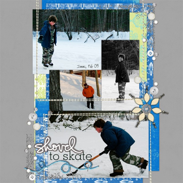
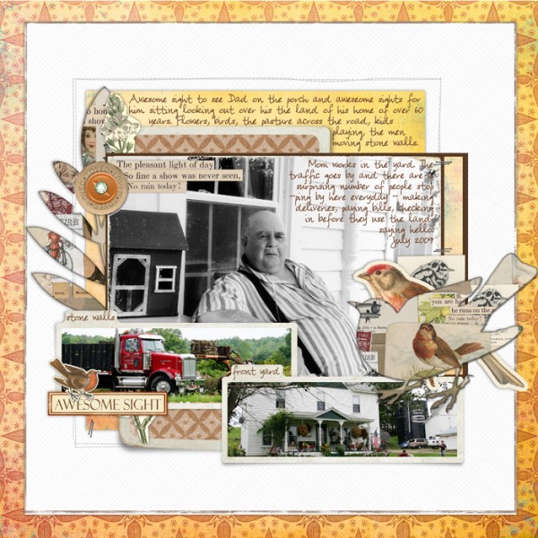
Using and choosing colors is a first step in learning how to scrapbook. What are your go-to colors? Do you use neutrals? A lot? Never? Wondering what neutrals can do for your pages? Want some ideas for using neutrals on your scrapbook pages? Read on.
Neutral colors may be totally without color or appear to be without color while having undertones of color.
Pure cool neutrals are black, grey, and white.
Near neutrals include ivory, brown, and beige, which have undertones of warm hues.
Use neutral colors on your scrapbook pages to:
1) Make other colors look brighter and deeper.
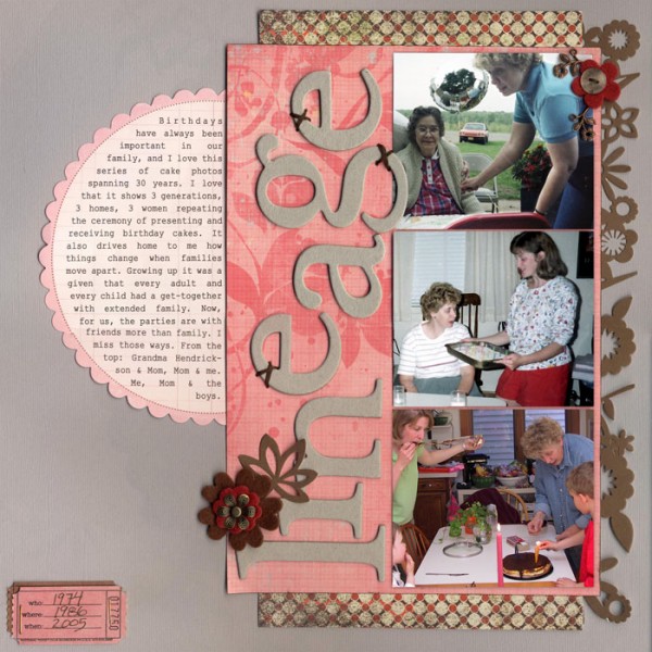
The pinks in the foreground elements on “Lineage” not only contrast well with the pale grey background, their color is made richer because of this backdrop. Brown accents contribute to the strength of the pinks.
2) Achieve a “classic” look.
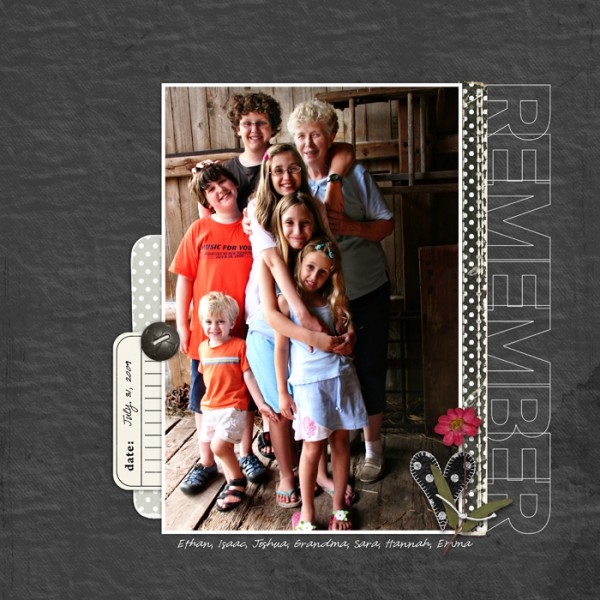
The black background on “Remember” gives the casual photo (with its bright and varied colors) a classic look and shows it off well.
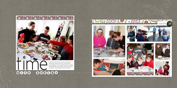
“Time With Shelby” has a classic look because of the simple and linear design, but the use of neutrals here is also important. The combination of a grey canvas with white photo mats provides and understated and classic tone to the page.
3) Tone down colors that might overpower.
4) Provide a backdrop for complexity (i.e., many photos and elements as well as design complexity).

