by Debbie Hodge | Apr 1, 2012 | Color, Design Principles
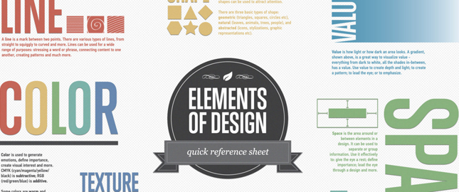
Inforgraphics are great for a quick review of things you may already have begun learning but can’t recall with perfection — or they can be an introduction of just what to study for newbies. Check out 8 infographics that cover the choices we make when...

by Debbie Hodge | Mar 16, 2012 | Composition
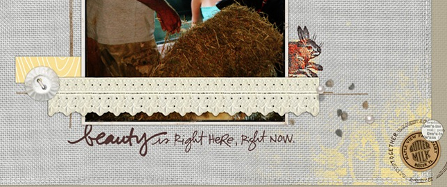
by Debbie Hodge This article appears in the March issue of Paper and Pixels alongside many more how-tos and ideas for paper and digital scrapbooking. Creating white space: figure and ground As you create a scrapbook page, you are: telling a story or conveying your...

by Debbie Hodge | Mar 13, 2012 | Composition, Ideas Spurred by Design, Photos, Picture Your Story
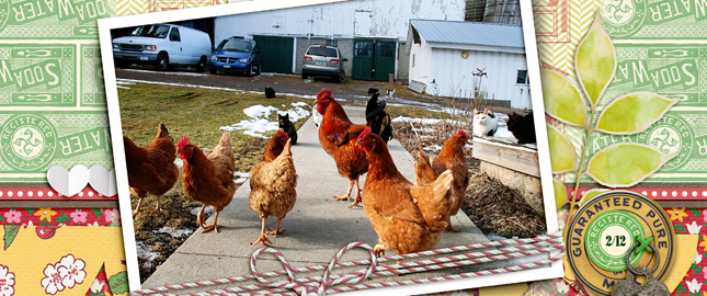
by Debbie Hodge “Straight-on” photos Close to 100 percent of my scrapbook pages have photos placed like these on Spring Break: “straight-on.” The sides of the photos run parallel to the canvas sides (and the tops and bottoms run parallel to...

by Debbie Hodge | Mar 8, 2012 | Design Principles, Embellishments
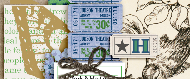
by Debbie Hodge Embellishments on a scrapbook page are not just great for adding interest, charm, and meaning. They are also important tools for creating a well designed page. The next time you’re choosing and placing your embellishments be sure that, in...

by Debbie Hodge | Mar 7, 2012 | Design Principles, Design Your Story, Journaling
by Debbie Hodge Alignment refers to how text is arranged into blocks or columns with hard or soft edges. There are four basic approaches to alignment: 1) Left, 2) Right, 3) Centered, 4) Justified. Check them out below — as well as a fifth option. Flush Left...

by Debbie Hodge | Feb 29, 2012 | Color
by Debbie Hodge A split-complementary color scheme uses a base color and then the two colors on either side of its complement (i.e., the color across from it on the color wheel). With this scheme your page will have contrast but with more nuance and less tension than...
