by Debbie Hodge
“Straight-on” photos
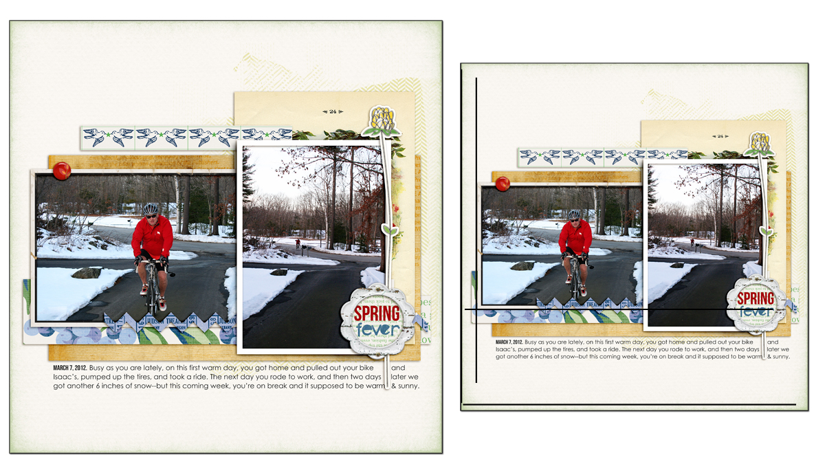
Close to 100 percent of my scrapbook pages have photos placed like these on Spring Break: “straight-on.” The sides of the photos run parallel to the canvas sides (and the tops and bottoms run parallel to canvas top and bottom) — these parallel lines extend into the distance never to intersect.

Spring Fever by Debbie Hodge | Supplies: Varsity Collection by Jenni Bowlin; Scissored Chevron, Mod Grunge FotoBlendz, Artplay Chevron Girl Craze, Distressed Edges 9 by Anna Aspnes; She's a Doll by Vinnie Pearce; Bookworm by Little Butterfly Wings; Juan Carlos and Fifi by Creashens; Also a Very Small Alpha by Allyson Pennington; Bebas Neue, Century Gothic fonts
Tilted photos
In the interest of “shaking things up,” let’s study great-looking pages with tilted photos and see what makes them work–starting with Amy Kingsford’s “Hello 2012.”
If you remember your geometry, you know that somewhere out in the distance the two lines shown here (the one along photo side and the one along canvas side) will eventually intersect. In other words: her photos are tilted.

Hello 2012 by Amy Kingsford | Supplies: Life In Frames Template No. 2 by Kitty Designs, Metamorphosis by Leora Sanford, Big Dreams and Pocket Treasures Paper by HGD by Laurie Ann and Forget Me Not Art Play Palette by Anna Aspnes.
The first thing I notice about how she’s mounted her tilted photots is that they sit on a horizontal band of cardstock that is not tilted. The bottom edge of this band meets the side of the page to create a nice solid right angle. There is a familiar stability beneath the tipsy photos.
Stability behind the tilts
It seems many of my favorite scrapbookers understand that tilted photos need some sort of un-tilted stability alongside (or beneath them).
Lisa Dickinson’s “She Makes It Look Easy” presents two tilted photos on a grid of 4 “straight-on” rectangles.

Easy by Lisa Dickinson (Masterful Scrapbook Design Design Play) | supplies: cardstock (Bazzill Basics) + patterned paper, chipboard shapes, stickers (Lily Bee Design) + chipboard letters (Basic Grey) + punches (EK Success, Creative Memories) + twine (Bazzill Basics) + misc. buttons + Courier font + machine stitching
Emily Pitts included two tilted photos on “Our Daily Bread.” Her stabilizing (or “straight-on”) elements are the center photo and the block of journaling beneath the photo grouping.

Our Daily Bread by Emily Pitts (Masterful Scrapbook Design Canvas) | Supplies: Supplies: Cardstock: American Crafts. Patterned papers: My Mind’s Eye and We R Memory Keepers. Alphabet: Basic Grey. Ink: Ranger. Stickers: Jenni Bowlin. Die cut: Sassafras. Brad: American Crafts. Pen: Micron. Thread: Coats and Clark.
Check out “Hello Lego” by Tiffany Tillman.
Her photos are tilted; she’s used paper cut with acutely and obtusely angled corners; her embellishments are sprinkled like little legos. Beneath and alongside all of this “cattywampus” placement, though, are several parallel and perpindicular lines. The teal mat, the border lines, the buildings, the edge of the journaling block, and the baseline of her title work all add a “squared” stability to the page.

Hello Lego by Tiffany Tillman (Masterful Scrapbook Design Typography) | Supplies: Digital Goodies: Creator by One Little Bird Designs. Page Template: Stuffy no. 1 by Simply Tiffany Studios.
What about my favorite “artsy” scrapbookers, though? How do they create stability? On this page by Anna Aspnes, I discover that she’s arrange three photos in a block — all of them aligned with one another — and then tilted the entire block of photos. So we’re still finding an underlying order.

Sugar by Anna Aspnes (Masterful Scrapbook Design Canvas) | Supplies: Burned Paperie, DifferentStrokes No. 5, WordTransfer Frames No. 1, Sumer WordTransfers No. 1, FotoGlows No. 3, Dotted LoopDaLoops No. 1
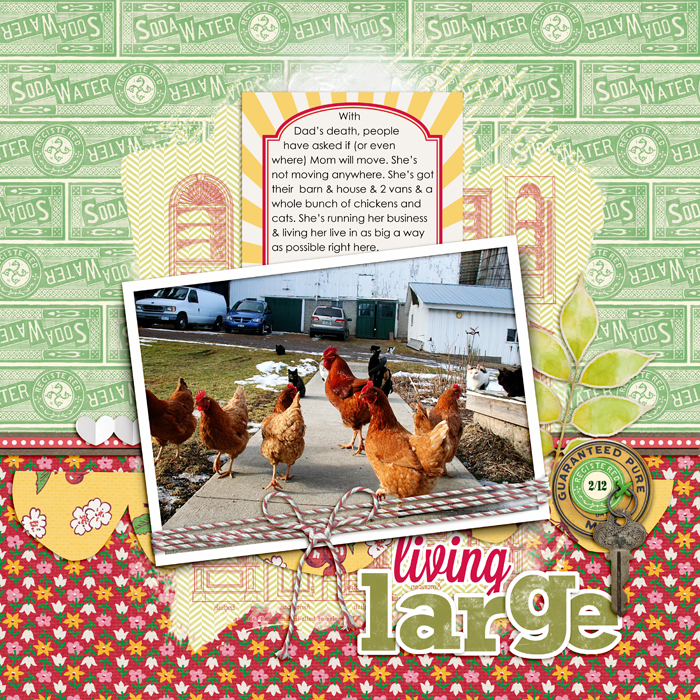
When I sat down to make my own page with a tilted photo, I began with a “free-form” cluster. As the page progressed, though, there was no shaking the feeling that I needed non-tilted and stable elements: the journaler rising above the photo and the top edge of the floral scallop were the first “straight-on” elements I added. I’d planned to use the red floral print as my background, but, in the course of moving things around beneath my tilted photo, I discovered that it made a better “shelf” along the bottom two-thirds of the page–and I had my solid base for a tilted photo.

Living Large by Debbie Hodge | Supplies: Homespun Papers, Homespun Journaling Cards, Soda Water Papers by Jenni Bowlin; Relocate by ViVa Artistry; Bakers' Twine 2 Katie Pertiet; Architectural Brushes by Artypants; Mod Grunge Fotoblendz, White Paint, Scissored Hearts 2, Scissored Scallops, Artplay Chevron Girl Craze by Anna Aspnes; Flair Box 3 by Paula Kesselring; Expedition by Lynn Grieveson; Key to My Heart by Sahlin Studio; Lavanderia, Rockwell fonts
What about you? Do you do any “tilting” –of photos or other elements–on your pages? How do you make your tilts work?

