by Debbie Hodge | Nov 11, 2013 | Composition, Finding and Using Inspiration, Get It Scrapped!, Ideas from Current Trends
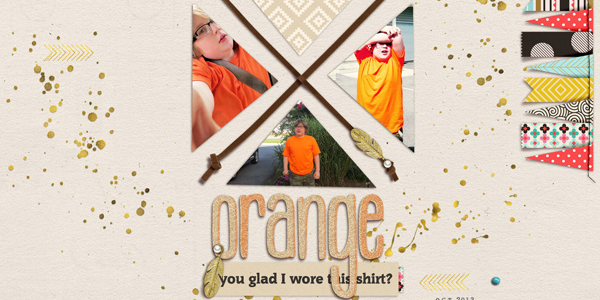
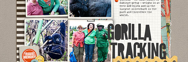
Logo designs can be a source of scrapbooking ideas and inspiration. Today our team is inspired by (and rocking) the “X” or crossed design, and they show you how they go from logo to page design below. about the X or crossed design This logo design trend...

by Debbie Hodge | Nov 6, 2013 | Color, Everyday Life
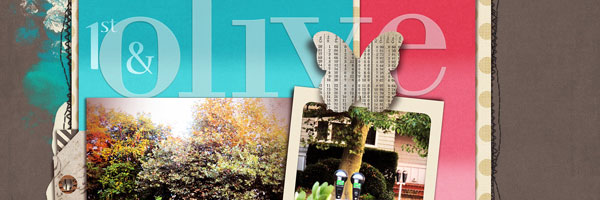
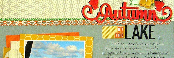
Color is a great storytelling tool for any visual journaler because of its associations with nature, its ability to trigger a physiological response, and because of the cultural connections people make. Typically, a scrapbooker turns to the colors of autumn that occur...

by Debbie Hodge | Oct 30, 2013 | Color
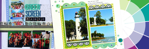
Cool colors on the wheel are blue, green, and violet. They tend to recede and have less visual weight than warm colors. Blue and green are calming and soothing and have connections to nature. Violet, which is made from a warm and a cool color and which appears less...

by Debbie Hodge | Oct 23, 2013 | DoubleUp, Sketches and Layered Templates
See how scrapbookers Susanne Brauer and Heather Awsumb used a one-page sketch/template from Amy Kingsford’s Scrap Your Summer 2013 Freebie Pack on their two-page layouts. Susanne Brauer says, “This page is about a tour my husband and I took of an...

by Debbie Hodge | Oct 9, 2013 | Composition
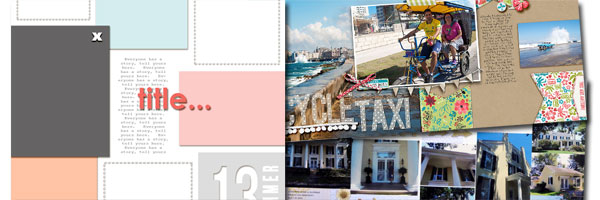
Working with a starter foundation to begin a scrapbook layout is a good way to make pages more efficiently — and to complete pages that have a solid composition. The key is to use a starter foundation that’s a solid base for layout design. The...

by Debbie Hodge | Oct 1, 2013 | Composition, Design Principles
Arranging and placing your scrapbook layout elements to create variations in density and cluster size is a way to create tension in some spots and release in others. (Check out more multi-cluster pages.) Do this with an eye toward using this variations to create...
