by Amy Kingsford | Feb 2, 2016 | Design Principles
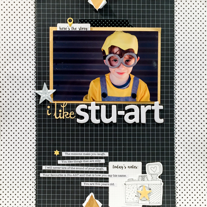
The design principle of contrast tells us that there should be obvious visual differences between the elements on your page. What’s more, contrasts will draw the viewer’s eye and add interest and variety. Check out a short video lesson on contrast below and then...

by Amy Kingsford | Jan 5, 2016 | Design Principles
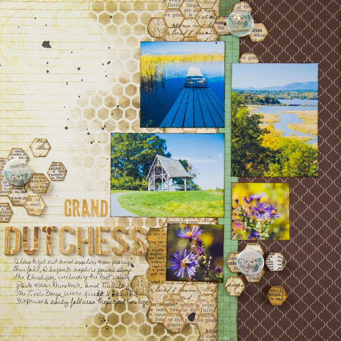
The design principle of alignment tells us to consciously place each element on a layout with a consideration for its relation to other elements on the page. Using alignments, you can create visual connections between elements, even if they are not next to one...

by Debbie Hodge | Dec 15, 2015 | Composition, Feature
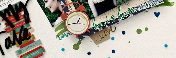
The latest Get It Scrapped Membership class–Scrapbook Coach #21–includes four video lessons walking students through the making of four “top heavy” designs. A “top heavy” design uses elements with substantial visual weight at the...

by Debbie Hodge | Dec 2, 2015 | Design Elements, Digital / Photoshop Techniques for Scrapbooking
This lesson from Jana Morton first appeared as a part of the membership class “Texture & Dimension.” For that class and over 60 more, join us. by Jana Morton As a photographer, I am very conscious of light. I am always trying to figure out my best position to...

by Debbie Hodge | Dec 1, 2015 | Composition, Feature, Photos
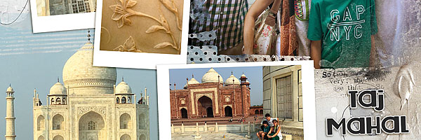
For many of us, photos are the reason to scrapbook and multi-photo scrapbook pages let us pack in lots of memories. While we’ve heard (and even sometimes agree) that one or two photos with strong journaling are as powerful as a dozen photos–still, there...

by Debbie Hodge | Nov 18, 2015 | Color, Ideas Spurred by Design
We frequently share ideas for trying out new scrapbook page color schemes at Get It Scrapped. Here are five creative looks at using color for your scrapbook page storytelling. When you get done with them, be sure to see last year’s color roundup here. [hr] 1....
