by Debbie Hodge
This column is all about understanding design strategies and approaches for two-page scrapbook layouts.
In each Double Up, I’ll share: a two-page layout, design analysis of what makes this two-page design work, page sketch with measurements, and a layered template.
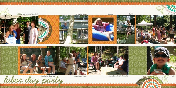
Go horizontal. Creating a band that runs the entire width of your two page layout and using it to hold your photos is an easy way to get a sharp design quickly. This band is about 8″ high (that’s the two smaller bands combined). I used to worry about the wasted space and the linearity of this kind of design, but I’ve found that the restrictions this band imposes just make the work easier–I’ll share several more pages that I’ve made with this design below.
 This is a digital page – see supplies in my DesignerDigitals gallery.
Add top and bottom horizontal borders. The narrow borders that run the entire width of this spread at top and bottom do several things: 1) they “bracket” or contain my page; 2) they add interest, repetitions, and contrast; 3) they reinforce the horizontal flow of the page.
Use a visual triangle that spans the two sides of the spread. Above, it’s my title combined with that embellishment cluster below it that grab the eye first. The second spot is at bottom left and the third spot is at top right.
Bleed your embellishments off the page. Because the photos and most of the elements are contained in a very linear and limited area, you can make your page feel “bigger” by running embellishments off the edge as I’ve done at bottom left and top right. When an element goes off the edge, the viewer’s eye fills in the rest. The result is that you’re using space that extends off the page!
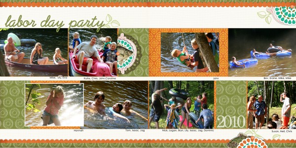
Here is a second page from the same event–I mixed up the sketch a bit and stuck to the same products.
This is a sketch that Tami Taylor used in her September, 2010 post for One Month at a Time. Links for the pdf with measurements and the layered template are below the sketch image.
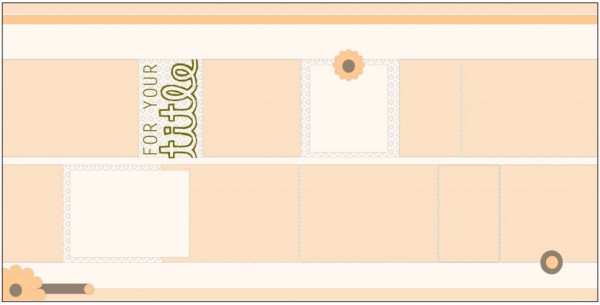 open pdf with Sketch – download layered template
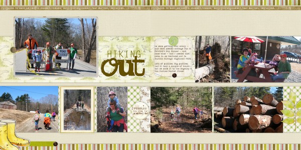
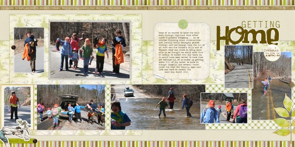
I’ve used this design repeatedly for events that require MORE than one 2-pager. Here’s several pages I made the last time our neighborhood was isolated by a flood. Notice also the variations I’ve used — going outside of that horizontal band.
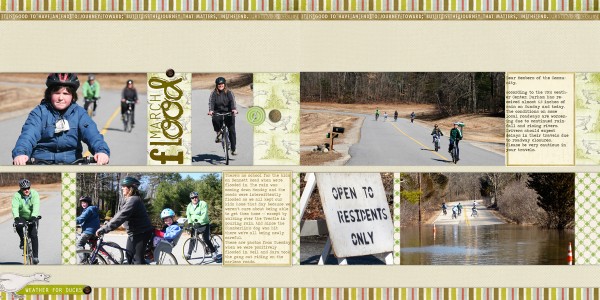
see the supplies for this digital page in my DesignerDigitals gallery.
[lovesketches]

