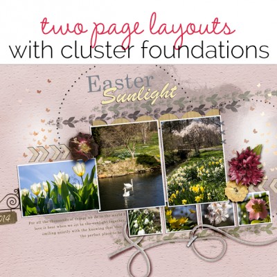
 The cluster foundation is one of several layout configurations scrapbookers use again and again when making scrapbook page designs. We’ve shared ideas for single page layouts using the cluster foundation (Seev Scrapbook Page Starter: Use A Multi-Cluster Foundation and Scrapbook Page Composition: Arrange Your Elements in a Free-Form Cluster). You can even get four step-by-step video lessons for working with the cluster foundation in Scrapbook Coach Class #13. Here, we’ve got ideas for putting those foundations to work on two-pagers.[hr] Kiki Kougioumtzi say, “On this layout, I give my daughter advice.” “To make cluster, I started by placing my main photo, which is the only color photo. I then arranged the secondary photos and embellishments so that everything is flowing from the main photo.”
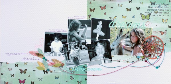
Dreams Are For Chasing by Kiki Kougioumtzi | Supplies: Patterned Paper: Studio Calico,October Afternoon; Alphas: American Crafts,Basic Grey; Brads: 7Gypsies, Basic Grey, My Mind’s Eye; Gems, Stamps, Ink: Studio Calico; Other: twine, Prima pebble.
[hr]Michelle Houghton says, “This layout commemorates a day with my entire family at the Honolulu Zoo.” “I created a single cluster of smaller animal photographs and embellishments at the center of the two page layout. Additional photos of my family watching the animals are placed so that the subjects are looking toward the center. The cluster of the animal photos that crosses the divide of the two-page layout not only gives viewers something to look at, it also connects the two pages.”
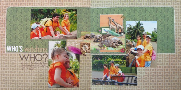
Who’s Watching Who by Michelle Houghton | Supplies: patterned paper, canvas tags, buttons, butterfly brads and feather; SEI, sticker letters Bella Blvd., ink; Sharpie, twine; American Crafts, kraft speech bubble; Maya Road
[hr]Stefanie Semple says, “Our niece and her hubby held a wedding celebration in South Africa that we were honored to attend.” “When I design with an organically-shaped cluster, I like elements to touch and overlap. Here, the photos are placed from left to right in a chronology, and I used small pieces of blue and pink paper to symbolize his and hers. Brushwork and visual triangles add texture and create flow around the design.”
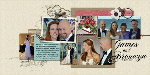
James and Bronwyn by Stefanie Semple | Supplies: Steph Designs : I do (retired kit); Pixelily : Love Forever. Roadside Designs (Templates, I used two and tweaked them a lot); Carina Gardner: Family Brushes.
[hr]Sue Althouse says, “This page is about exploring the hidden treasures of a lifelong avid collector.” “Using Lesson 2 in the Scrapbook Coach Clusters Class as inspiration, I created a circle and bracket cluster foundation for my layout. I cut an 11″ circle with my Silhouette and divided it between the two pages. The large doily, scalloped borders and rounded corner on the journaling block keep the organic shape flowing around the page.
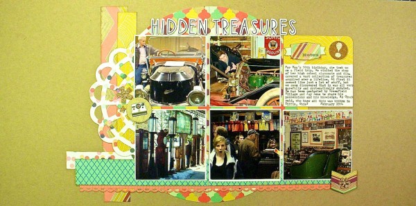
Hidden Treasures by Sue Althouse | Supplies: Cardstock: Bazzill; Patterned Paper, Stickers: Webster’s Pages; Border Punch: Fiskars; Alphabets: American Crafts; Ink: Tim Holtz; Doily Die Cut: Silhouette; Cork: Studio Calico
[hr]Andrea says, “When I think of a 2-page layout I think of using a lot photos. Thus, the photos from this past Easter were the perfect subject for this page.” “I started with an interesting single-page template that had space for just two photos. Since I really liked the layering in the template, I opened all the photos I wanted to use and broke spaces on the template and added to the space where needed. I replaced all the layered items with ones that fit my theme. Adding overlapping items adds to the page depth.”
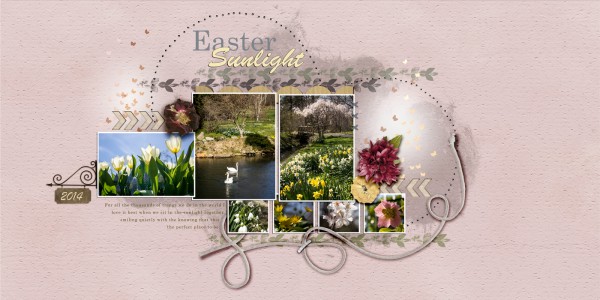
Easter Sunlight by Andrea | Supplies: Anna Aspnes, Art Play Why Not Paper, Butterfly Glows; Sahlin studio paper cling holes; OScraps IAWL arrow forever joy, scalloped trim CBD; llal string; Lilas Past Time garden flowers; fftd Freebee81 template altered.
[hr]Devra Hunt says, “This page is about how we got in the spirit for the Seahawks’ road to the Superbowl.” “I printed my photos in varying shapes and sizes and placed them in a loosely blocked cluster across both pages. I added ribbon and embellishments to create a shelf that gives the photos a foundation.”
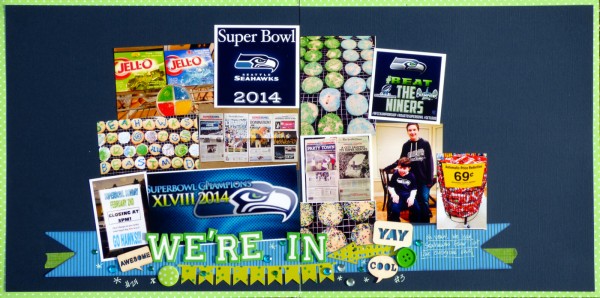
We’re In by Devra Hunt | Supplies: Cardstock: Bazzill, Patterened Paper: Doodlebug Designs, SEI; Washi & Brad: Queen & Co; Wood Veneer: Recollections, Basic Grey; Buttons: The Button Co; Bling: Hobby Lobby; Alpha: American Crafts; Die Cuts: Silhouette; Pen: Souffle; Adhesive: EK Success; Photo Printer: Epson

