by Debbie Hodge
I originally became interested in the idea of setting a mental clock ticking (to create tension) when I studied fiction writing.
As a scrapbooker, I thought a lot about getting tension into the written component of my storytelling–but not so much the visual component.
And then, last year in our critique workshops, I got curious about why the teachers gave some advice again and again. I wanted to understand why Doris and Celeste praised the breaking of borders and why Emily and Paula suggested “snuggling” titlework alphas in more closely.
The reading and searching I did brought me to this answer: their advice was beneficial because it created visual tension.
Ah, tension, my old storytelling friend, was important for more than written creations — it was important for visual creations, too.
And now I realize that the scrapbook pages I most love use techniques for adding tension to both the narrative and visual aspects of a layout.
set a clock ticking on your pages
Have you ever thought about approaches for getting a clock ticking on your pages? Do this and you will have the viewers of your work experiencing a keen sense of time passing. When you evoke such nostalgia, you also evoke an appreciate for life both past and present.

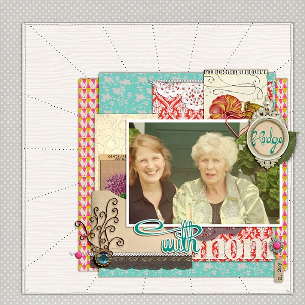
I set the clock ticking on “With Mom” using a photo treatment that aged the photo along with old-timey prints (vintage floral, damask and Swiss dot) to establish a sense of timelessness. I know the photo is from current day, and, yet, the page has an old fashioned feeling.
The result?
It evokes strong emotions in me about the passage of time in my own life–about how much I love my mom, miss my dad, and just might be squandering my time. The geometric print with “off” pinks is the one nod to current times. Notice that stitched burst, and you just might be thinking about how fleeting a sunrise can be.
take advantage of how humans SEE the world
Do you “get” why we talk about Gestalt principles for visual designs? It’s because there are perceptual forces (that cross eras and cultures) that humans apprehend when they look at things — including creative works. Understanding and tapping into them gives you mastery in your visual communications.

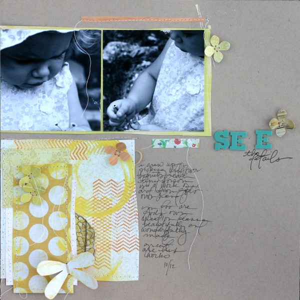
Doris set up her title so that we would perceive a “pull” on that stray “e.”
She says: That awkward space between the second and third letters in my title forces the viewer to stop and absorb the details — and that fits in nicely with the theme of my page.
I loved the way my niece was taking the time to study one tiny flower. It reminded me of how much I loved those flowers as a little girl and that I should slow down and enjoy the little details in my life as an adult.
learn more about adding tension to your scrapbook pages
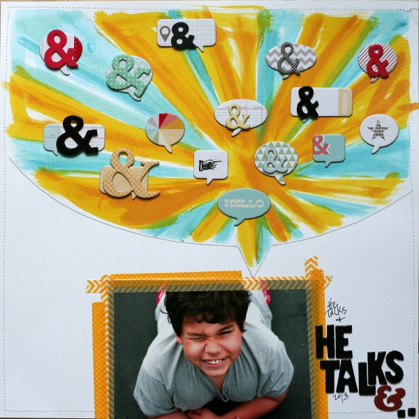
Look at the energy on this page by Doris Sander, from the absence of words in the talk bubble to the proliferation of ampersands. From the breaking of canvas borders at top and bottom to the incomplete title and the squinting face in the picture. Ow! I feel the sun in my eyes while mom tells me to look in the camera and I sense Mom’s amazement at my never-ending stream of conversation.
Don’t you want that kind of energy on your own pages?
Join us.
You can immediately download a 300-page ebook (with over a dozen illustrated focus lessons and 60+ annotated scrapbook pages by paper and digital scrapbookers Anna Aspnes, Dina Wakley, Emily Pitts, Corrie Jones, and Doris Sander + the the MSD team of myself, Tami Taylor and Amy Kingsford).
Then, throughout September and October we’ll host 10 live events (and provide recordings afterward). These live events give everyone a chance to talk to a variety of top scrapbookers about how they approach their craft–and even get feedback on their own pages.
Register in the sidebar here or click here to sign up at Masterful Scrapbook Design (where you will access all materials)
[current]


