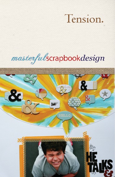
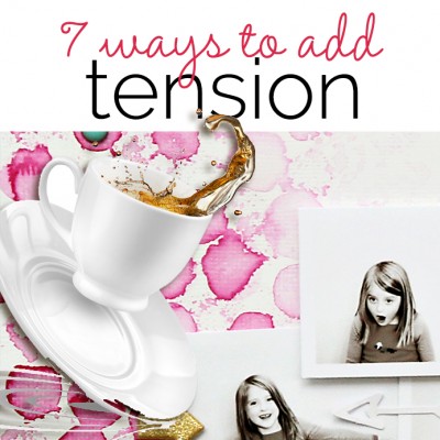
 Tension is an important element in making something beautiful, including scrapbook layout designs.
Consider the good guy and the bad guy in fiction, vertical columns supporting curves in architecture, hard movements combined with flowing movements in dance.
Tension gets attention. When you set up a situation with tension, the viewer feels like something isn’t quite right, that something might happen that the viewer doesn’t want to miss.
Starting September 4th, we’re exploring tension at Masterful Scrapbook Design, kicking the class off with a 200+ page ebook that includes 60+ annotated layouts. And then we’ll dig in even deeper with 10 live webinars (video AND audio recordings provided).
Teaching this class are: author, teacher and mixed media artist Dina Wakley, digital product designer and scrapbooker Anna Aspnes, Two Peas Garden Girl Corrie Jones, Jenni Bowlin Marketing Director Doris Sander, and Cocoa Daisy Marketing and Design Team Lead Emily Pitts. As always Tami Taylor and Amy Kingsford and I (Debbie Hodge) also teach.
Our framework for exploring and teaching you how to get tension into your own designs (which could be scrapbook pages, journals, graphic design projects, and even your home decor) looks at these 7 ways to achieve tension.
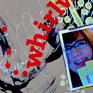
A peek at how Dina Wakley made a page that evokes a sense of time passing as she scrapbooks her first book authorship and publication.
1. Convey a sense of one moment in time
Work with your visual design to create a feeling that what we are seeing is just one moment in time–that things were different just a moment before and that things will be different in the next moment. The viewer won’t want to miss what you are presenting.
[divider_flat]
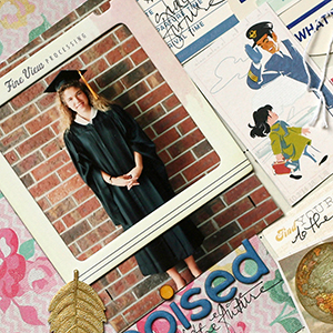
A peek at Doris Sander’s skillful use of juxtapositions on the page about a young woman at a critical juncture in life.
2. Include juxtapositions
Make an “off” choice within a solid visual design and you will catch the viewer’s attention. It’s important here that your juxtaposition be made in the just the right amount. Too much “off” and we’re confused.
[divider_flat]
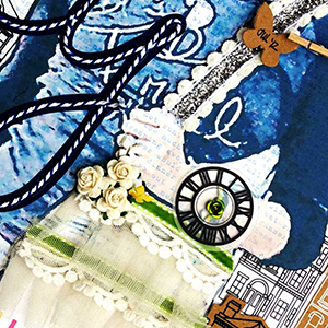
A peek at Emily Pitts’ exploration of an important work and personal relationship.
3. Explore an idea and resolve it visually
Explore a feeling or a melody or a theme with your visual design — and make sure you resolve the questions you raise.
[divider_flat]
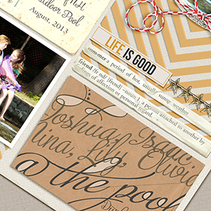
A peek at Debbie’s Hodge’s transformation of calligraphy for a summer page and an unexpected use of type. She even shares the Photoshop how-to.
4. Add tension with type
Do something uncomfortable with type. BUT . . . whatever you do must matter to your visual design. It must be purposeful and in alignment with your page subject.
[divider_flat]
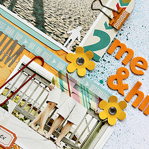
A peek at some of the borders broken on Corrie Jones’ ode to her husband and her relationship with him.
5. Break borders
Get outside the lines in your designs for many reasons: to keep white space active, to draw attention, to ground, and to surprise.
[divider_flat]
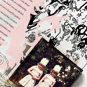
Variations in density and proximity let Anna Aspnes skillfully tell a story that spans decades, one about fairy tales, romantic expectations, and real life.
6. Work with variations in density and proximity
You can create rhythm with variations in density and proximity of your page elements. You can create tension in one area and release in another.
[divider_flat]
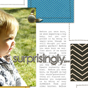
Amy Kingsford uses weight, pull and empty space on a page about parental expectations and how life works out.
7. Leverage weight, pull, and empty space.
Objects in a design have visual weight and exert directional pull. Use weight and pull to create tension on your scrapbook layouts.
[divider_flat][hr]
Sign up to study tension at Masterful Scrapbook Design
[hr]

