 by Debbie Hodge
There are several layout configurations of combined elements that scrapbookers use again and again when making scrapbook pages (for example, blocked, clustered, and shaped). These foundations are used again and again because they work well for housing the most frequently encountered combinations of elements (1 to 5 photos with title and journaling) and they consistently yield well-designed pages.
The “shelf” is one of these foundations. Using a horizontal “shelf” (of paper strips or ribbon or even a series of elements) provides a base to build up from and it simplifies the scrapbooking process because it gives you a starting place — and a direction.
Amy Kingsford says, “My go-to composition is the ‘shelf.’ It uses horizontal borders to build a strong base for showcasing photos and other key elements. The shelf doesn’t span the full width of the page like a band foundation often does. I like the shelf because it automatically makes my photo the center of attention. I also like that it allows me to group key elements together in a way that connects them and creates a sense of unity.”
I usually float my shelf to one side of the page or the other creating an asymmetrical design, but, every once in a while, I’ll place my shelf smack dab in the middle of the page. I often start by selecting one large landscape photo or a few square or vertical photos that I can group together. I choose a couple of eye-catching borders to layer together or sometimes even just bits and pieces that I can combine to create a strong visual barrier, and I layer them across my page. I use this barrier to underscore my photos and other key elements.
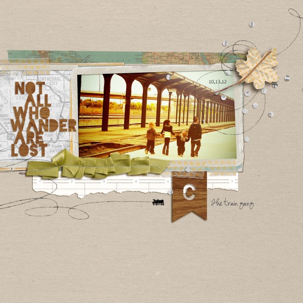
Train Gang by Amy Kingsford | Supplies: Valorie Wibbens : Lost and Found; Amy Wolff : Botanical Elements; Anna Aspnes: Globe Trotter Loop a Loops; Agnes Biro : Weathered Frames; Gennifer Bursett: Elemental: Kym’s Washi.
Leah Farquharson says, “This page is about myself and my husband. I’m grateful for him every day. I created a shelf using washi tape and then layered journaling cards and elements as a mat for my photo. I think it was a great fit for this page because it gave me the opportunity to really showcase my photo and journaling in several spots!”
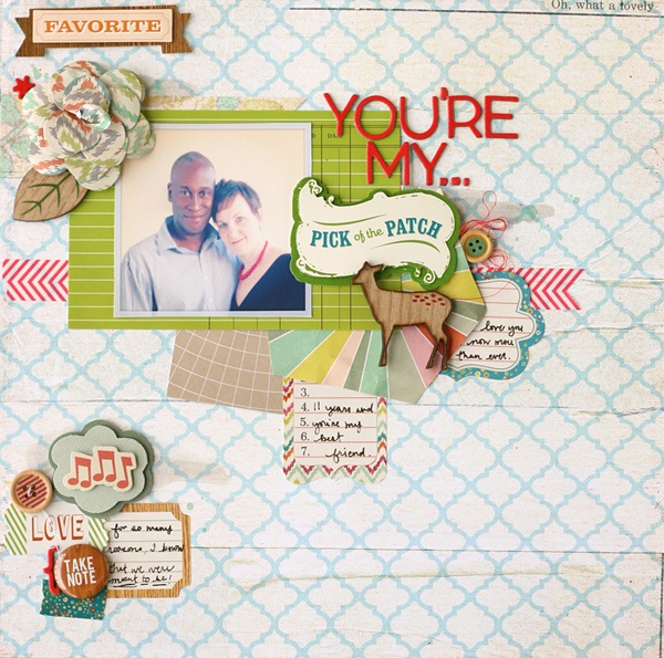
You’re My… by Leah Farquharson | Supplies: Washi tape: Bella Blvd. Patterned paper: Crate Paper, Studio Calico. Journaling card, flair button: Studio Calico. Flower, journaling stickers, 3D stickers, buttons, wooden embellishments, chipboard letters: Crate Paper. Thread: Guterman. Pen: Martha Stewart.
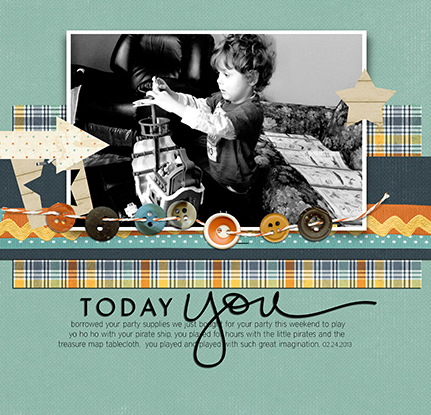
Tara McKernin “This layout shows Jake engrossed in playing with his pirates. He played for hours on end. I like simple layouts, often with a single photo focus. Here I created a shelf by layering papers, ribbons, and buttons. I feel like it was a great way to anchor the layout.”
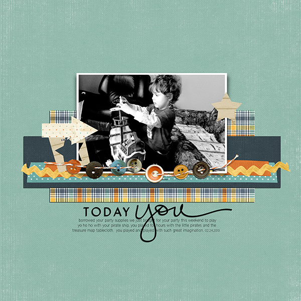
Today you | Tara McKernin | Supplies: Papers and Elements Karen Funk Be Unique; Frame Katie Pertiet; Word art Ali Edwards; Font District Thin
Katie Scott says, “My daughter found the bucket of Halloween candy on top of the fridge and climbed up onto the counter to get it. I did this same bit when I was a kid. I used the shelf to arrange the 2 portrait photos and to layer up lots of stripes and embellishments. This was fun since there was candy overload so it felt right to have embellishment overload too.”
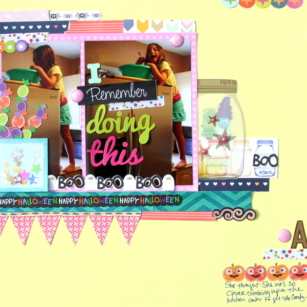
I Rember Doing This by Katie Scott | Supplies: American Crafts Dear Lizzy & Maggie Holmes 6×6 paper packs; K&Company Border Stickers, do dads; letters from GCD Studios.
Amy Kingsford says, “This page is about my nephew’s first football game last season. Here I’ve used a centered shelf made up of several horizontal borders and trims to showcase my photo, title and journaling. I added a few embellishments to my shelf to break up the linear feel a bit and threw a semi-transparent strip in there to add a bot more depth. I like the resulting white space that this composition leaves–giving the page a clean and masculine look.”

Winner by Amy Kingsford | Supplies: Karen Funk: These Are the Days, Dare to Dream Solids; Mye de Leon: Veneer Alpha; Crystal Livesay: Hints of Fall Templates.
Kiki Kougioumtzi says, “When our dog was a little puppy, he loved to sleep on my slippers and I felt sorry to take them back. I used the shelf attached to one edge of the page. It gives me a strong base for the photos and my decorative cluster: just a like a place to sit and relax.”
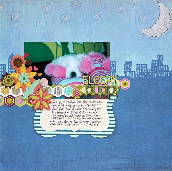
Sleepy Puppy by Kiki Kougioumtzi|Supplies:Patterned paper:Lazar StudioWerx;Alphas:Basic Grey;Stickers:American Crafts,Basic Grey,My Mind’s Eye;Other:Making Memories journaling book.
Deborah Wagner says, “This is a photo of my nephews playing in the ocean many years ago. I love scrapping old photos! I blended the focal photo into an ocean scene paper. Then I created a shelf with paper strips, lace, and a banner for my smaller photo.”
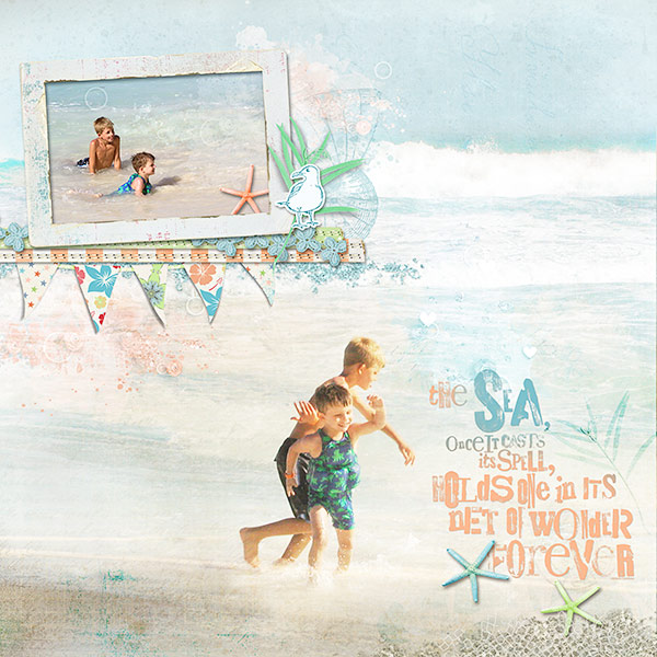
The Sea by Deborah Wagner. Supplies from Designer Digitals. Katie Pertiet – Destination Seaside Paper Pack, At the Beach Word Art, Beach House Memories Kit, Catana Kit, Beachy Clusters No. 3, Alandia Tropics Kit, Sun Porch Clusters, Shoreline Kit; Lynn Grieveson – Santa Cruz Kit, Madras Kit, Worn Strips No. 11, Wailua Kit; Cassie Jones – Bending Shadows
Brenda Becknell says, “At 3-1/2 years old, my granddaughter is just starting to get into playing board games, and Grandpa is one of her favorite playmates. The two horizontal photos were a good fit for a shelf composition. I started with the widest piece of yellow patterned paper, then added a slightly narrower circle print piece, a narrower piece of red print with the ends snipped into banner v’s, and then added a punched border piece underneath all the layers. I stitched through two of the strips with an unthreaded sewing machine, just to get the texture without any thread. The shelf composition was echoed with the smaller strips at the top right corner of the page.”
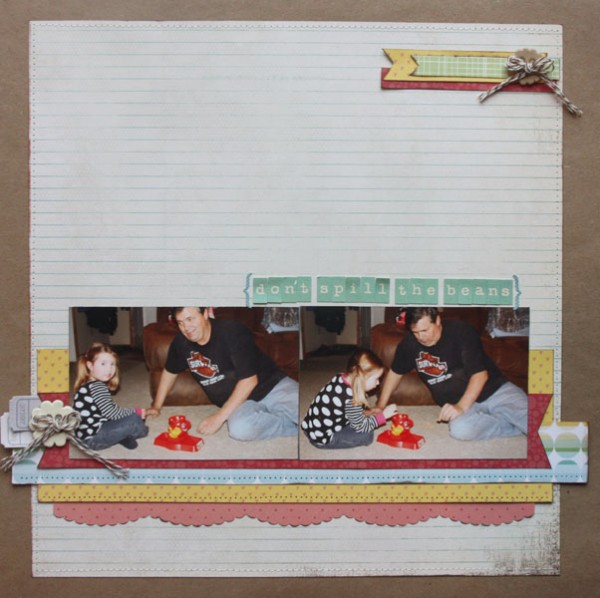
Don’t Spill the Beans by Brenda Becknell | Supplies: Patterned paper: Basic Gray and Studio Calico; cardstock: Hobby Lobby; Alpha stickers: October Afternoon and Lily Bee
Adriana Puckett says, “‘Checkmate’ features photos of my daughters playing with a huge chess board during a trip to a local winery. The shelf composition was a great match for the page because it allowed the photos to be supported and emphasized at the same time.”
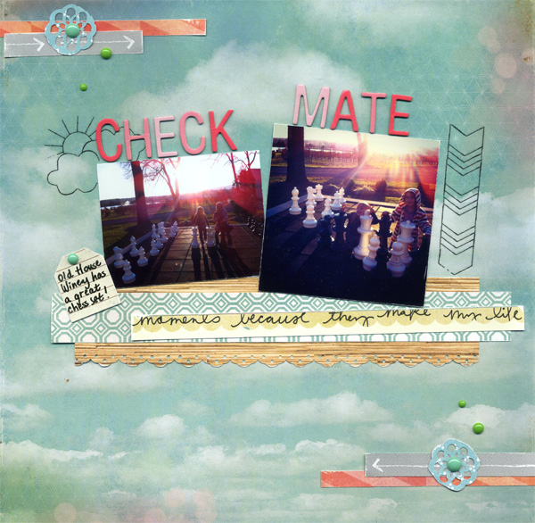
Checkmate by Adriana Puckett | Supplies: Patterned Paper: American Crafts and some scraps; Letters : Ombre Goodness Thickers (American Crafts); Embellishements: Aqua & Green Enamel Dots (Studio Calico + Basic Grey) Mini Marks Dream Stickers (Amy Tan by American Crafts)
Adryane Driscoll says, “I thought a shelf composition lent itself to a page about sewing because of the ease of finding elements to layer to create the shelf. I used ribbon, lace, a measuring tape, stitching and sewing pins.”
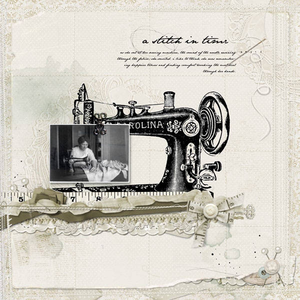
a stitch in time by Adryane Driscoll: Credits: Anna Aspnes I ArtPlay Palette Blooming Marvelous, Taped Numbers No.1, Dripped Stains No.1, ArtPlay Palette Metro Grafitti, ArtPlay Palette Chatter, ArtPlay Palette Simplicity, ArtPlay Palette Sweet Pea, ArtPlay Palette Woodland, ArtPlay Palette No.2, KrissKross Stitching Overlays No.2, and ArtPlay Palette Classico; Catrine I Home for the Holidays; Mindy Terasawa I Apple Dumplings, Bugiboo; Lynn Grieveson I Rosalie, Late Summer; Katie Pertiet I Yarn Swirls, Collageables No.4; and Pattie Knox I PinIts! Pearls; photo from the Internet.
Amy Kingsford says, “This page is about my recent experience of starting a journal, with the journaling coming from my first journal entry. I used a double shelf–one to showcase the photo and a second to underscore my journaling which is just as important (if not more). For both shelves I’ve used layered horizontal pieces that create a visual surface for my photo and other key components to rest on.”

Daily Ramblings by Amy Kingsford | Supplies: Karla Dudley: Sidewalk Alphas, Dameselle Bundle; Mye de Leon: Off We Go Elements; Creashens: Bare Necessities Papers; Crystal Livesay: Spring Fling Templates.
[current]

