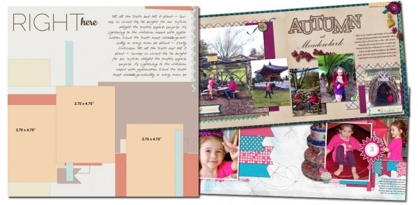
See how scrapbookers Adriana Puckett and Terry Billman used a one-page sketch/template from our Bundle #92 on their two-page layouts.
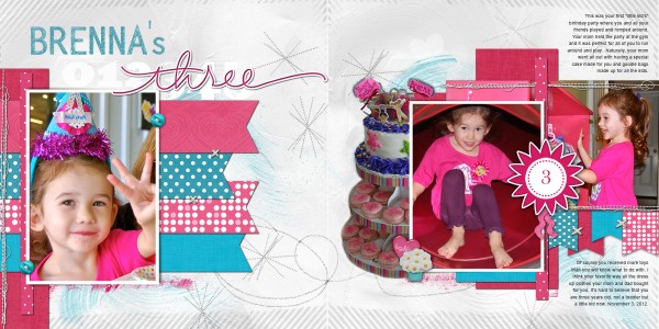
Terry Billman says, “This layout is about my granddaughter, Brenna, turning three years old.”
Terry flipped and then “split” the original sketch to spread it across two pages. The focal point photo is on the left side and two supporting photos are clustered on the right. In addition to the layers from the sketch, Terry layered banners on each side. The banners on the left are horizontal and guide the eye over to the right where the banners are vertical and smaller. Terry extracted a cake from one of her photos and layered it in, also.

Brenna’s Three created by Terry Billman| Anna Aspnes: Art Play Smooch, Art Play Forget Me Not, Art Play Kinder Magic, Art Play Crazy Life, Striped Edge Overlay, Stitched by Anna White 4, Katie Pertiet: Pick Me Up, Heart Pebbles No. 3, Collageable Notions No. 1, Between the Lines Alpha, Alandia Tropics, Gingerbread Runaway, Michelle Martin: Janine, Andrea Victoria: Beloved, Ali Edwards: Hand Drawn Numbers, 31 Days Circle Accents
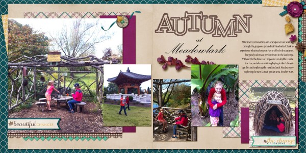
Adriana Puckett says, “During a recent trip to Grandma and Grandpa’s, we walked through the gorgeous grounds at Meadowlark Botanical Garden and noted all of the seasonal changes.”
Adriana also flipped and “split” the sketch as Terry did–notice the layers clustered at far left and far right and the placement of a focal point photo at far left. The difference here is that a series of smaller photos run across the page. Adriana used the edge strips and embellishments from the sketch throughout her spread.

Autumn at Meadowlark by Adriana Puckett | Supplies: All patterned paper and embellishments from Autumn Splendor kit by Designs by Megan Turnidge. Fonts: “at Meadowlark” is Palace Script MT and for journaling is Nueva Std.
[lovesketches]


