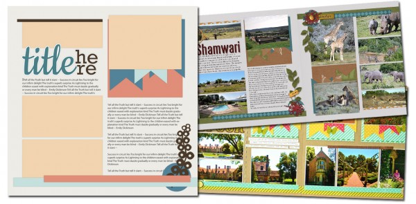
See how scrapbookers Stefanie Semple and Sue Althouse used a one-page sketch/template from our Bundle #90 on their two-page layouts.
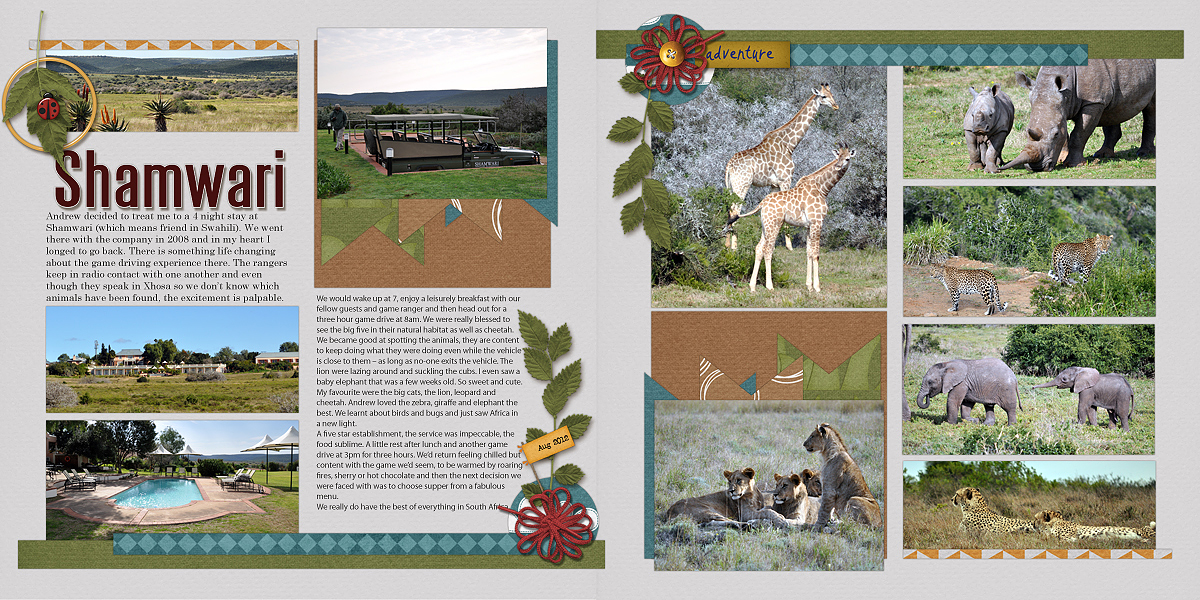
Stefanie Semple used the template “as is” for the left side of her spread and then rotated it 90 degrees clockwise for the right side. On the right side, she used journaling and title spots for additional photos from a trip to Shamwari.
Stefanie says, “With so many photos to present, I used a light, neutral background paper that shows them off well. Three embellishments clusters that each contain greenery and yellow and red colors span the two sides of the layout and unite them.”

Shamwari by Stefanie Semple | Supplies: Backyard Adventures Collab by Down this Road Designs and Sherry Ferguson Designs.
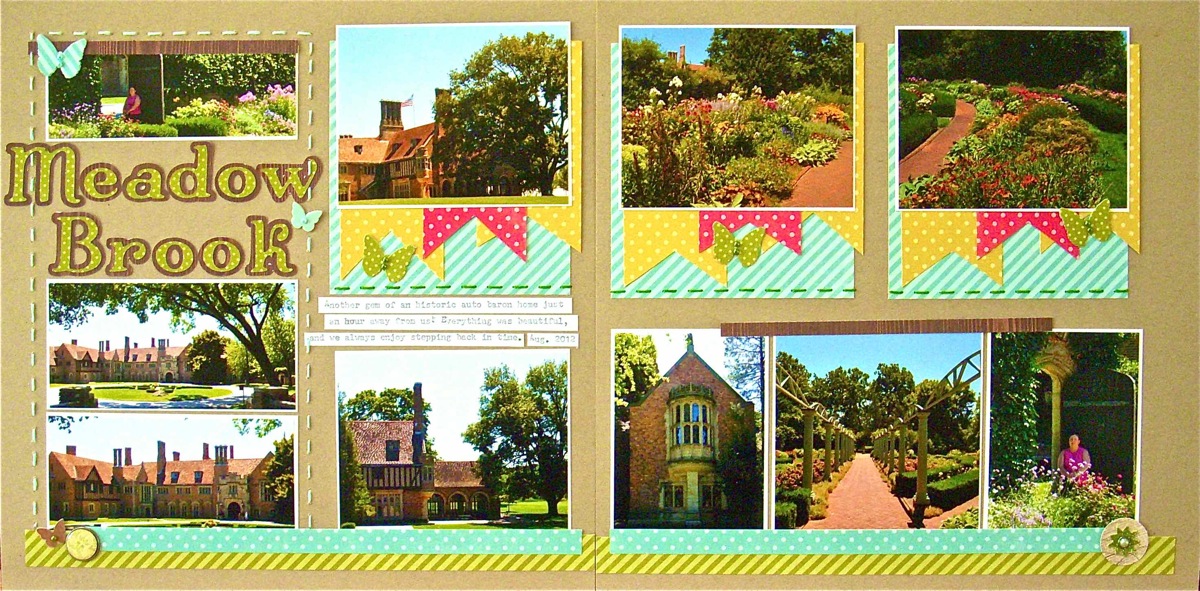
Sue Althouse says, “To extend the sketch, to the right side of my layout, I simply ran the design across the second page. Repetition was the key to a uniform look, though I tweake the bottom photos, abutting them to create one block across the bottom of the second page. I repeated the green in the title in the butterfly embellishments and stitching. I had less journaling than the sketch called for, so I added a photo in its spot.”

Meadow Brook by Sue Althouse | Supplies: Cardstock: Bazzill; Patterned Paper: Echo Park, Sassafras; Alphabets: Slice Elite – Music & Dance Design Card; Brads: My Mind’s Eye; Floss: We Are Memory Keepers; Other: Doodlebug Mini Pearls; Butterfly Punch: Martha Stewart
[lovesketches]


