by Debbie Hodge
If you love playing with design, and want a new challenge, step away from the grid and the block for today (you’ll want to get back to them tomorrow because they are fabulous foundations) and try working with multiple clusters.
[twocol_one]
Using multiple clusters is a less-frequently used design but one that has lots of room for variations and play with product and flow.
[/twocol_one]
[twocol_one_last]
[/twocol_one_last]
Debbie Hodge‘s “Be Happy” has three clusters, each isolated from the other by white space. When arranging and embellishing, Debbie treated each cluster both individually (does it look good on its own?) and as a part of the whole (are there repetitions that unite and is there flow across the clusters?)
We have a page sketch and free layered template for this layout if you want to give it a try. Debbie says “This sketch makes a pretty page and offers lots of opportunity to have fun with borders and embellishments.”
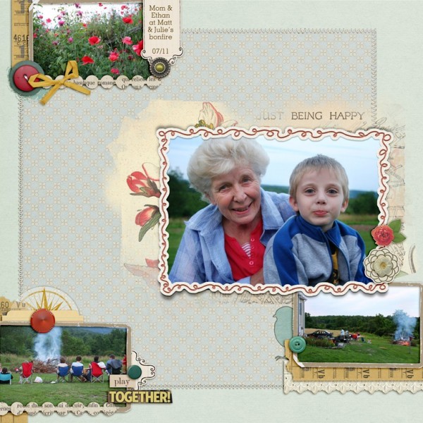
Being Happy by Debbie Hodge | Supplies: Sweater Weather, Wildflower, Interlude by One Little Bird; Chasing Fireflies by Paislee Press; Collageable No 2, Doodle Do Frames No 2, Paper Frames Kraft No 1, In Text Paper Pack, From my Bookshelf Blendables No 3 by Katie Pertiet; Ransom Words by Vicki Stegall; Thankful for You by Jenn Barrette; Duly Noted by Leora Sanford; Mellow by Lynn Marie; DIY Board Game by ViVa Artistry
As you make a page with multiple clusters, consider always:
- does each cluster look good on its own?
- does each cluster work with the piece as a whole?
For it to work with the whole, create unity by using repetitions with variety and by attending to flow.
Amy Kingsford used the sketch set that Debbie’s “Being Happy” is based on to lay the foundation and hash out the general placement of her clusters.
Amy says, “I used just two photos and created a third cluster with a digital mason jar to hold my title. I created rhythm and unity with the repetition of motifs and colors. The most obvious repetition is of the butterfly, which I used in each cluster but in different ways.”
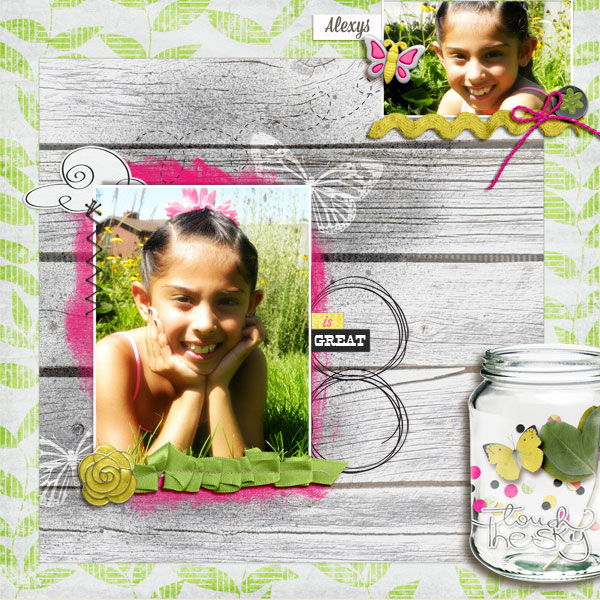
Eight Is Great by Amy Kingsford | Supplies: Butterfly Flyaway by Sugary Fancy Designs, Butterflies Spritzed by Sahlin Studio and Template #85 by Get It Scrapped.
Christy Strickler scrapbooked photos of her son and husband. Both of them are very important to me, says Christy, but in different ways, so I wanted them to each have their own pocket. The pockets are cut from old denim jeans and hearts spill out onto the photos.”
Christy arranged three clusters in a visual triangle that keeps your eyes circling the page. There are two pocket clusters and one title cluster. They are united by the embossed cardstock base in each as well as the repeating reds and blues.
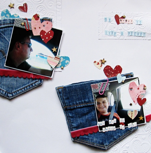
My Heart is Like a Pocket by Christy Strickler Supplies| Cardstock: Colorbok; Patterned Paper: Fancy Pants; Alphas: Pink Paislee, American Crafts; Embossing Folder: Spellbinders; tape: My Mind’s Eye; Other: denim pockets, paperclips
Meghann Andrew scrapbooked three photos from a baseball game, giving each its own cluster on a pieced background. Each photo is matted with dark navy and the colors red and blue are repeated in each cluster. The topmost cluster is connected to the title by a strip of tickets.
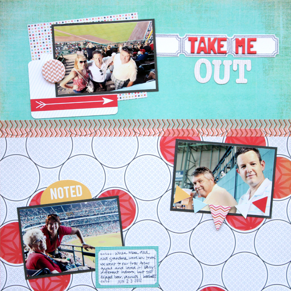
Take Me Out by Meghann Andrew | Supplies: Cardstock- Bazzill (white, grey); patterned paper- Basic Grey (teal, multi-colored polka dot), American Crafts (red), Studio Calico (circles); washi tape- October Afternoon; chipboard letter stickers- Basic Grey; corrugated letter stickers- Pebbles; die-cut shapes- Studio Calico (folder, ‘noted’ & small pennants); chipboard pennant- October After-noon; journaling spots- Elle’s Studio; stamp- Studio Calico; ink- Stampin’ Up!
Doris Sander says, “This hilarious series of photos is of my two little nieces getting in a fight over a basket at the beach. They usually get in at least one fight each time they get together, but I know they’ll be the best of friends when they grow up just like their mothers.” There are three clusters on this page: the grouping of three photos with clock hand and ephemera at top left, the single photo at top right and the flower bleeding off page bottom. In each cluster, elements are flush with (and even bleeding off) page edge. (See compositions that go to the edge.) Mist and pink flowers are scattered in the white space between clusters.
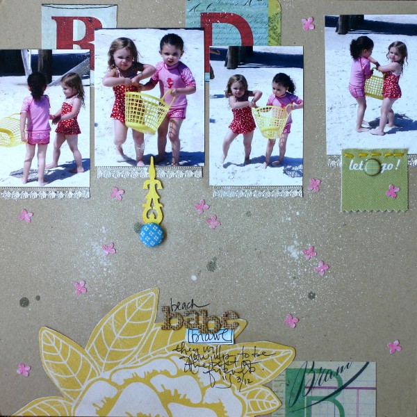
Supplies | cardstock – Bazzill, patterned paper – Basic Grey, Crate Paper, punch – Martha Stewart, mist – Studio Calico, chipboard alphabet – American Crafts, brads – Crate Paper, fabric tag – Ormolu, clock hand – vintage, other – embroidery floss, German foil
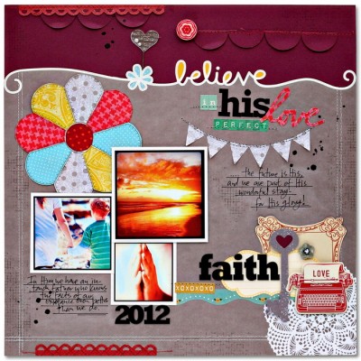
On Believe in His Love, Kim Watson wanted to speak about her faith and the security she feels knowing that the God of the universe has her back, “that my place in history is already secure, all because of His love, not by anything I had done or could ever do.”
The clusters here flow into one another and lack the obvious isolating white space on the pages above Each cluster, though, has a strong focal point on its own, and the three clusters are united by repetitions of colors, black alpha stickers, and the overall structure of the page.

Cardstock: Bazzill, Patterned paper: American Crafts, Crate paper, Jillibean Soup; Stickers: American Crafts, Ki Memories, Crate Paper; Alpha stickers: Glitz Believe by Kim Watson | Supplies: Designs, October Afternoon, Jillibean Soup; Pin: 7 Gypsies; Buttons: Crate Paper; Ink: Clearsnap; Pen: Sakura
Debbie Hodge‘s “Winter Carnival” has just two clusters. Each one holds multiple photos and the smaller photos at top right are layered with title and journaling. Each cluster is a triangular grouping and the sit diagonal from one another, each snuggled into a corner of the page.
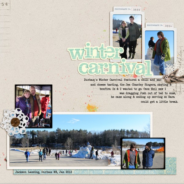
Winter Carnival by Debbie Hodge | Supplies: Retrouvailles by One Little Bird and Vinnie Pearce, Antoinette by Shannon Hegarty; Vintage Pointsettia by Krista Sahlin, Touch of Magic Sweet Awaits by Kitty Designs; Restoration by Gina Cabrera; Handcut Snowflakes by Valerie Wibbins; Woodcut Alpha by Crystal wiilkerson
Terry Billman says “I often like to scrapbook a black-and-white photo on a white background paper with generous white space and red accents. Here one cluster features my dog blended into the canvas and surrounded by acrylic hearts. Loopdaloops lead the eye from this cluster to the second cluster at bottom right which holds the title an embellishments.”
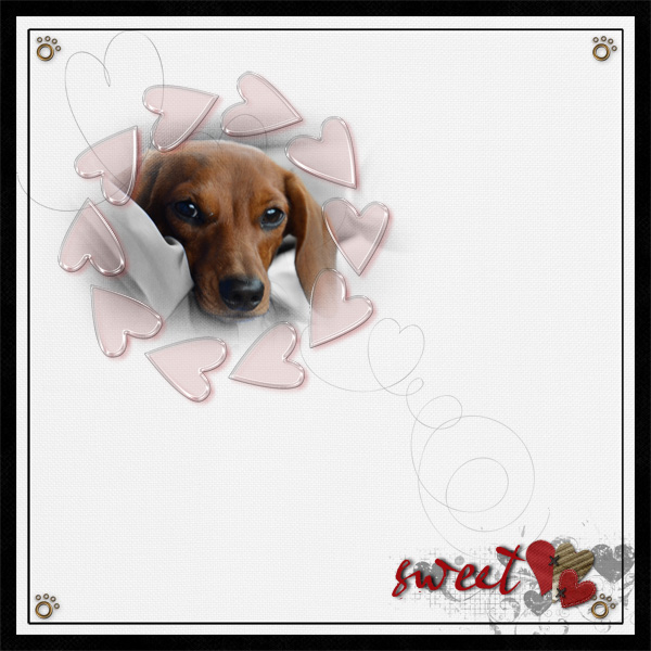
Sweet by Terry Billman | Supplies: Maplebrook Studios: Aki Solids
Just Linens No. 18; Katie Pertiet: Ledger Love 1, Flossy Stitches, Defining Words; Cathy Zielski: Love Fest; Anna Aspnes: Art Play Palette Smooch, Heart Loopdaloop No. 2, Fotoblendz Clipping Mask No. 2; Patti Knox: Clothespinned Words, Absolutely Acrylic Hearts, Gone to the Dogs
Barb Brookbank says, “I created one big cluster of photos, titlework, and embellishments that is the page focal point. A journaling circle sits below and two the left, and I always love to add a little cluster going off the page, the one here in the upper left corner.
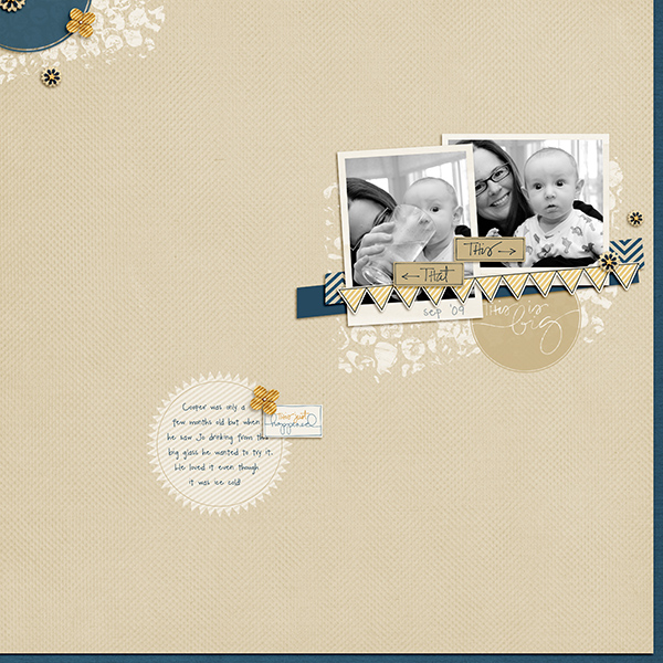
This Is Big by Barb Brookbank | Supplies: Kit: Big Ideas by One Little Bird (this kit won’t be released until after September 1st)
Font: DJB My Mood Ring Says Blah by Darcy Baldwin
Doris Sander has scrapbooking a lighthearted look at her niece. “At this young age she has a happy go lucky perspective on life that makes her fun to scrapbook. She is indeed a happy little birdie.”
“While I often like to cluster my photos, title, and journaling all together, I experimented with a different design here. Each photo and the journaling block are in a separate spot on the canvas. This is a harder design to manage than one that clusters all elements at one spot. It’s harder to create a focal point and cohesiveness.”
“I’ve tackled the focal point issue by clustering several embellishments around the title to make it stand out under the dominant photo. I then gave the page cohesiveness by uniting the two photos and the journaling block by adding a chipboard tab to each.”
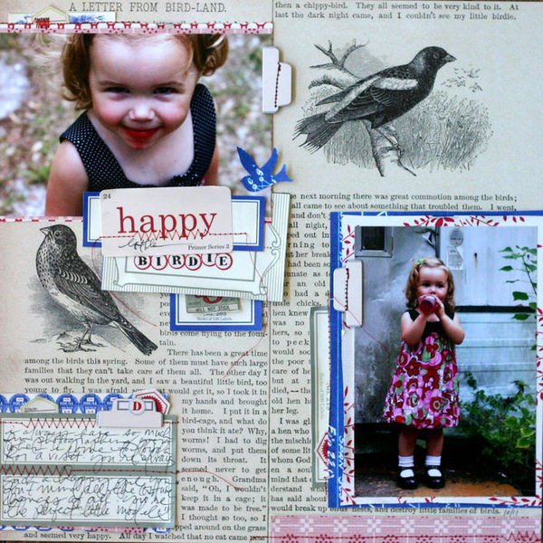
Happy Birdie by Doris Sander | Supplies: Happy Little Birdie by Doris Sander | Supplies: patterned paper, stickers, chipboard – Jenni Bowlin Studio, punch – Jenni Bowlin for Fiskars
Give the multiple-cluster composition a try and link us up to it. Remember to pay attention to each cluster on its own AND as a part of the greater whole.

