by Debbie Hodge
 When you incorporate visual flow into your scrapbook page design, you guide the viewer’s eye through it, ensuring they understand what’s important about the story you are telling.
The most common types of scrapbook page flow are visual triangle, z-flow, circular flow and diagonal flow.
Composing a photograph so that your subject is at a diagonal almost always makes a more compelling shot. The same principle can be applied to page design. In this article are 3 approaches to creating diagonal flow on the page.
Your best tools for creating flow on the page are shape, placement within space, contrasts, repetitions, and alignments. See how they work on these pages.
Two points on a line
The diagonal line of your flow does not need to be explicit. Set up at least two points along your diagonal that stand out and that the eye will connect to one another.
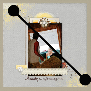
While the focal point of “Beauty is right here” is a single centered photo, embellishment clusters at top left and bottom right of the page establish a diagonal line that guides the eye down through all of the elements. The clusters sit isolated by generous white space. The white embellishments contrast with the canvas and catch they eye. Repetitions of white guide the eye down the diagonal.
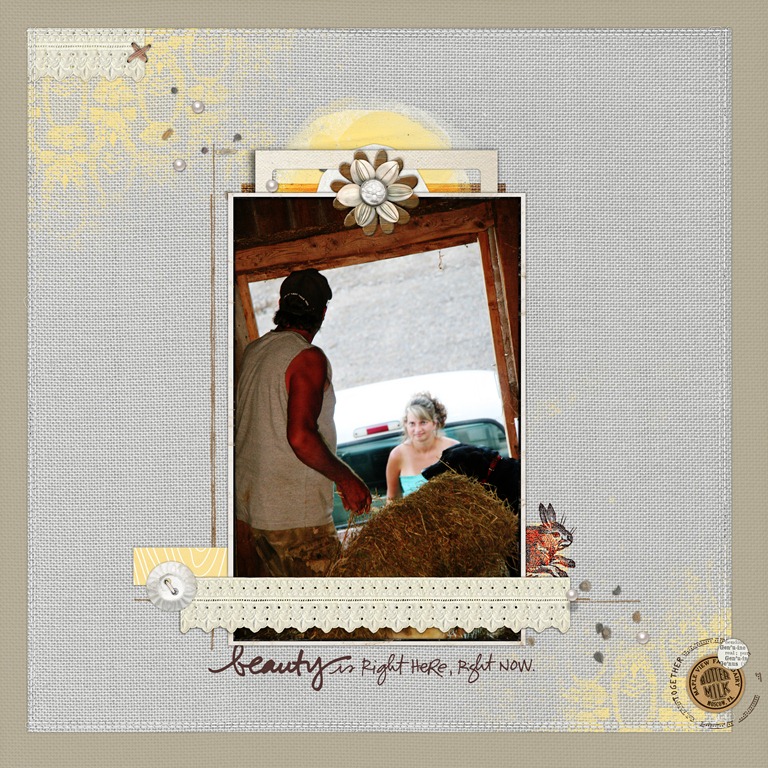
Beauty by Debbie Hodge | Supplies: ArtPlay Palette Genuine, ArtPlay Palette Easter Bunny, ArtPlay Palette Floralis, ArtPlay Palette Ex Libris ValueSet, ArtPlay Palette Find My Way ValueSet by Anna Aspnes; Faux Bois: Spring Paper Pack by Andrea Victoria; Oiselet Rouge Element Pack, Rimmed Framers No. 01, Vintage Photo Frames No. 24, Vintage Milk Caps No. 01, Wooden Flowers No. 01, Around Words Brushes and Stamps by Katie Pertiet; Fasten Its! No. 03 by Pattie Knox; Just Linens Paper Pack No. 01 by Maplebrook Studios.
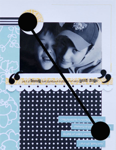
Betsy Sammarco’s “Good Boys” looks much different from the page above, but it shares a similar approach to creating diagonal flow. An embellishment point at top left and journaling strips at bottom right stand out and lead the eye down and through her photo, title, and message.

Good Boys by Betsy Sammarco | Supplies: Patterned paper: American Crafts, Flair button: American Crafts, quotation brads: Around the Block (no longer manufactured), die cut cardstock: Bazzill
A diagonal swath
Arrange all of your elements in an organic cluster that stretches along the page’s diagonal

Amber Ries not only grouped her elements in a cluster placed along a diagonal line, she leads into and out of the cluster with loopy handdrawn lines. She kept the weight of the journaling block (which extends out of the diagonal) lighter by avoiding any strong alignment.

Zwischenstop by Amber Ries | Supplies: Kitty Designs: flight Collection; Anna Aspnes: ScriptTease Travel | LoopDaLoop Arrows | Big Wide World | dotted korners and edges | Find My Way; Paula Kesselring: art in the box
Shape

The cluster on “Memorial Day” stretches from top left of the page to bottom right. Repetitions of white and blue reinforce the downward diagonal line.
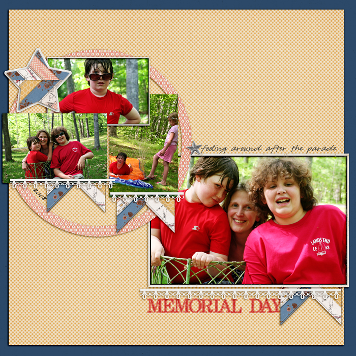
Memorial Day by Debbie Hodge | Supplies: Retrouvailles by One Little Bird and Vinnie Pearce; Rimmed Framers No 1, Academic Sanded Alpha by Katie Pertiet; Artplay Palette Rockstar by Anna Aspnes
Right triangles
When you’re working with a rectangular/square canvas and the bulk of your elements are arranged below (or above) a diagonal, they end up filling a triangular area.

While the elements on “Something Special” do not fit perfectly within a right triangle, still there are enough points that contrast (and, thus, stand out) to create a sense of a diagonal. Repetitions of color and value contribute to the strength of the line. The bulk of the page’s visual weight and content sits in the area of the canvas down and to the left of the diagonal.
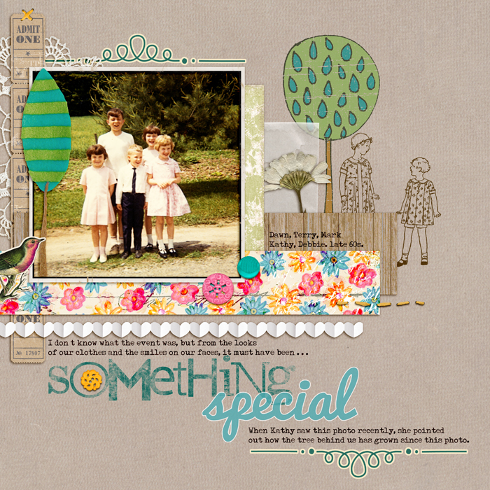
Something Special by Debbie Hodge | Supplies: Retro Spring by Reverie Atelier; Ancienne Bold by Quirky Twerp; Rimmed Framers by Katie Pertiet; Scissored Hearts by Anna Aspnes; Whimsical Borderlines by Andrea Victoria; Kraft Party by Robyn Meierotto; Pressed Petals by Sahlin Studio; A Simple Mixup Alpha by isa Sisneros; Pacifico, Typenoksidi fonts
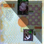
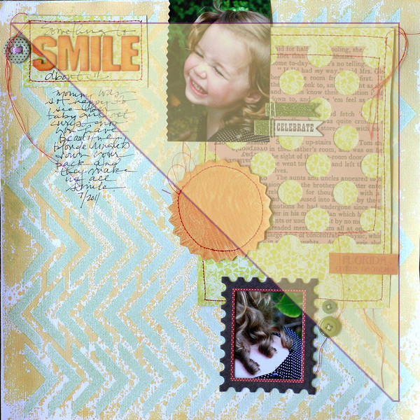
Doris Sander flipped the triangle, putting the bulk of her content in the upper right corner of her canvas and arranging elements to create a strong downward diagonal line that completes the triangle. The challenge with this design is to compose a page that has balance; i.e., that doesn’t feel like it’s going to topple down into the bottom corner. The pieces that extend across the diagonal provide the stabilation that gives the page visual balance. Just as Amber avoided strong justification of a journaling block that extends across the diagonal on “Zwischenstop, so, too, has Doris done on “Smile.” The result is an airy spot of text that adds balance but without becoming too heavy.

Smile by Doris Sander | Supplies: chipboard letters, foam stamp – Jenni Bowlin Studio, paint, ink – Jenni Bowlin for Ranger, stencil – The Crafter’s Workshop, chipboard elements, patterned paper – My Mind’s Eye, buttons - vintage
Create diagonal flow on your next page with one of these approaches:
- define two points on a line,
- arrange elements in a diagonal swath,
- compose within a right triangle.
[current]

