by Debbie Hodge
The canvas is the piece of paper (or digital background) upon which you build your page. It’s what holds all of your elements, and it defines the space within in which you’re working.
The canvas shape and size is one of the choices you have to make, and the base material is another. Here’s a look at frequently used bases, as well as the opportunities and challenges each offer.
Solid Neutral Canvas
A plain white, cream, kraft, or black cardstock base is usually the easiest base upon which to place photos and other elements so that they stand out well. A neutral base is often a low-key part of the overall design. Not only do you have choices with regard to color, you can also choose the best texture for your photos and subject.
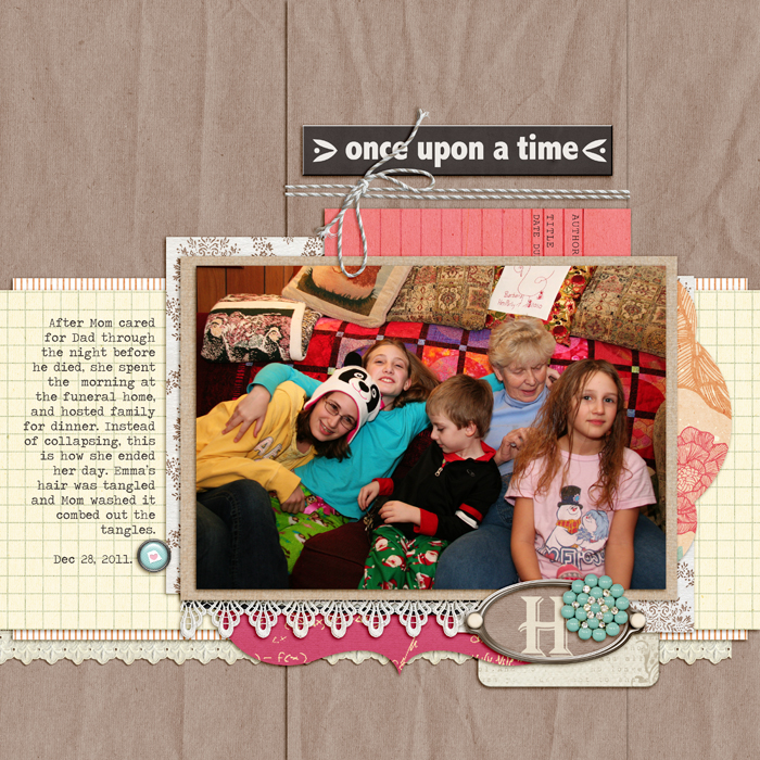
“H” sits on a crumpled kraft base that makes a warm and homey base for this page of grandkids on the sofa with Grandma.
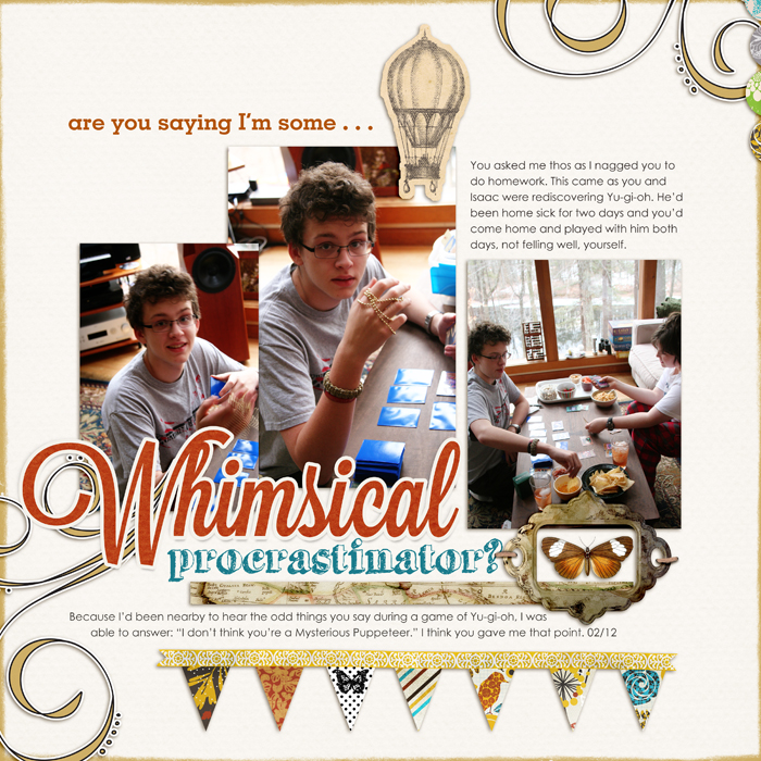
The elements on “Whimsical Procrastinator” sit on a textured white base that shows off the photos and colorful elements well.
A neutral canvas is also an opportunity for some misting or inking. Doris Sander used a Bingo Card mask and misting on white canvas for “9 Years.”
Solid Color Canvas
When you layer on a base of color, there’s a good chance that base color will become the dominant color in your color scheme.
The rich blue canvas on Kayleigh Wiles‘ “Keep Calm” is great a great choice for a page on calmness, since blue often has a soothing effect. The blue is the dominant color in this high contrast scheme with complementary blues and oranges as well as complementary greens and pinks.
Keep Calm by Kayleigh Wiles | Supplies: Lucious Kit by Maplebrook Studios; Vintage Photo Frames No. 25, Basic Polka Dot Ribbons No. 01 and Tabbed Dates by Katie Pertiet; Hint at it No. 08 Brushes by Lynn Grieveson; Easy Curled Edges No. 01, LoopDaLoop Artstrokes No. 04 BrushSet, ArtPlay Palatte Special One & Seafoam by Anna Aspnes; Painted Christmas Words Brushes and Stamps by Ali Edwards
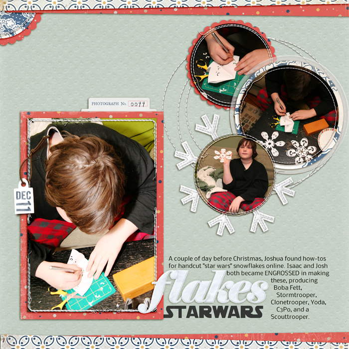
The background on “Star Wars Flakes” is a pale textured blue that’s more subdued than the base on Kayleigh’s page. The photos and white and red mats pop against it.
Patterned Paper Canvas
If you using patterned papers, there will be times you’ll want them as your page base. It’s often a little tricky making sure the photos aren’t overwhelmed by the paper, but there are lots of ways to make it work, including:
- using tone-on-tone or tone-with-neutral patterns,
- using paint or brushwork to create a foundation for your elements, and
- matting your elements.
Check out other ideas for making patterned-paper work as your page base.
Emily Pitts likes using subtle patterns for pages bases, with tone-on-tone or a graph/ledger patterns topping the list. For “Boy at 13” she chose a diagonally striped paper to move the viewer’s eye in the same direction as her son’s gaze.
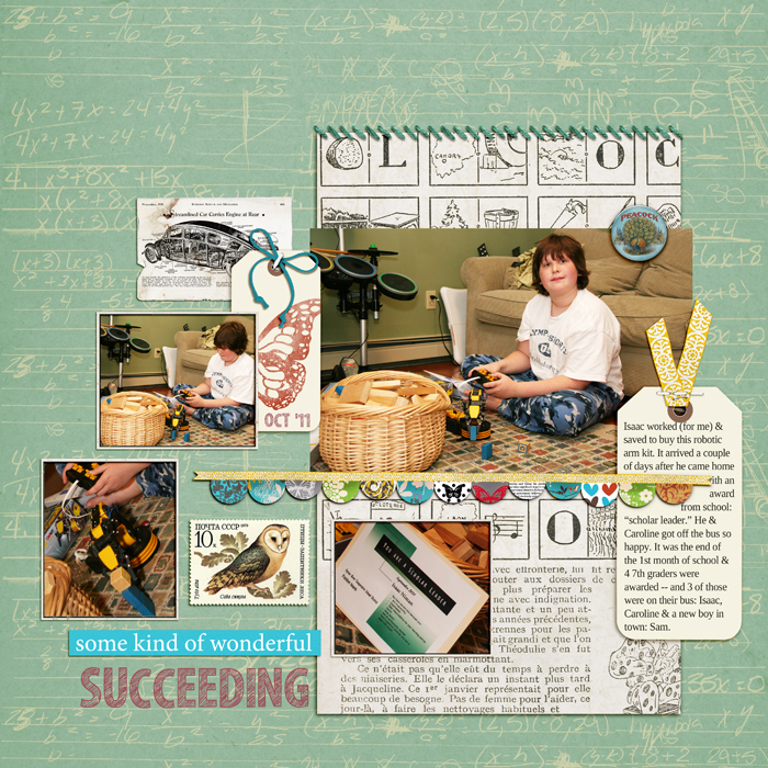
I used high-contrast elements and white photo mats on a subtle school-themed patterned paper base that supports the story on “Succeeding.”
Digitally-Blended Canvas
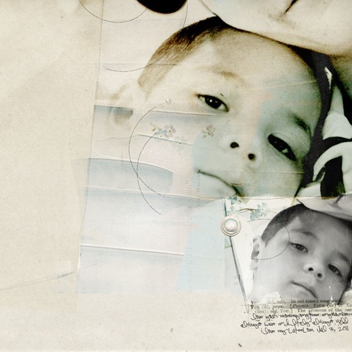
On this page, Anna Aspnes used a predesigned artsy background from one of her Artplay Palette products. She blended two photos using the Photoshop layer mask function and soft distressed brushes. Anna looks for areas of predominantly solid and preferably neutral color on any predesigned background as a spot for housing photos.
Photo as Canvas
An enlarged photo is another option for your page canvas.
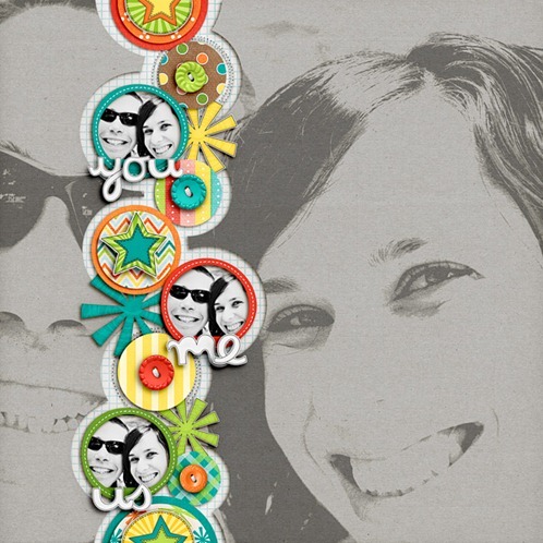
Lynnette Penacho added a blended large-scale photo to her background paper. She says, “I love the fun graphic pop-art feel the blending adds to the page.”
Pieced Canvas
Your canvas doesn’t have to be just one solid piece. Here’s a look at a simple pieced canvas. (Check out more examples of pieced backgrounds.)
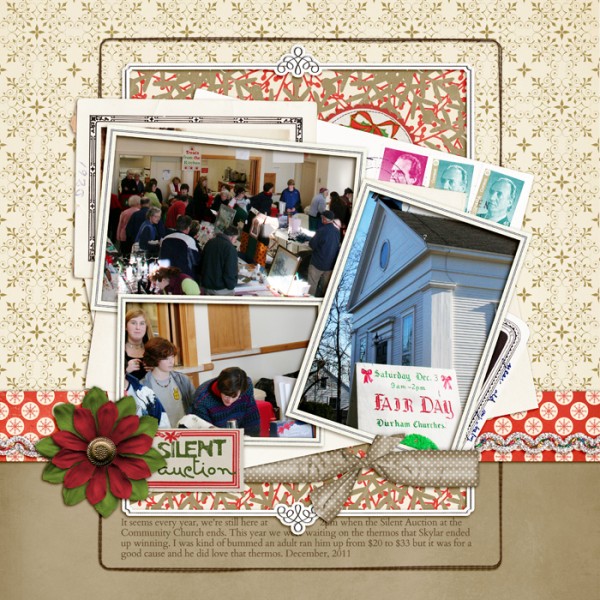
“Silent Auction” presents photos, title, and several pieces of ephemera in a haphazard cluster mounted on a backdrop of kraft and gold-on-white patterned paper topped with a bold red strip.
“Silent Auction” by Debbie Hodge | Supplies: Holiday Cheer, Round Robin by Lynn Grieveson; In the Loop Frame, Making a List by One Little Bird; Kitschy Christmas by Jenn Barrette and Sahlin Studios; Another Very Small Alpha by Allison Pennington; Stitched by Anna Brown Borders No 1; Massana Script, Cardo fonts
Take a look at your pages–and pages by others that you like. What’s your canvas preference? And what do you want to try?
We’ve studied the Scrapbook Page Canvas in detail at Masterful Scrapbook Design with paper and digital designers. Find a 40-page pdf seminar, 5 live webinars (with recordings), 7 focused articles, and 2 annotated galleries when you click here.

