Pieced backgrounds are great ways to incorporate more papers and add interest to your canvas.
by Debbie Hodge
Your scrapbook page canvas is the base upon which you build your page.
You might use solid cardstock, patterned paper, a die-cut shape, a base altered with mediums like paint and ink, or – how about a pieced background?
Here are 4 ideas for starting your next scrapbook page with a pieced-paper canvas.
1. Classic pieced background
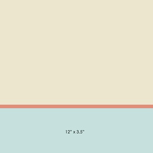
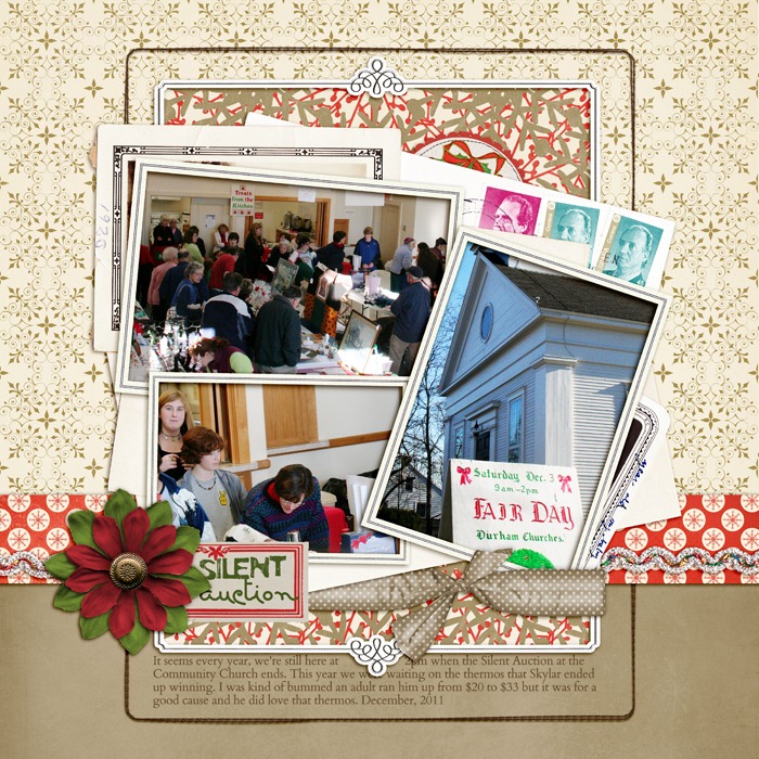
This is a classic pieced background format.
One-quarter to one-third of the page is filled with one paper; the remainder is filled with another; a narrow strip tops the area where they meet. The bands may run horizontally or vertically and sit to either side, top, or bottom.
This simple base lets you use more papers and add interest, yet is clean enough to support a busy cluster of elements as on “Silent Auction.”
“Silent Auction” presents photos, title, and several pieces of ephemera in a haphazard cluster mounted on a backdrop of kraft and gold-on-white patterned paper topped with a bold red strip.

“Silent Auction” by Debbie Hodge | Supplies: Holiday Cheer, Round Robin by Lynn Grieveson; In the Loop Frame, Making a List by One Little Bird; Kitschy Christmas by Jenn Barrette and Sahlin Studios; Another Very Small Alpha by Allison Pennington; Stitched by Anna Brown Borders No 1; Massana Script, Cardo fonts
2. Blocked background (OR “Crazy Quilt”)
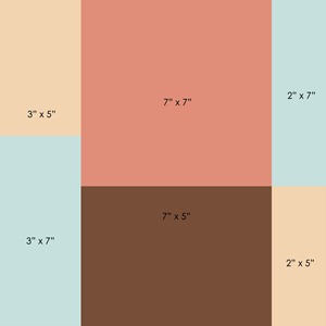
This pieced background could be a sketch for a blocked page, with the individual blocks providing homes for photos, title, and journaling.
What if, though, instead of filling those blocks with your primary page elements, you filled them with papers, and then built a cluster of photos, title and journaling that you layered on top of this base?
Or . . . think of this design like a “crazy quilt,” and use it as an opportunity to use several patterned papers.
When making “Hodge,” I selected patterned papers with yellows (and I let in just a bit of pink). This unified the background and kept it from overwhelming the photos and foreground elements. If your elements are getting lost on the “quilt,” add a swath of paint or ink. I used a digital “fotoblendz” by Anna Aspnes and clipped white paper to it to give my cluster a subtle foundation and help it stand out.
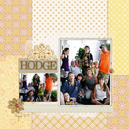
“Hodge” by Debbie Hodge | Supplies: La Belle Vie, PageKraft by One Little Bird; French Summer by Lynn Grieveson; Artistry de Blanco Element Pack, Academic Sanded Alpha, Oiselet Rouge Element Pack, King Me by Katie Pertiet; Oak Tree by Sarah Gleason; Brad Bonanza 3 by Pattie Knox; Stitched by Anna Cream, Fotoblendz No 5 by Anna Aspnes; Treasured Moments by Sugarplum Paperie; Masanna Script font.
3. Big contrasts
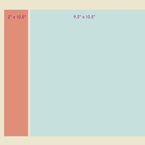
Rather than blocky rectangles with height-to-width proportions much like those of your photos, try using longer (or taller) pieces. Here, an 8” wide piece spans most of the height of the page and is flanked by 1.5” and .5” vertical strips. A narrow horizontal band sits below the wide center piece and two of its flanking strips, allowing the narrowest strips to span the entire canvas.
It makes a great backdrop for a complex cluster of elements surrounded by generous white space. The pieced background is the white space, and it’s unexpected and interesting.
I mixed simple patterns with kraft for my background so that the foreground would remain the focus.
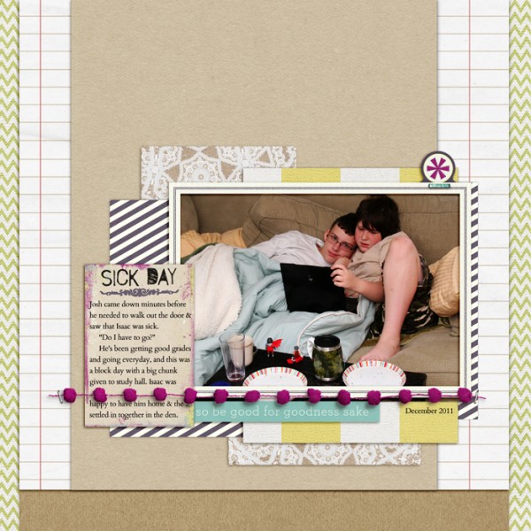
"Sick Day" by Debbie Hodge | Supplies: Star On Top by Amy Martin and One Little Bird; Making a List, PageKraft by One Little Bird; Brown Paper Packages by Krista Sahlin, Very Small Alpha by Allison Pennington; Designer Mixed, Cardo fonts
4. As middleman
Take that simple background in the first example and do something unexpected. Leave a narrow gutter instead of abutting the two pieces or topping them with a strip. Allow a margin or even bleed the grouping off one edge of the canvas.
With this approach, the pieced grouping is no longer your canvas base, but, rather, a foundation that comes between your canvas and your page elements.
The radiating stripes on the narrow band of patterned paper on “The Double-Nickel Birthday” lead the eye into the grouping mounted on top of the pieced foundation.
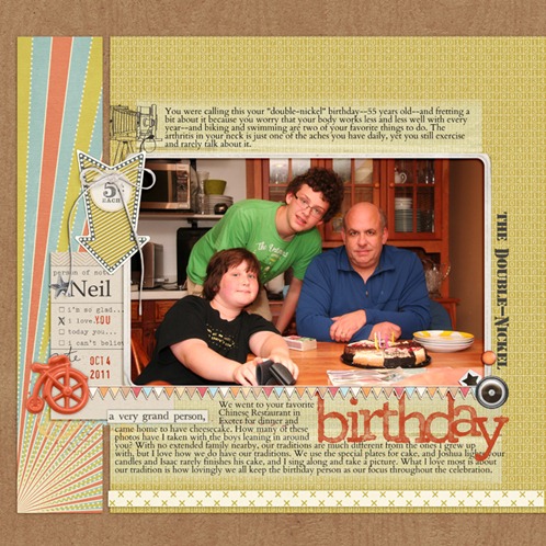
“The Double-Nickel Birthday” by Debbie Hodge | Supplies: Lemonade Stand by Taylor Made; Artplay Palette Rockstar by Anna Aspnes; Fall Fun Kit, Vintage Photo Frames No 26 by Katie Pertiet; Epic Kit by One Little Bird, Biograffiti, Paislee Press; Warm October Kit by Lynn Grieveson; Messy Slab Alpha by Cathy Zielske; Kreased Transfers by Anna Aspnes; La Belle Vie Kit, Westover Kit by One Little Bird; Photobooth Kit by Paislee Press; Australian Flying Corps Stencil, Cardo fonts.
Has this inspired you to create a pieced background? Or are you already making pages with pieced backgrounds?
We’ve studied the Scrapbook Page Canvas in detail at Masterful Scrapbook Design with paper and digital designers. Find a 40-page pdf seminar, 5 live webinars (with recordings), 7 focused articles, and 2 annotated galleries when you click here.

