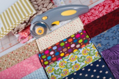
Whenever I look through my grandmother’s record books, my favorite part is looking at the beautiful fabric swatches she collected from the 30s and 40s. In addition to the beauty of these patterns, I’m impressed by how many of them have stood the test of time and are still used today.
Look at your wardrobe, your home decor, and your scrapbooking stash, to see that some patterns are timeless and to get ideas for using those patterns on your scrapbook pages.
A few fun facts about classic patterns
- Dotted Swiss was first made on hand looms in Switzerland in 1750.
- Denim pants are now referred to as “jeans” because they were once worn by Italian sailors from Genoa, whose countrymen are referred to as “Genes.”
- Damask was given its name based on its origin from Damascus, Syria in the Middle Ages.
- While the name itself comes from Scotland, the paisley pattern is an ancient vegetable motif that originates from Persia.
- Because of the complicated process by which lace is made, prior to the 1500s lace patterns featured geometric shapes, rather than the more intricate floral designs we see today.
- Tartan plaids have crossbars of at least three or more colors and their designs are often used to identify different Celtic clans.
- While gingham is now widely recognized as a “checked pattern” its name comes from the Malaysian word for stripes–as it was originally a striped fabric when the Dutch began importing it in the 17th century.
- Polka dots were named such because the pattern emerged during the era of the polka dance in the mid to late 1800s.
- In 2006, the University of Alabama football team wore houndstooth uniforms to commemorate former coach Paul “Bear” Bryant, who was well-known for his selection of houndstooth hats.
Ideas for using classic patterns on your scrapbook pages
1. Pair classic patterns for easy mixing.
Classic patterns have earned the title “timeless” because they have been used generation after generation.
Because our eye easily recognizes these patterns, they have become a “basic” or “staple” when used in design–and they are, thus, easy patterns to mix and match.
On “Cutie,” I easily mixed colors and patterns by sticking with the basics. The houndstooth and dotted Swiss patterns give a sweet and trendy feel without being too busy.
“Cutie” by Amy Kingsford
2. Add texture and romance with pleated strips of lace-patterned paper.
Wilna does a great job of completing the shabby-chic look of her layout, “You Are You” by adding a pleated strip of lace-inspired patterned paper.
The pleating lets her reclaim the dimension found in fabric. The charming pattern reinforces her feminine and romantic theme, while infusing the soft texture and intricate detail of lace, itself, into her page.
“You Are You” by Wilna Furstenberg
(from Masterful Scrapbook Design, April, 2011)
3. Repeat the shapes of a paisley pattern for unity.
In her layout “Posing,” Debbie echos the overall shapes and motif of her paisley background in the elements she’s chosen to embellish with. The feather embellishment, flourish frame, lace trim and damask border all repeat the shapes, angles and patterns of the paisley motif.
By using contrasting colors and larger scale elements, she creates a sense of unity throughout the page without allowing the elements to get lost in the background.
“Posing” by Debbie Hodge
4. Create a one-of-a-kind plaid background with leftover strips.
Not only do I love how the dynamic plaid background on Celeste Smith’s “Pumpkin Mush” utilizes leftover paper scraps, I also love that it leaves the layout needing little else besides a title and journaling.
The combination of straight and zig-zag stitching within the plaid pattern is a subtle touch that adds dimension and a bit of fun.
“Pumpkin Mush” by Celeste Smith
(from Masterful Scrapbook Design, April, 2011)
5. Incorporate the characteristics of denim for a laid-back, masculine feel.
The denim background used on my layout “Special Bond” is the perfect touch of masculinity for the “boys-only” theme of this page. The distressed texture and the stitching characteristics of denim are also represented here–adding just a touch of detail and interest to this fairly simple page.
“Special Bond” by Amy Kingsford
6. Use small bits of several classic patterns for an eclectic look.
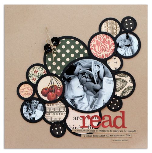
By using small portions of a many classic patterns in frames, Lisa created a charming page foundation for her layout “Read.” These classic patterns in combination with vintage ephemera give the page a nostalic and old-fashioned tone. The fun arrangement and mixture of prints creates little need for extra embellishments.
7. Use polka dots to set a playful tone.
Different patterns and the way in which they’re rendered will evoke different moods in the viewer. Because of the many possible combinations of color and size in polka-dot pattern, it’s an especially great pattern for signalling tone.
On “Let Your Imagination Take Flight,” I filled black outlined dots from a digital brush with yellow to create the page foundation. The result was a whimsical and playful tone that guided the rest of my pattern and embellishment choices. I repeated the polka dot print throughout the layout, so there was no question that this page was all about FUN!
“Let Your Imagination Take Flight” by Amy Kingsford
8. Use ink on embossed paper to get the look of aged damask.
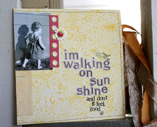
Damask can make a bold statement. As a background, though, a large-scale damask pattern can be a bit much. On “I’m Walking On Sunshine” Doris Sander inked an embossed damask paper to create a background with aged and muted look. She needed minimal embellishments on this canvas and created a page with a classy look.
9. Use a small and subtle dotted swiss for eye-catching titlework.
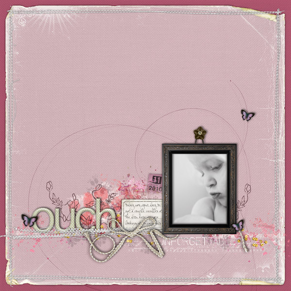
Speaking of timeless, check out the subtle and romantic effect the dotted Swiss title adds to Kayleigh’s already delicate page “Ouch.” The small-scale pattern gives her layout a touch of texture. Their color contrasts with the background while creating visual connection with her photo. The results is that her title is a secondary focal point on the page.
10. Replicate the texture and dimension of fabric.
Textured cardstock, laser- and die-cut papers and borders, doilies, and embossing can all be used to add texture and dimension.
“I’m a Robot” by Cindy Liebel is a rich mixture of color, pattern, and texture. Cindy used a number of classic motifs for successfully mixing so many colors and patterns on her page. And then she went a step farther with several techniques to enhance the texture of those patterns.
Cindy re-created the texture of lace with the use of border punches and doilies. She mimiced the dimension of dotted Swiss by using small pebbles and textured cardstock. The result is an engaging page full of energy and depth.
“I’m a Robot” by Cindy Liebel
(from Masterful Scrapbook Design, April, 2011)
Take a look around. In what ways do you find classic patterns impacting your home, wardrobe and scrapbook pages? What are your favorite combinations and what are the new ones that you’ve been inspired to try?
[akingsford] [patternedpaper]


