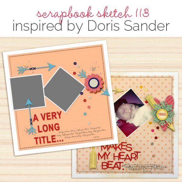
 This free scrapbook page sketch comes from a page made by Doris Sander for the Oomph & Polish class in the Get It Scrapped Membership, where members have access to a library of over 100 layered templates and page sketches, searchable by # of photos and layout type.
It’s unique design is sure to add just the right amount of tension and punch to your next scrapbook page, we can’t wait to see how you use it!
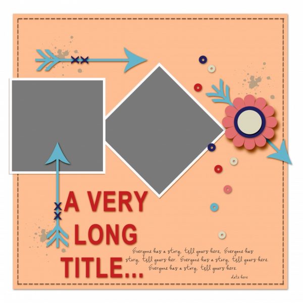
Sketch and Layered Template made by Amy Kingsford based on a layout by Doris Sander for the GIS Membership Class Oomph & Polish
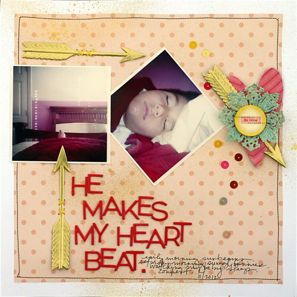
He Makes My Heart Beat by Doris Sander | Supplies: cardstock – Bazzill, patterned paper, sticker – Crate Paper, chipboard alphabet – American Crafts, chipboard heart – Jenni Bowlin Studio, sequins – Pebbles Inc., doily, arrow – German Foil, mist – Heidi Swapp, other – embroidery floss
Doris says, “When I lined up my first photo and the heart, I just naturally placed the middle photo as a diamond. I really liked the look
of square, diamond, and heart all in a row and felt like the diamond tilt gave the photo a lot more presence on the page.”
download template and previews
Get over 150 more sketches and templates with a GIS membership
[hr]
More inspiration…
Looking for more examples of how you might use this sketch/template to inspire your next page? Here are a few inspired pages from our Get It Scrapped Creative Team.
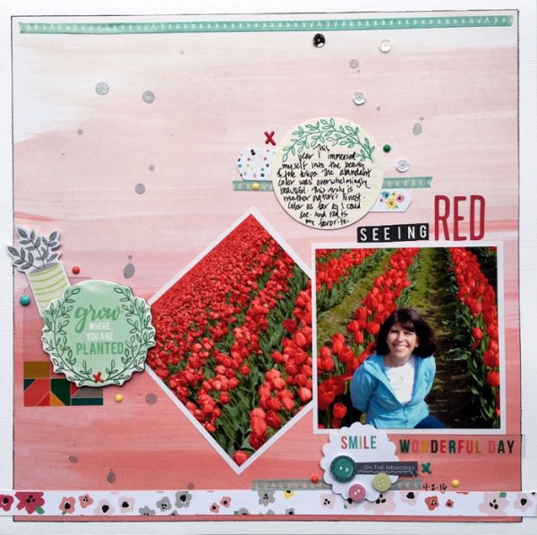
Devra Hunt says, “When i first looked at this sketch I thought it was very sharp, and geometric, and I was excited to use it to scrapbook these photos of beautiful tulip fields. As I began to play with the sketch, I found it to be like designing with a band foundation, but with more shapes. I flipped it upside down, putting the weight of the page at the bottom. That gave more balance and flow to my layout. When choosing my embellishments, I used circular shapes to soften the sharp lines.”
Ronnie Crowley says, “I’m always drawn to templates that include space for a long title. A long title can take the place of journaling on my pages about our dog. Doris used arrows to create flow through the page. I replaced the arrows with a dog leash.”
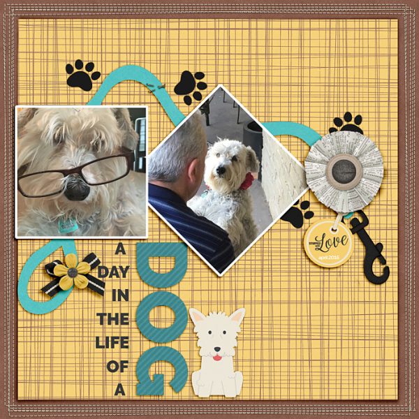
A Day in the Life of a Dog by Ronnie Crowley | Supplies: A. Pennington – Brilliant; K.Aagard – Page Border Stitches, Word Art World – A dog’s life
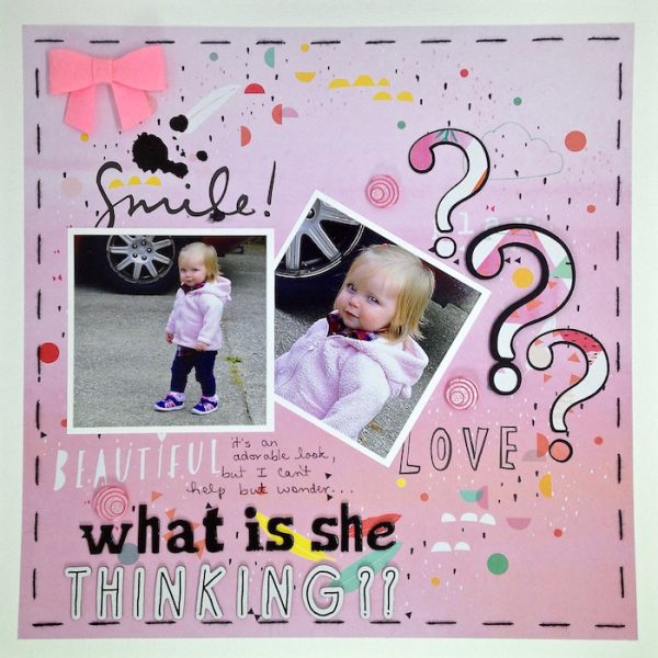
Sue Althouse says, “I was drawn to the interesting shapes, long title and open space in this sketch. My page is about wondering what goes on in the mind of our two-year old granddaughter. I used patterned paper with small shapes arranged in a large circle as my background then added photos and placed other page elements around the circle defined by the patterned paper. Visual triangles of black, pink buttons and textures provide the finishing touches.”

