 Embellishing scrapbook pages with a strong visual triangle is good because it moves the viewer’s eye through your page. While you can add eye-catching complexity with the skilled use of multiple visual triangles, a clean and straight-forward approach also yields stand-out designs.
Did you know that when you work with a visual triangle it’s important to have variety in those three embellishment spots? Yep. It is important — that’s how you get repetitions with variety and emphasis. Without emphasis (or a visual hierarchy) everything takes on the same level of importance and it’s hard for the viewer to know where to start and what matters.
Lesson 1 in Scrapbook Coach 14 shows you just how to make a page with a visual triangle that has clear visual hierarchy. And our creative team shows you how they’ve done that on pages below.
Make a page with three–and only three–embellishing spots. One of these spots will include the title. Each of these spots will have a different visual weight–and, thus, you have created a visual hierarchy that indicates where to start looking and the flow for looking throughout the page. Be sure to incorporate at least one repetition with variety in the three clusters
[hr]
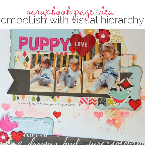
Gretchen Henninger says, “This layout shares the joy of a girl and her dog.”
“The three embellishment spots are: clustered around the title, at the bottom right of the focal photo, and at the bottom left of the page, with the cluster by the title having the most weight. Each cluster is grounded with a blue foundational piece and contains variations of the same elements, including hearts, birds, flowers, and enamel dots.”
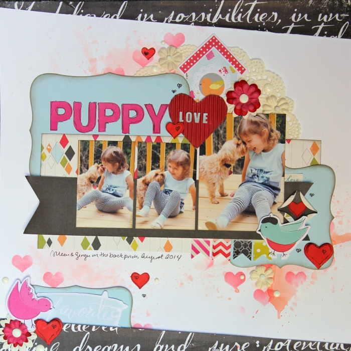
Puppy Love by Gretchen Henninger / Supplies: Paper, Die Cuts, Stickers and Alphas: Fancy Pants Designs (Me-Ology); Ink: Tim Holtz Distress Ink (pumice stone, worn lipstick); Spray Ink: Lindy’s Stamp Gang Starburst (cosmopolitan pink), Glitz Spritz (blazing sun); Stencil: Heidi Swapp; Doily: Bo Bunny; Punch: EK Success (circle); Dies: Simon Says Stamp (hearts), Spellbinders (rectangle), Ellison (square); Enamel Dots: Doddlebug; Other: miscellaneous flowers and brads
[hr]
Andrea says, “I was inspired to make a page from the color combination in a photo of flowers.”
There are three clusters, and the most important and most embellished is the title cluster. Next, going clockwise is the flower with the doily and wire butterflies. Following along you move to the other flower with the brushwork and the bird leads back to the title. There are plenty of repetitions: flowers, butterflies, pink and white. Normally I don’t use patterned paper, but I really like the way the page came out.”
[hr]
Kiki Kougioumtzi says, “While on the train during our travel we played with the facing mirrors which made infinite reflections.”
“The most important embellishment point here is the title cluster. All the elements in it are repeated at two more points forming a visual triangle. I used variations of color, motif, texture and size in my repetitions. The aqua, pink and off-white colors are repeated in varying proportions. A hint of yellow is appearing only in my main cluster.”
“The camera and butterfly motif are repeated in varied sizes (and texture). Mirrors introduce a new texture and they vary in size and form. The reflective attribute is repeated on my title letters. Another texture is enamel dots (that vary in size) and sequins. Sequins form double triangles: one small within my title’s cluster and a bigger one within the composition’s cluster. And finally the dots of my background paper are repeated in the circles of the other clusters of my triangle (punched paper and drawn on the camera motif).”

Mirror play by Kiki Kougioumtzi|Supplies:Pattern paper: Studio Calico, Becky Higgins digital Project Life cards; Enamel dots, sequins: Studio Calico; Paper punches: Fiskars; Other: Mirrors, alpha stickers.
[hr]
Vicki Hibbins says, “I wanted to keep this page about my daughter’s photo-shoot at a friend’s studio simple. I made the title big and surrounded it with a large circle of bling to make this visually important. In each cluster I repeated the butterfly and circle motif and used yellow and turquoise.”
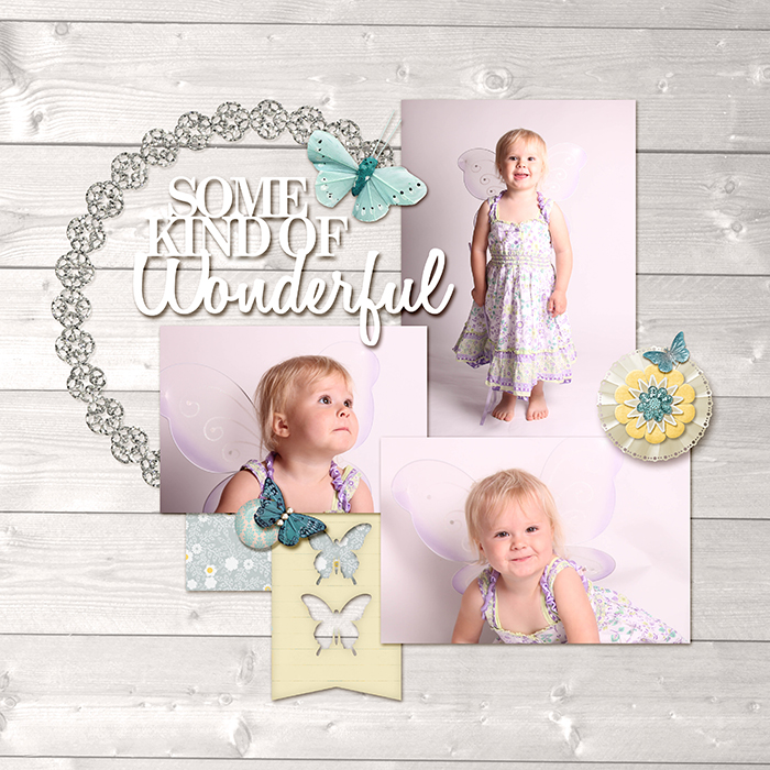
Butterfly Briony by Vicki Hibbins| Ange Designs: Eternally; Kaye Winiecki: Eclectic Moments; Jady Day Studio: Oh Hoppy Day; Stolen Moments Design: Reflection; Laurie Ann: Spring in my Step
[hr]
Devra Hunt says, “This is my son enjoying some time in the pool on a hot summer day.”
“It was natural to make the title the heaviest embellishment area because of the product I chose. As you move around the page to the bottom, the clusters get smaller. I repeated the color yellow, and wood pieces, but in different shapes and pieces.”
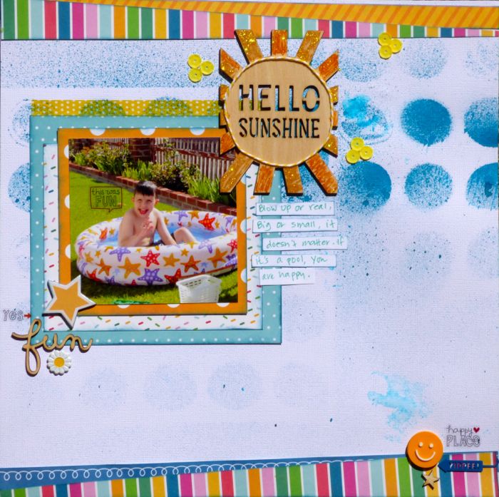
Hello Sunshine by Devra Hunt | Supplies: CS-American Crafts, PP-Pebbles, wood chips-Freckled Fawn Studio Calico, chipboard, brad, paper clip,
badge, phrase stickers, vellum tape-Freckled Fawn, Stencil & Sequins-Studio Calico, Mist-Dylusions, twine-Doodlebug Designs, Stickles, ink-Memento, pen & adhesive-EK Success
[hr]
Marcia Fortunato says, “This layout is about my first attempts to preserve the bounty from my garden. ”
“I attempted to draw the viewer into my title at the top left by embellishing that area most heavily. The next weighty embellishment point is on the diagonal from the title, thus guiding the viewer through the journaling and photo. Finally I established a triangle of embellishments with a much smaller cluster at the bottom left.”
“In each embellishment area I included a bit of navy, a circular element, a heart, and bits of green and raspberry to balance out the strong colors in the photos. ”
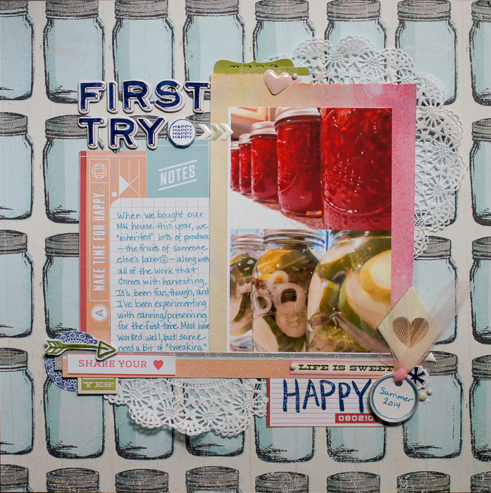
First Try by Marcia Fortunato | Supplies: Patterned Paper: Studio Calico; Watercolor paper: Royal Langnickel; Journal card: Project Life; Letter stickers: Thickers (American Crafts); Labels and word strips: Jillibean Soup, Life.Love.Paper, Studio Calico; Stamps: Studio Calico, Teresa Collins, Heidi Swapp; Ink: Studio Calico; Pens/Markers: Sharpie Pen, Distress Marker (Ranger), Bic Mark-It, Pilot; Doilies & tulle: Studio Calico; Watercolors: Prang.


