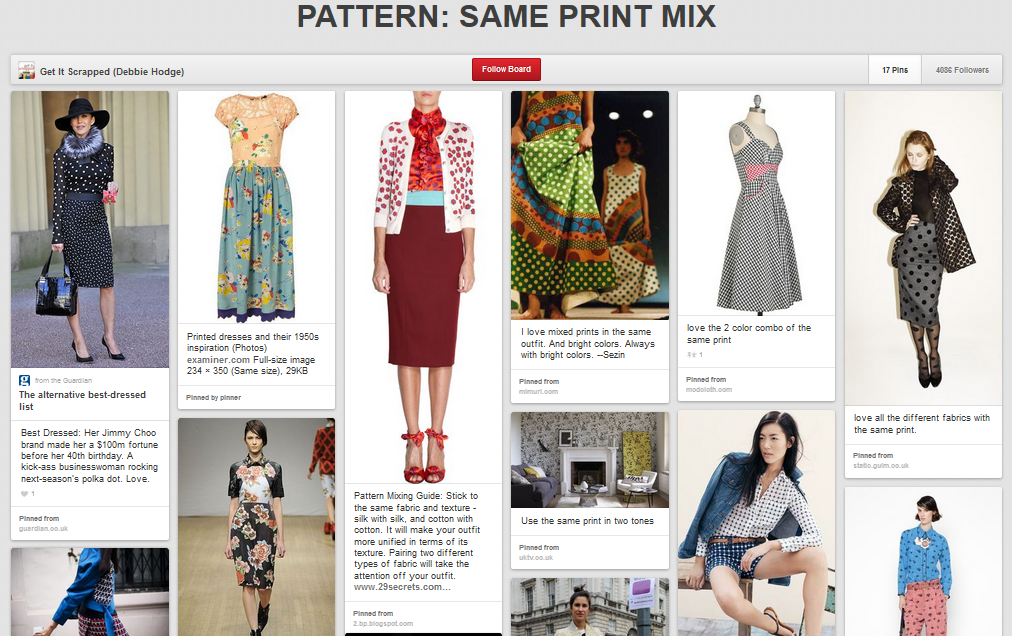
After a season of pattern mashups, the newest trend in print mixing in fashion is to mix same or very similar prints in different sizes and colors. Inspired by this trend, our team made pages with the same motif mixed in a variety of colors and sizes and styles.
leaves
Debbie Hodge says, “My son and his girlfriend recently went on a chilly November picnic, and these are the photos I took of them walking down the hill behind our house to the river. Leaves are a great motif for fall pages, and I collected several prints from different designers, using one as a mat and gathering four different prints into an embellishing block. Small bits of a low-contrast woodgrain print work almost as a solid on the page.”
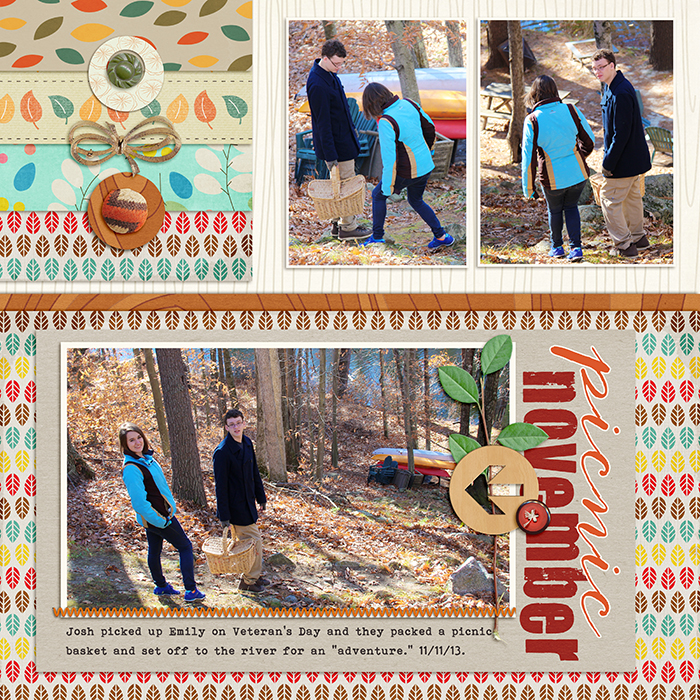
November Picnic by Debbie Hodge | Supplies: Storyteller November by Just Jaimee; Santa’s Workshop by Sahlin Studio; Fall Festival by Amy Stoeffel; Evergreen by Lynne-Marie; Autumn Twist by Mye de Leon; Randomness by Kaye Winiecki; Autumn Lines, Straight Line Stitched by Anna Aspnes; Evergreen by One Little Bird; Joyeaux Trinkets by Allison Pennington; Document This by Laurie Ann; Spring Craze by Valerie Brown; Bohemian Typewriter, Anna Clara, Your Are Loved fonts
arrows
Amy Kingsford says, “This page is about our last family geocaching trip and my son’s first official find! I wanted to use arrows in a big way in this page to reinforce my story. I used a variety of arrow prints that all have a retro feel. This is a digital scrapbook page and to find arrow patterns, I searched for the word arrow on my computer hard drive and found lots of ppapers to pull from. The green hand-drawn arrow print caught my eye first because of its airiness and whimsical feel. I chose other prints for a variety in density and scale.”
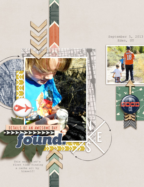
Found by Amy Kingsford | Supplies: Audrey Neal: Wanderlust; Dawn by DesignL Day Tripper Collection; Karla Dudley The Good Stuff Add-on; Sahlin Studio: Wood Veneer – Arrows; One Little Bird: Possibilities (arrow frame).
anchors
Katie Scott says, “My Aunt and Uncle recently retired and bought their dream boat ‘The MeeShee.’ Our family has a long-time tradition of sailing, and I wanted to use the anchor motif for the page. I found a variety of supplies with anchors including patterned papers, an anchor brad, and 3″x4″ Project Life cards. I also used coordinating patterns and shapes like chevrons, stripes, and stars.”

Retiremnet by Katie Scott | Supplies: Glitz Design, Fancy Pants, Crate Paper, American Crafts, Cosmo Cricket patterned papers; Glitz Design, Smash Book, My Mind’s Eye, and vintage embellishments; washi tape; Basic Grey letter stickers.
reindeer
Debbie Hodge says, “This week in my class Your December Story I’m exploring the idea of magical worlds and of how the rules and possibilities in a magical world are different. Thus I’m scrapbooking a look at my ‘rules’ — my must-dos before Christmas arrives. They include crafting a new ornament, watching White Christmas, going on the Cookie Walk at our local church, and attending our friends’ BYOM (bring your own menorah) party. I used reindeer prints from four different collections and even clipped a reindeer print to a papercut of reindeer leaping into the sky.”
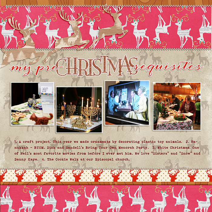
My Pre-Christmas Requisites by Debbie Hodge | Supplies: Vintage Christmas, December Basics by Laurie Ann; Merry Month by Amy Wolff; Santa’s Workshop by Sahlin Studio; Chalkboard Alpha by Katie Pertiet; Cozy Christmas by Kristin Cronin Barrow; Papermats by Kaye Winiecki; Anna Clara, Bohemian Typewriter fonts.
stripes
Carrie Arick says, “After decorating our Christmas tree every year, I take photos and most are less than stellar. This page is about those outtakes. I started with these photos, which aren’t great, but tell the story I was documenting. I knew because the photos were busy and had lots of contrast that I wanted two simple patterns that contrasted with each other. I also knew that large prints have less visual weight making them slip into the background, and small prints are denser, which gives them more visual weight, so they naturally move to the foreground. I decided on a gold and white chunky horizontal stripe and skinny dark grey and white diagonal stripe. The natural visual weight of each pattern made deciding how to use them easy. One thing I learned from one of my fellow scrappers recently was using a diagonal pattern paper to help lead the eye into the photo, so I did that here. The diagonal stripes were bit harsh directly against the photos, so used a piece of vellum to soften it.”
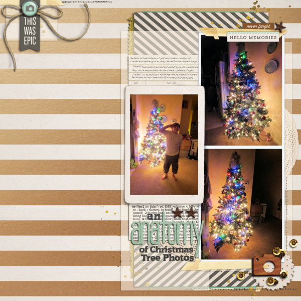
An Anatomy of Christmas Tree Photos by Carrie Arick | Supplies: Paislee Press: Golden Hour Papers; One Little Bird: Memory Collector Bundle; Sara Gleason: Ash Tree Elements; Gennifer Bursett: Anchored Elements; Gina Cabrera: Arizona Autumn; Sahlin Studio: Reflections Elements; Chelle’s Creations: Blue Bird Papers; Amber Clerg: All Glitter & Sparkles Alpha; Fonts: Commons, MA Brownie tOO
Ashley Horton says, “After a recent trip to the beach, we stopped at a local ice cream shop to get milkshakes for the family. I chose a collection that would work with my daughter’s photo and that included a pattern that was available in different sizes and colors. The diagonal stripes help add energy to my layout and I worked with a black-and-white stripe and a teal-and-white stripe to add contrasting colors. The stripes vary in size, which adds fun visual interest to the layout.”
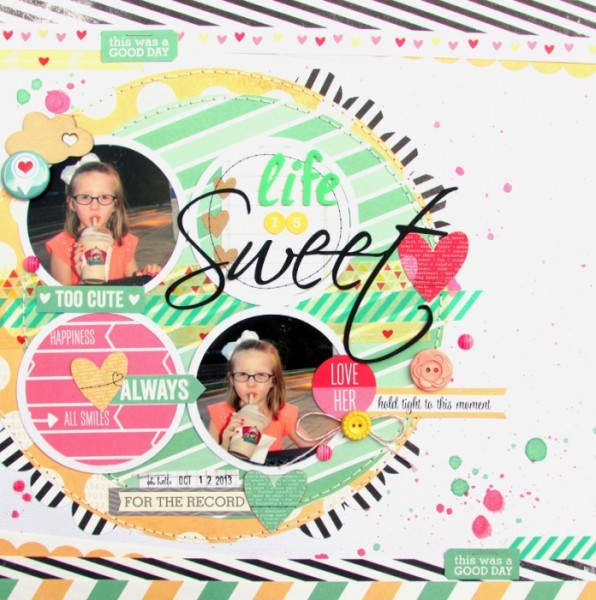
Life is Sweet by Ashley Horton | Supplies: Patterned Paper & Tags: Elle’s Studio; Thickers, Baker’s Twine & Date Stamp: American Crafts; Washi Tape & Wood Veneer: The Paper Bakery; Flair Button: A Flair for Buttons; Mini Market Stickers & Buttons: October Afternoon; Candy Dots: Skipping5; Spray Mist: Heidi Swapp & Studio Calico
chevrons
Celeste Smith says “My son makes wacky faces behind my back in the car all the time! I decided to scrap this page with a variety of chevron prints – I thought it went along well with the wacky photo. I used one set of crazy colored chevron papers from Alison Pennington. I played with the scale of the papers by transforming them in Photoshop. I was quite haphazard in my placement. I tried to at least include the angle of the chevron in each triangle so that it didn’t just look striped. I think the result with all the angles and bright colors is wacky and goes with the photo quite well!”

Wacky Kiddo by Celeste Smith | Supplies: One Little Bird Happy Gram kit; Karla Dudley: Walter Cut Files, Erica Hernandez: Chevol Patterned Papers; Robyn Meierotto: Layered Template No. 6; Alison Pennington: Charming Chevrons Patterned Paper; Splendid Fiins: Make a Mess Overlays; Gine Cabrera: Fabric Buttons; Font: Underwood Champion.
triangles
Amy Kingsford says, “This page is about my youngest son and how his personality and his energy make my days better. I use the triangle motif throughout this page and vibrant pops of color to try and match the energy of this oversized photo. Because triangles are so energetic, I had to be careful. So I selected a medium-scale triangle vellum overlay to layer over my entire page, including my photo, for a subtle yet interesting look. I felt I could get away with the dense print with my light-colored, mostly-transparent overlay, but when it came to the vibrantly colored yellow triangle print I scaled it down to fit my triangle cut-out and thankfully it was a little less dense so the two prints would mix nicely with one another.”
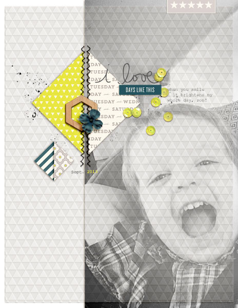
Days Like These by Amy Kingsford | Supplies: One Little Bird: Per Diem; Amy Martin: Shaped Up Triangles V. 2; Creashens: Vellum – Trinagles.
circles / dots
Brenda Becknell says, “My granddaughter’s favorite part of our local fall festival was the petting zoo and a chance to feed the goats and deer. Before I started scrapbooking, I was a quilter and a lot of the guidelines for mixing colors and prints in quilting apply just as well to scrapbooking. On this page, I mixed various polka dot patterns, taking care to vary the scale and density of the pattern. The background paper has a very small dot pattern, so it “reads” more like a solid color. The main paper has larger polka dots in a gradient color scheme, so the larger dots aren’t as dizzying as they might have been in a brighter color. Another dotted paper was used as a photo mat, with a taupe/grey background that makes it more neutral. The last bit of polka dot is found on the tone-on-tone blue alphabet stickers. For contrast, I added a strip of diagonal striped paper, and strips of yellow and coral patterned paper at the bottom for a pop of color. Even though they’re not technically polka dots (the yellow is a tiny heart pattern and the coral is an all over bubble pattern), they fit into the circle/dot theme. The outline stitching, buttons and sentiment sticker also add a little texture and contrast to the polka dots.”
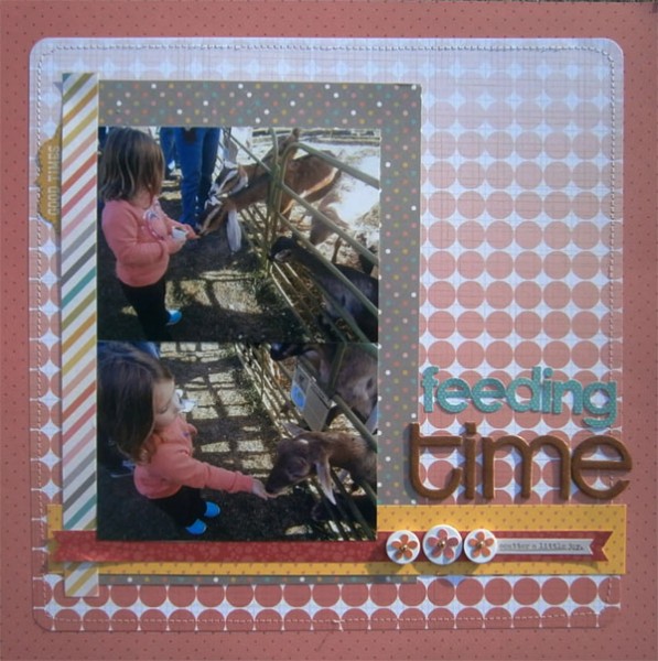
Feeding Time by Brenda Becknell | Supplies: Patterned paper: Studio Calico, Simple Stories; Alphabet stickers: Little Yellow Bicycle; Chipboard alphas: Basic Grey; Stickers: Simple Stories; brown Copic marker, white buttons, machine stitching
Heather Awsumb says, “This page lists some of the things I’m thankful for in my life. This was one of the rare times for me where product led the story and layout instead of the other way around. I started with the idea of using small dots as my pattern. They were easy to find because I have all my papers tagged using the print types described in Using Basic Print Patterns. I searched for “geometric” and then pulled all the papers with small dot patterns and decided on a color scheme from the papers I have. I intentionally decided on all tone-on-neutral papers and I like that they have varying sizes of dots but are clearly all of the same print type. The layout was inspired by a layout Lisa Dickinson shared on Ali Edwards blog a few months ago.”
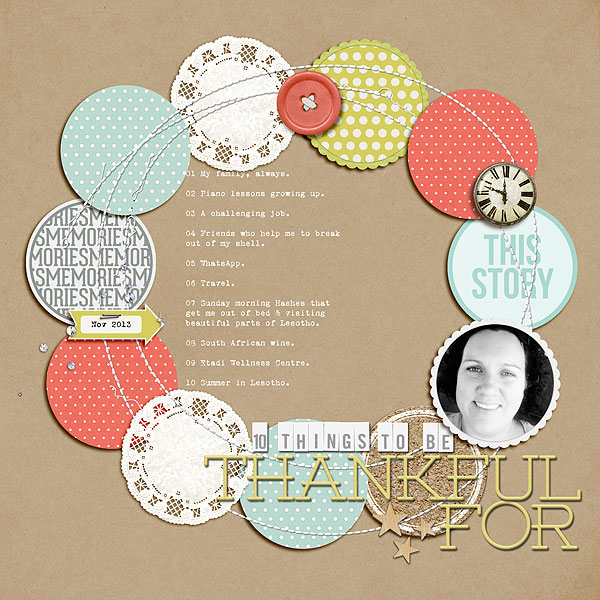
10 Things to be Thankful For by Heather Awsumb | Supplies: These Walls, Daily Bulletin, Identity, Retrospective, This and That, Star Gazer by One Little Bird Designs; Be Buttoned: Energy, Away We Go Solids, White and Gray Tab Alpha, Plastic Slimline Serifs No 1, Messy Stitched Circles White No 1, Dot Repeats No 1, So Fine Solids, Corkboard Discs No 1 by Katie Pertiet; More Than Just Mom by Shannon McNab; Hello Story Week 1 digital downloads by Ali Edwards
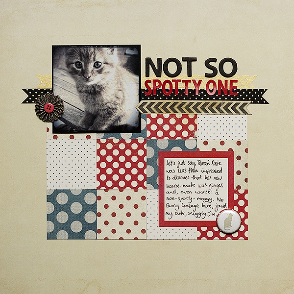
Amanda Robinson says, “I created this page to record how this cat differs from my others as he’s the only one who doesn’t have a ‘spotted’ coat. As my page subject revolves around spots I used a selecton of spotted papers in a grid design. I knew I had a number of red and blue spotted papers in my stash so set out to find a selection which had different sized spots to create more interest in my design. As I was working with two colors I chose two in each color: one with colored spots and the other with colored background, to balance the design. I ended up converting my picture to black and white so that it didn’t compete with the colorful grid.”

