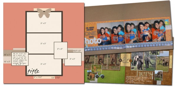
See how scrapbookers Brenda Becknell and Stefanie Semple used a one-page sketch/template from our Bundle #52 on their two-page layouts. Both scrapbookers rotated the sketch on its side. Stefanie kept the arrangement close to the original while Brenda focused on using the larger photo blocks and move the two sides in closer to one another.
Brenda Becknell rotated the sketch 90 degrees and focused on using those three large photo spots. She repeated them again on the facing page, and filled five with photos and one with the long and big title that’s a great lead-in to the photos. Brenda says, “In place of the smaller photos in the sketch, I used embellishments that were cut from patterned paper or stamped.”

We Just Wanted One Good Photo by Brenda Becknell | Supplies: Patterned Paper: Jillibean Soup; Alphas: Authentique and American Crafts; Smile definition stamp: Stampabilities; Hero Arts: black ink;
Tim Holtz: filmstrip ribbon
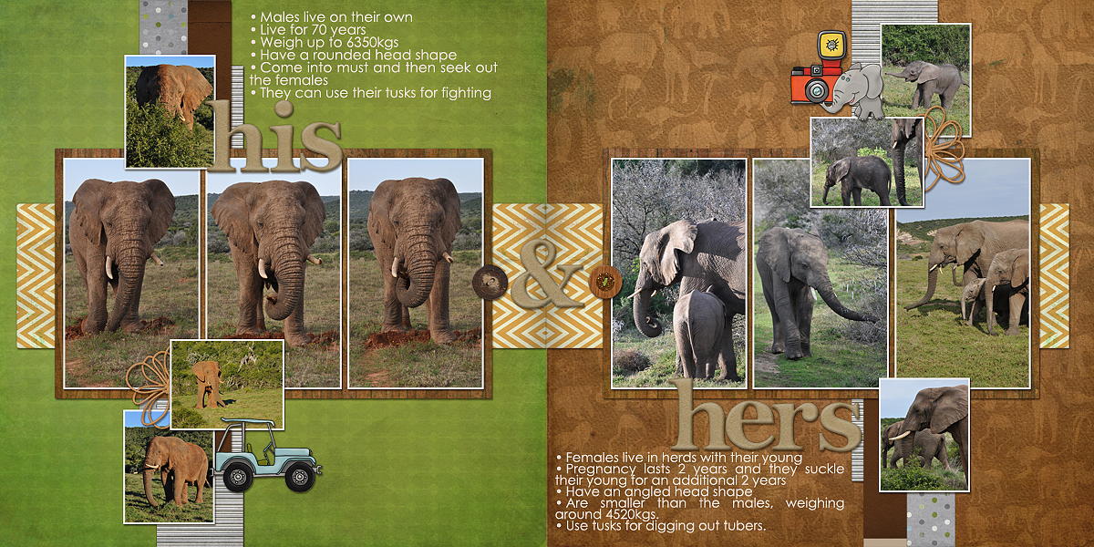
Stefanie Semple started with the original sketch of both sides of the layout. She rotated one side 90 degrees left and the other 90 degrees right and also extended the paper strip behind the photos to meet in the center.
Stefanie says, “Because of the separate feel of the photo groupings I made a “contrast and compare” type of layout, using different backgrounds for each side for an eye catching design. I’ve found that when the backgrounds are different people “read” the pages individually instead of reading across from left to right. On the left is the story of a solitary bull elephant with facts about him and his way of life, contrasting with the females, shown on the right, with their extended families and babies.”

His & Hers by Stefanie Semple | Supplies: Clever Monkey Graphics: Zoodles of Fun and Soft Chipboard Alpha.
[lovesketches]


