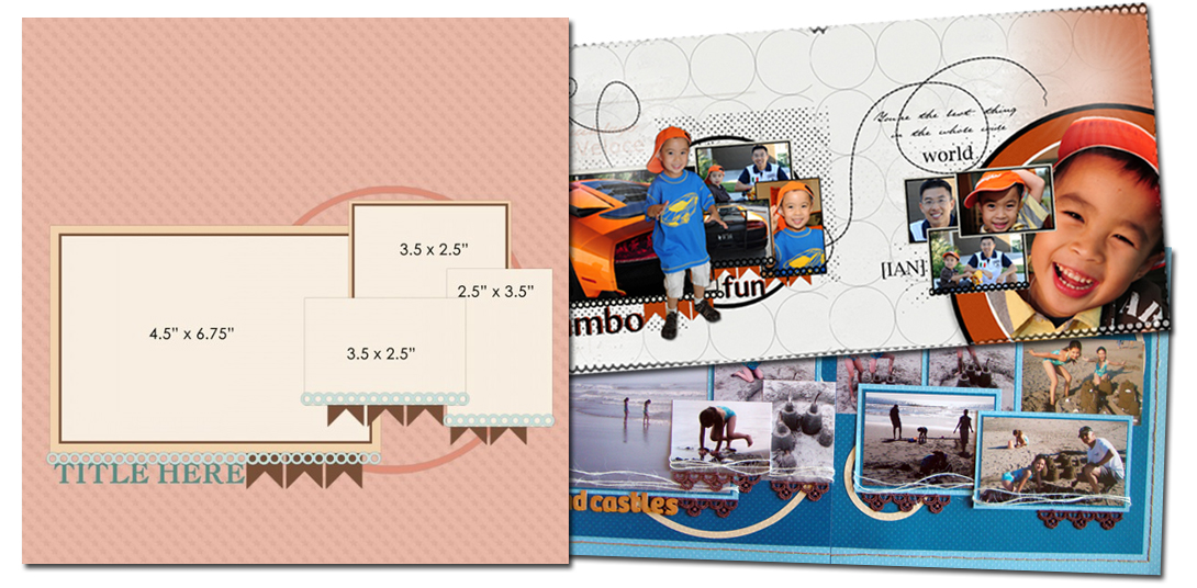
See how Terry Billman and Michelle Houghton used a one-page sketch/template from our Bundle #82 on their two-page layouts.
Repeat the cluster of smaller photos on the 2nd page
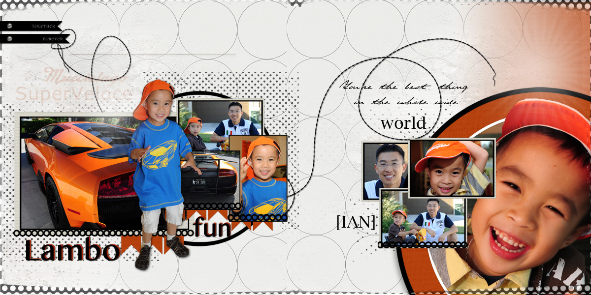
Terry Billman used the arrangement of the photos in the sketch/template pretty much as-is on the left side of her spread (with the addition of a very cute little boy digitally extracted and layered on top). For the right side, she repeated the cluster of smaller photos and backed them up with a large circle-cropped portrait bleeding off page right and page bottom.
Terri says, “I loved the idea of making this sketch into a two-page layout because it allowed me to use eight photographs. The theme here is how much fun father and son have touring in their Lamborghini. I incorporated photographs of the car, dad and son in their Lamborghini clothes, and the little bicycle is also a Lamborghini. The photos of Ian exude excitement. He loves this time with his Dad.”
“I thought the ring strips in the original sketch were perfect to portray tires. To complement the same circular theme, I used a polka dot overlay and polka dots behind the photographs. I chose the background paper because it was light, and I wanted the photos to pop off the page. It was a bonus that the paper had circles. The stitching was used to tie the left side of the page to the right side. To follow the same circular theme, I added the large circular photo on the right. The white, black, and orange circles frame the large circular focal photo. The extractions on each side create depth to the layout. The title has an orange drop shadow to add depth and I lowered the opacity of the model name of the car.”

Lambo Fun by Terry Billman | Supplies: Anna Aspnes: Art Play Palette Classico, Art Play Great Outdoors, Foto Glows No. 4
12 x 12 Polka Dot Edges #1; Katie Pertiet: Spots Dots Brushes No. 8, Classic Cardstock Carnival, Twisted Stitches No. 2
Continue the pattern set up on page 1 to page 2
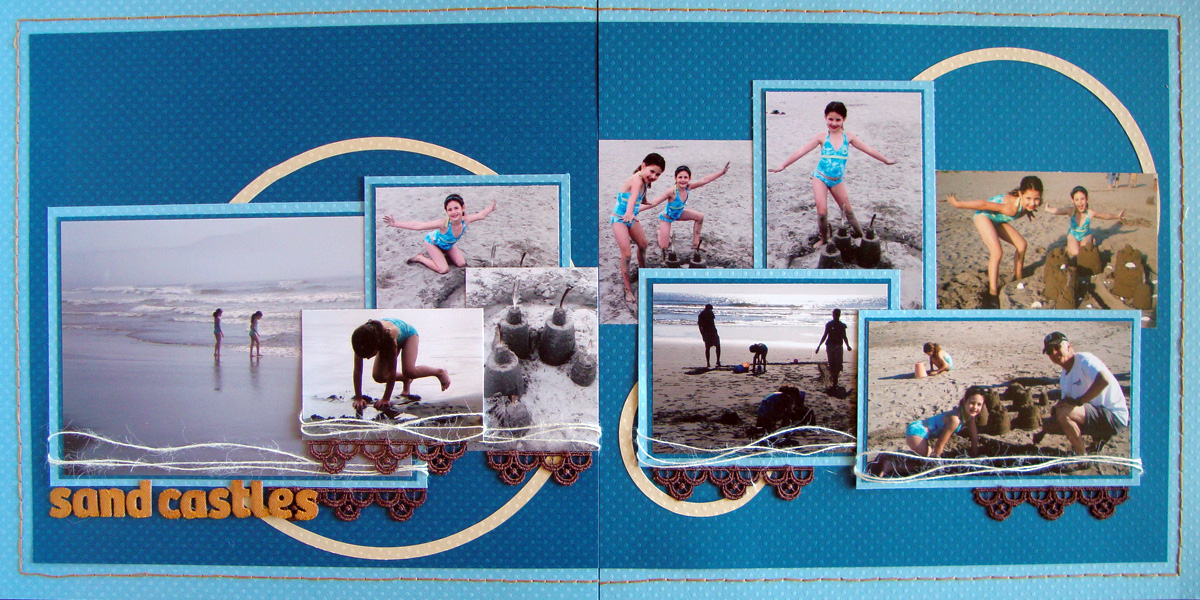
Michelle Houghton used the layout of the sketch as-is on the left side of her spread and then continued the pattern set up by the smaller photos over onto the right side – layering and staggering both portrait and landscape photos. Two smaller circle rings add repetitons that unify the spread as a whole.
Michelle says “I really love a sketch, and this one was no exception. I loved the clean lines and the collage of photos and circles on this sketch in particular, so I stretched the collage, circles, and banner accents onto the second page. I also used a hand stitched boarder that runs all the way around the two pages to tie them together. To me this was the perfect solution to a lot of photos all about our sand castle building at the beach.

Sand Castles by Michelle Houghton | Supplies: Cardstock – Bazzill Swiss Dots; Twine – American Crafts; Lettering – American Crafts Thickers (colored to match with Copics); Lace and thread
[lovesketches]


