 Scrapbooking a wedding? Take a look at these pages from our creative team and MSD teachers, and pay attention to:
- colors
- products
- photo crops
- layout design, and
- embellishment
And then check out embellishing quotes and wedding fonts in our Quickstart Series.
Marie-Pierre Capistran says, “This page is the first (of many to come!!) I made of my wedding. And I got married 12 years ago! I’m happy that I finally got the push I needed to do that. It feels good to put those pictures into my scrapbook. While making it I had several memories coming to my mind.”
“I started with two pictures, one slightly bigger than the other. I chose a general picture where we could see us both in full length, and I also chose the kiss to show a little bit of love. I had several nice pictures in which we were just standing beside one another, but that’s not what I wanted for this story. I used the Mix and Mend collection from the great Michelle Clement. The background paper itself makes pretty much the work. I just added some little embellishments here and there like the trims under the pictures to ground them and I added a title (nothing fancy) with the where and when and the story in a block underneath the pictures.
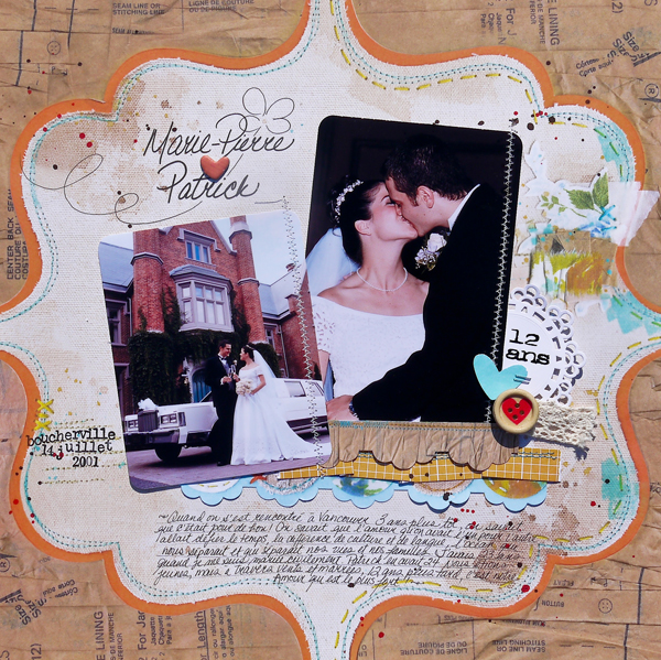
Marie-Pierre {heart} Patrick by Marie-Pierre Capistran | Supplies:
paper: Sassafrass Lass Mix&Mend, Amy Tangerine Sketchbook; lace tag: Martha Stewart; button: Dear Lizzy Neapolitan; lace: Hero Arts woven lace ribbon; chipboard accent: Crate paper season collection; Rub-on: O’Barbo typewriter; stamps: SU! Calendar, Inkadinkadoo typewriter; other: sewing thread.
Amy Kingsford says “On my page “It’s Friday I’m In Love” I went with a basic design and used minimal elements and clean typography in an effort to let this beautiful photo that I took of my sister-in-law and her new husband really shine. These two were married on a beautiful Friday in October which made me think of this song that I used for my title/journaling–and in my opinion it says just enough!”
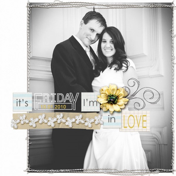
It’s Friday I’m In Love by Amy Kingsford | Supplies: Airtime by One Little Bird Designs, Press Packet No. 2 by Paislee Press and Distressed Day Stamps by Biograffiti.
Michelle Houghton says, ” This stunning photo of my brother and his new wife was so romantic I wanted to something very unique and special to feature it. I wove patterned paper to create the matte and the title “woven together” seemed to fit the photo and the layout as well.”
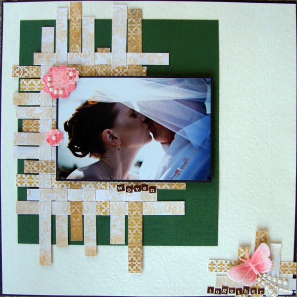
Woven Together by Michelle Houghton | Supplies: Cardstock – Bazzil Basics and American Crafts, Patterned paper – My Minds Eye, Canvas flowers, butterfly and pearls – Prima, Ink – Copic.
Amy Kingsford says, “On ‘Capture This Moment’ I aimed to commemorate the moment in which my husband and my life together began. I wanted to use photos that captured the parts of our wedding that were truly all about US — those little moments we stole away from all of the greetings and photos to just enjoy one another.”
“I wanted the photos to really be the star of this page so I chose a simple design. I chose papers that coordinated with our wedding colors, which were also prominent in the photos. And then I added a mixture of elements ranging from elegant to homespun in order to intertwine the two ideas of this being both a special occasion as well as a collection of intimate moments.”
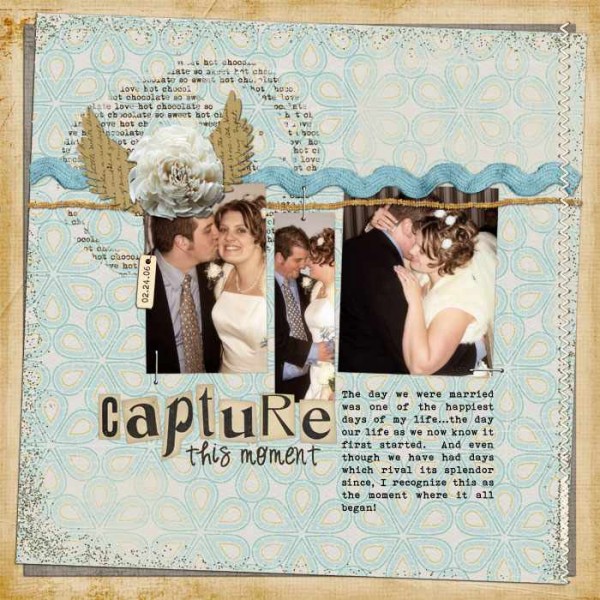
Capture This Moment by Amy Kingsford | Supplies: Capture this moment Layered Template by Erin Clayton, Textured Solids No 1 by Erin Clayton, Stitched Down No 1 by Erin Clayton, Slice Of Heaven {mini kit} by HGD by Laurie Ann, Elinor by Aja Abney, Chocolate Love by Bohemian Art, Vintage Ransom Alpha by PixelWorks
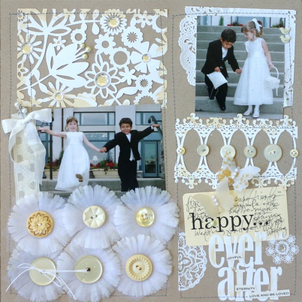
Doris Sander says, “This is a photo of my cousins and me in an older cousin’s wedding back when I was a little 5 year old. I didn’t have an actual photo of my older cousin in her wedding dress, so I just used one of her when she was a little girl. I used predominantly vintage supplies on this layout since they went well with the “dated” photo.”
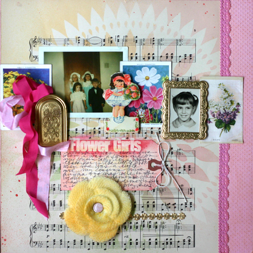
Flower Girls by Doris Sander | Supplies: cardstock – Bazzill, seam binding – Beaux Regards, knit flower – Maya Road, tag – Avery, lace tape – Decollections, mist – Jenni Bowlin for Ranger Re-Inkers, ephemera, sheet music, gold door – vintage, other – brad, German foil
Terry Billman says, “My grand daughter was a flower girl in a wedding this weekend. She looked so precious I wanted something simple to not take away from the beauty of the photo. In order to keep it simple, I chose a monochromatic theme and used purple, the color of her ribbon/sash. The photo just pops against the light shade of purple and accented by the darker matting.”
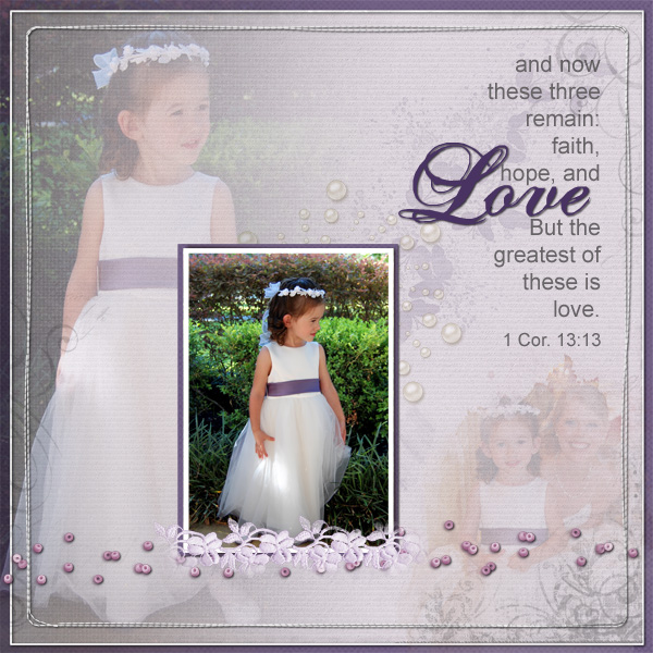
Love by Terry Billman | Supplies: Katie Pertiet: Watery Wings, Chalked rubbings No. 1, Bead Scatterings, Letterbox Overlay 5; Maplebrook Studios: Jacinda Solids; Anna Aspnes: Art Play Solids Adventure, Masking Gradient Canvas, Fotoblendz Clipping Mask No. 8, Art Play Palette Crazy Life Frame, Art Play Palette Authentic, Stitched by Anna Border No. 1, Hipster Plume Korner Edges No. 3; Patti Knox: Pearl Accents
Meghann Andrew says, “I usually see wedding layouts that are very feminine, but for this layout, I wanted to remember the night that my husband, dad and brother tried on their suits for the final fitting before our wedding, so I wanted it to have a masculine feel. I choose a kit with a lot of neutrals in it and then accented them with green and turquoise. The ruler paper strips accentuated the topic of the suit fitting. I then masked and misted the pennant banner with three different colors of mist to add more color, and added embellishments with pops of color. I also created an embellishment by punching out an image of two interlocking rings from the patterned paper and covering it with Glossy Accents.”
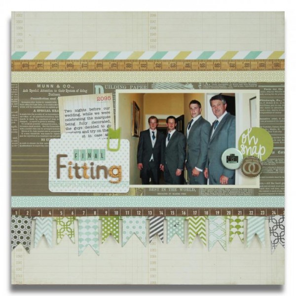
Final Fitting by Meghann Andrew | Supplies: Studio Calico’s 35mm kit: Cardstock: Bazzill, Patterned paper: Echo Park (grid, ruler), Studio Calico (stripe, text, green geometric, blue geometric), Die-cuts: Studio Calico (folder & ‘Oh Snap’ circle), Badge: Marcy Penner, Banners: Heidi Swapp, Punch: Martha Stewart, Clip: EK Success Smash, Journaling tag: Crate Paper, Chipboard alphas: Studio Calico, Cardstock alphas: Studio Calico, Mistable ink: Studio Calico, Glossy Accents.
Michelle Houghton says, “I kept this layout clean and simple using the complimentary colors that my sister-in-law had chosen for the wedding. They made for a beautiful wedding and a beautiful clean layout.”
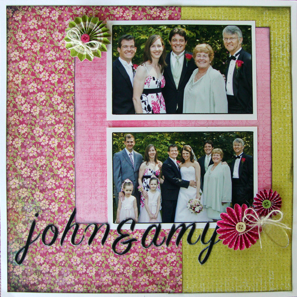
John & Amy by Michelle Houghton | Supplies: Cardstock – American Crafts, Patterned Paper – Basic Grey and Prima, Twine – American Crafts, Acrylic Tag – Tim Holtz, Flowers – American Crafts, Letters – American Crafts Thickers, Ink – Tsukineko
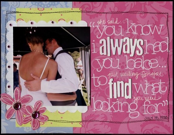
Lisa Dickinson says, “Page inspiration doesn’t always have to come from a visible source – words, lyrics, and quotes can also be a starting point for design! For this page featuring a wedding photo, I focused the design around the lyrics from a song that appropriately described our engagement. The right hand side of the page is completely filled with text (a combo of chipboard & rub-on lettering) and serves as a design element, title, and journaling all in one.”
Doris Sander says, “A monochromatic color scheme of whites is perfect for a wedding layout. I was able to add all sorts of fun details, but still keep the focus on the photos because the whites are so subtle. And what better “color” is there for a wedding? ”

