Consider, though, using a grid to organize just a section of a page that does not have an overall grid foundation.
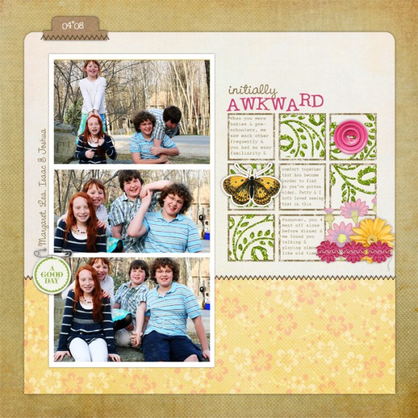
Debbie Hodge made “Initially Awkward” with a template by Ali Edwards. A band of three photos is accented with a small 3 by 3 grid of squares that hold embellishments and journaling. It’s a charming area of the page and the underlying grid makes it possible to include these extras without creating chaos on the page.
Amy Kingsford arranged one of the words in her title in a grid on “My 2011 Christmas Wishlist.”
Amy says, “Sometimes it can be fun to piece together a foundation that is made up of several approaches. On this page I’ve done just that–used a combination of grids, shapes, bands, strips and brushwork to piece together the inner canvas of my page. This technique works especially well with pages that don’t have photos because it establishes extra visual interest that a photo would normally provide.
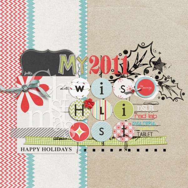
My 2011 Christmas Wishlists | Supplies: Star On Top Collab Kit (One Little Bird Designs and Amy Martin), Retro Christmas BrushSet Add-on (Anna Aspnes), Holly Template (Sara Gleason)
Doris Sander used a patterned paper with grid of silhouettes as a major elements on “Precious.”
Doris says, “Sometimes I like to use large chunks of patterned paper to help tell my story. Here I found a couple pieces (the cherries and the little girl’s silhouette) that seemed a perfect match for this photo of my niece that I love so much.”
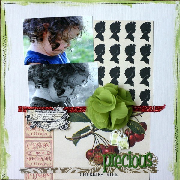
Precious by Doris Sander | Supplies: Precious by Doris Sander | Supplies – patterned paper, stamp, paint, and ink by JBS, rub-on by Hambly, tags by Avery, flower by Bazzill, trim by May Arts, chipboard alphabet by American Crafts
Amy Mallory says, “My number one go-to design is the grid. When I have a blank canvas in front of me, I think about this grid design and how I can use it over and over, but still keep it fresh.”
On “Dreams Come True” she kept it fresh by adding a 4 by 3 grid of circles as an embellishment block below her photo.
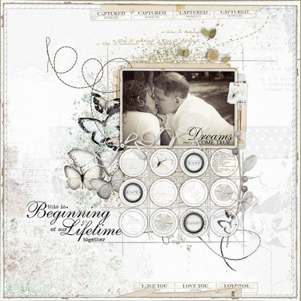
Dreams Come True by Amy Mallory
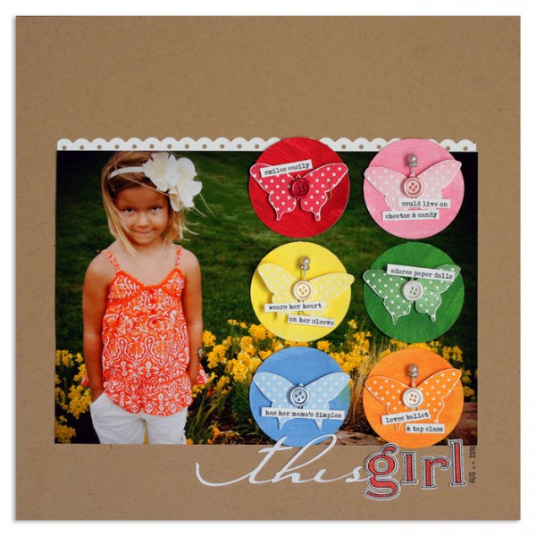
Lisa Dickinson is masterful at working the grid in a variety of ways. On “This Girl” she overlaid a 2 by 3 grid of embellished circles on an oversized photo.
PAPER TOOLS
This Girl by Lisa Dickinson | supplies: Bazzill cardstock in kraft & white
+ Jenni Bowlin paints (Cough Syrup, Chewing Gum, Lemon Drops, Seed
Packet, Soap Powder, Chicken Feed) + Jenni Bowlin inks (Cough Syrup,
Chewing Gum, Lemon Drops, Seed Packet, Soap Powder, Chicken Feed) +
butterfly stamp (Studio Calico) + buttons + stick pins + border punch + JBS
letter stickers
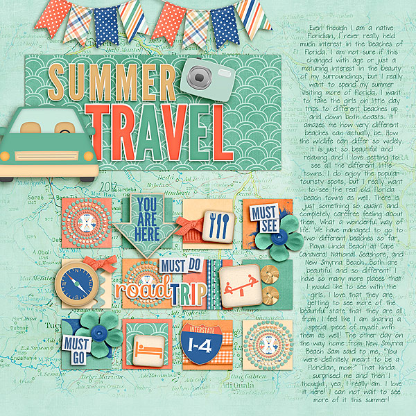
Tanyia Deskins added a grid of theme related embellishment to her photo-less page about summer travel. Adding grids that hold a variety of patterned papers is quick work for digital scrapbookers.
[designclass]

