 A fun way to work with embellishments is to group them together.
Embellishment clusters can be showy or simple. The beauty of a cluster is that you can combine several elements, including images, to reinforce page
subject and contribute to design. Think of an embellishment cluster as a small arrangement that works both on its own and as a part of the larger whole of your page.
Not sure how to put an embellishment cluster together. Try one of these approaches on your next page — and then another and another until you’re a pro at clustering.
1. Cluster in threes
A cluster of 3 or 5 very similar elements makes a great page accent. In design, odd numbers of objects are more interesting to the eye than even numbers of objects. An odd number of objects can be arranged both symmetrically and asymmetrically. (Check out Tap the Power of 3.)
The clustered elements should incorporate repetitions with variety. So, for instance, three different but circular items would work. On “Same,” Celeste Smith combined a large felt flower, a small chipoard flower, and a circular date spot in a cluster at bottom right of her photo.
You could also use three button (or gems or hearts) but vary their size and/or shape and/or color.

Same by Celeste Smith | Supplies: Digital Supplies: Cool Beans Mixed Buttons, Minestrone Paper Pack, Harvest Felt Flower,Red Polkas Canvas Flowers,Calendar Journaling Sprouts on White - Digital Sprout Pack #1 - all from Jillibean Soup; Font: Another Typewriter
2. Cluster in layers
The layered cluster is a small and beautiful arrangement well designed on its own and well-integrated into the rest of the layout by virtue of the repetitions it incorporates. When you make these kinds of clusters, work to mix stand-out pieces with meaning neutral embellishments like photo-turns, ribbon, buttons, brads, and tags. Strive, also, to include a combination of textures and shapes within a cluster.
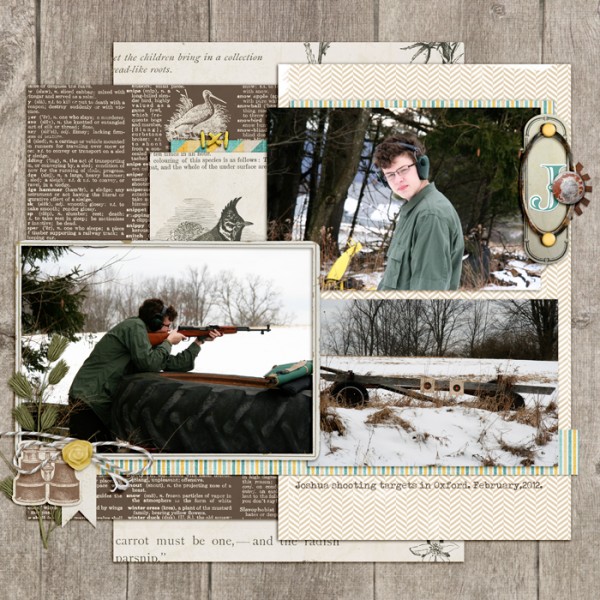
There are two layered embellishment clusters on “J.” At top right a label rotated 90 degrees provides the base upon which the cluster is built. A sticker monogram, label plate, distressed brad, and gear are layered upon a label rotated 90 degrees. They support the setting shown in the photos and represent my son. The yellow brads provide the eye-catching pops of color that make this one of three “yellow” spots in a visual triangle.
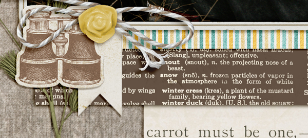
A smaller tag provides the base at bottom left. While the binoculars, branch, flower, and tie don’t actually fit on the tag, still, the tag provides the first grounding layer to the cluster.

"J" by Debbie Hodge | Supplies: Lemonade Stand by Robyn Meierotto; Flair Box 3 by Paula Kesselring; Lost World, Storytime, Gearhead by ViVa Artistry; Baker's Twine Asst, Vintage Charm Chipboard Stickers, Farm Fresh, Flossy Stitches by Katie Pertiet; Artplay Chevron Crazy Life by Anna Aspnes; Brad Bonanza by Pattie Knox; Uncharted by Krystal Hartley; Beffle Medium, Typendoski fonts.
3. Cluster in stacks
Another way to create clusters is to combine small bits – oftuen meaning neutral embellishments like buttons, flowers, brads, gems, and chipboard shapes–and stack them up. Top it all off with an interesting fastener and you’ve got “stacked” treasures with lots of appeal.
Lisa Dickinson’s “This girl” has 6 stacked clusters: multicolored circles topped with matching butterflies, flowers, and tilted journaling strips. See the repetitions here and the variety. Notice what classic embellishment spots these stacks create.

This Girl by Lisa Dickinson | supplies: Bazzill cardstock in kraft & white + Jenni Bowlin paints (Cough Syrup, Chewing Gum, Lemon Drops, Seed Packet, Soap Powder, Chicken Feed) + Jenni Bowlin inks (Cough Syrup, Chewing Gum, Lemon Drops, Seed Packet, Soap Powder, Chicken Feed) + butterfly stamp (Studio Calico) + buttons + stick pins + border punch + JBS letter stickers
4. Cluster in series
Small embellishments can get lost on a full-sized page. One way to let them shine is to place them in a series. Whether you line them up tidily or a bit askew, put
them on a straight line or place them along the outline of a shape, arranging small embellishments in a series is a great way to organize them, create flow, and add
repetitions to your page.
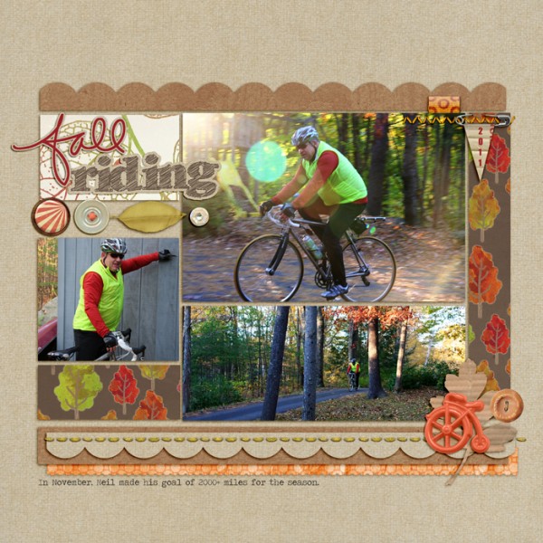
I’ve lined up four elements to fill a “compartment” on “Fall Riding.” Circle elements and a leaf are united by their proximity and organization in a series.

Fall Riding by Debbie Hodge | Supplies: Krafty Cuts Leaves No 1, Krafty Canvas No 1, Fall Fun Element Pack, Banner Saftey Tags No 1, Scallop Strip Masks, Lifted Leaves No 1 by Katie Pertiet; Folded Ribbon Bits by Pattie Knox; Autumn Moon Ephemera by Sahlin Studio; Journey Back Elements by Vinnie Pearce; Wild Weekend, To The Woods, Glitter Thread Stitches by Lynn Grieveson; Westover by One Little Bird; Fall and Halloween Handdrawn words by Ali Edwards
5. Cluster in sprinklings
Add a random-looking cluster or trail of embellishments to soften up a linear page, fill a spot, support your page subject and mood, or just have fun. While a sprinkling should appear random, a little tweaking and attention to the balance of the elements within the sprinkling never hurts. Incorporate repetitions with variety in the elements you sprinkle.
Betsy Sammarco punched small flowers from patterned paper and sprinkled them in a downward diagonal path that leads the eye to the focal point photo. She’s stacked little gems on top of the flowers.

Layout by Betsy Sammarco | Supplies: Patterned Paper: Pink Paislee and scrap, Chipboard Frame: Maya Road, Bling: Doodlebug Design, vintage label: flea market
6. Custer in pockets
Audrey Neal is a linear scrapbooker, preferring graphic patterns, color-blocked backgrounds, and gridded photo templates. Audrey says, “I try hard, though, to incorporate non-linear elements into my designs to help balance all those straight lines. You might think that embellishment clusters would be too “messy” for my orderly ways, but it’s actually pretty easy to create a simple pocket cluster like the one on ‘Go Somewhere.’”
The base of Audrey’s pocket cluster is a library pocket with a world map on the front, held together by striped pieces of tape. Inside the pocket are flat, paper elements as wells more dimensional elements with organic shapes like the flower and grass stems. These elements rise out of the pocket and spill over onto other blocked in the gridded composition.

Go Somewhere by Audrey Neal | Supplies: Agnes Biro and Erica Coombs: En Route collaboration, Design House Digital, fonts: Pea Sara Print
[designclass]

