 by Debbie Hodge
Texture is tactile. When you add texture and dimension to your scrapbook page, you engage the viewer’s sense of touch — another sense in addition to sight. As a result you draw your viewer in on another level.
It’s an obvious design move to add texture with embellishments, chipboard titlework, and mixed media canvas treatments. What about the journaling, though? It’s not usually the first page element that comes to mind when thinking about texture and dimension–unless you like handwriting with puffy ink.
Three ideas for adding texture and dimension to journaling follow.
1. Combine alphas with fonts or handwriting
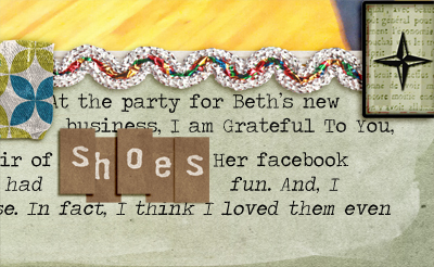
Pull out one or a few of the important words in your journaling and render them with an alpha. You can do this with fonts or with handwriting.
I’ve done this on “Shoes” using small “alpha-bits” for one word. The word ends up being a part of the journaling and a low-key page title.

Shoes by Debbie Hodge | Supplies: Kitschy Christmas by Sahlin Studio and Jenn Barrette; DIY Board Games, Mix & Match Alpha by ViVa Artistry; Vintage Photo Frames No 26, Watery Washes by Katie Pertiet; Bedazzled by Pattie Knox; Stitched by Anna Borders No 3 by Anna Aspnes; Tidbits Alpha by One Little Bird.
2. Add stitched journaling lines
Add lines for your handwritten journaling with stitching as Michelle Clement has done on “This Fall.” The only catch: you’ll probably need to add them AFTER you’ve done the journaling in order to get those descenders (like the tail of the “g”) smoothly written.

This Fall by Michelle Clement (Masterful Scrapbook Design Texture Issue) | Supplies: Patterned Paper, Chipboard Embellishments, Chipboard Letter Stickers, and Stickers by Bella Blvd. Embroidery Floss by DMC. Letter Stamps by Hero Arts. Black Pen. Masking Tape. Thread. Staples. Acrylic Paint
3. Add tone-on-tone texture with journaling strips
Journaling strips can rock a page design is so many ways. Lisa Dickinson used white strips on a white background for subtle tone-on-tone dimension.

Spring Break by Lisa Dickinson (Masterful Scrapbook Design Design Play Issue) | supplies: cardstock (Bazzil Basics) + patterned paper (Webster’s Pages, American Crafts, Jenni Bowlin Studio) + stamps, ink (Jenni Bowin Studio) + stickers (Sassafras Lass) + label (Studio Calcio) + die cuts (Pink Paislee) + tag (American Crafts) + circle cutter (Creative Memories) + buttons (Maya Road) + ribbon (May Arts) + border punch (Fiskars) + twine (Coats & Clark) + font (Ieicester)
[lovejournaling]

