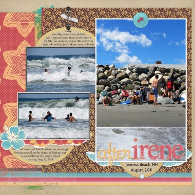
With any pattern combinations try to use: a mix of large and small scale prints, prints that vary in their density (i.e., how closely the motifs are placed), and colors that work together. You’re not looking for a 50-50 balance, but, rather, one that goes by the “gallon-quart-pint” rule.
by Debbie Hodge
Since antiquity, patterns have been incorporated into tiles, linens, rugs, wallpaper, dishes, upholstery, clothing, and more. Pattern and texture are wonderful tools for adding interest to scrapbook pages, especially when they’re mixed well.
You’ll find patterned papers for scrapbooking in four types–and these same four types are prevalent in decorating. These are:
- floral,
- geometric
- motif, and
- pictorial
Floral Patterns
With floral patterns, the print contains–you got it: flowers! Floral patterns come in a wide range of styles that work with many page topics. Four pages with floral prints follow. Notice how different the styling of the floral prints is on each. Notice, also, that three of the pages include two floral prints that contrast in color, scale, or density while still having commonalities in styling.
mix common styling with differences in scale
On “Oh Happy Day” I used two floral patterned papers. Their styling has a tropical feel and they work well with outdoor photos.
The background canvas includes large floral motifs in two tones placed in a seemingly random pattern. A large block of a red-on-white floral print backs up the photo. This print features a smaller motif placed in a repeating pattern. While the prints vary in color, scale, and density, they are united by the tropical flower motif in each.
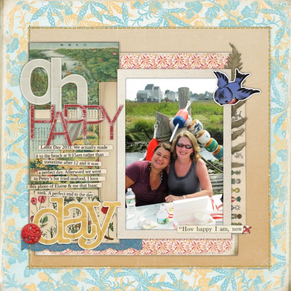
“Oh Happy Day” by Debbie Hodge | Supplies: Collageables No. 04 and No 1, Thin Chip Alphabet: Red, Basic Paper Alphabet: Beige, Basic Paper Alphabet: Yellow, Coastal Element Pack, Flossy Stitches: Red, Journaling Strip Masks, Vintage Photo Frames No. 24 by Katie Pertiet; Summer Sunset Distressed Add-on Paper Pack, Glitter Thread Stitches by Lynn Grieveson
mix colorful florals with tone-on-tone florals
The floral prints on “H” are more formal and remind me of vintage wallpaper. In limited doses, they are great for at-home photos taken in the living room.
The motif on each is a small scale, but the print with yellows and greens is less densely placed that the blue-on-white backing it up. Ledger paper and a damask tone-on-tone print mix well with the eye-catching florals.
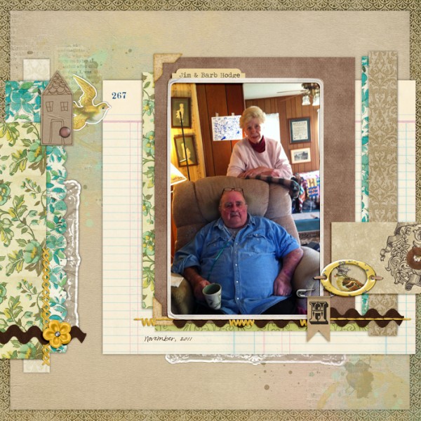
“H” by Debbie Hodge | Supplies: 7:30pm, 2:00pm by Amy Wolff; Retrospect 365, Retrospect 365 Tags, Medley Borders 1, Medley Borders 2 by QuirkyTwerp; Mellow by Lynne-Marie; Just Juicy by Lynn Grieveson; Brad Bonanza 3 by Pattie Knox; Flossy Stitches Brown by Katie Pertiet; Goldrush, Traveling Typewriter fonts
mix themed florals
The floral prints on “Fair Day” are bold and holiday-themed, and small blocks complete a blocked composition. One print includes vintage and realistically-styled poinsettias while the other print includes smaller and more playfully styled flowers.
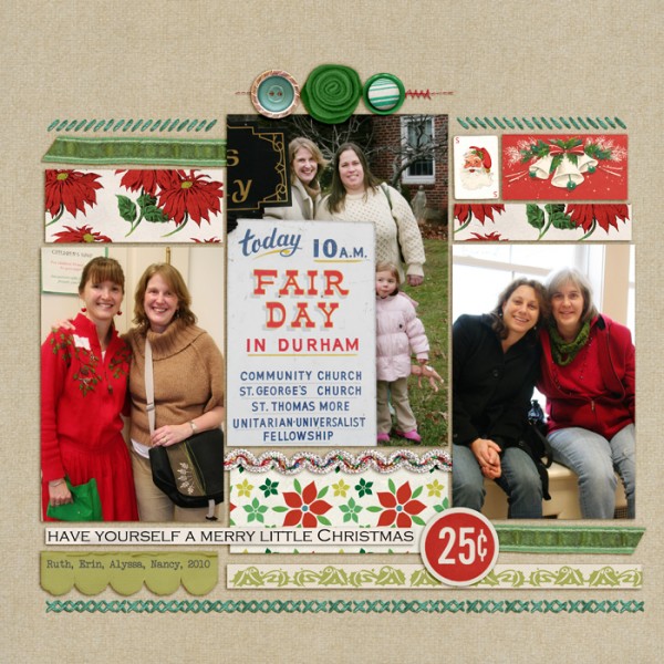
“Fair Day” by Debbie Hodge | Supplies: Kitschy Christmas by Sahlin Studio and Jenn Barrette; Stitch Medley Borders by Quirky Twerp; Torn and Tattered Scallop Strips by Anna Aspnes
mix florals with abstract motifs
Florals will mix with any motif when you pay attention to color, scale, and density.
On “Embroider Me,” the title sits on a delicate floral print, and a band of a larger-scale abstract motif print spans the width of the page.
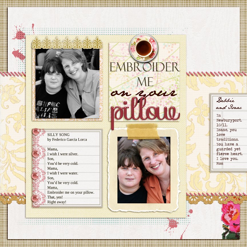
Embroider Me by Debbie Hodge | Supplies: Sweet Storytelling by Sahlin Studio; Flair Box 3, Popup Studio Brushes by Paula Kesselring; Antoinnette by Shannon Hegarty; Stitch Medley by Quirky Twerp; In Distress Spring by Lynn Grieveson; Etc by Polka Dot Pixels; Westchester by One Little Bird; Homespun Stitches by Kitschy Digitals; Storytelling Alpha 2 by Amanda Heimann; Just LInens 1 by Maplebrook Studio; Felix Titling, Jane Austen, Traveling Typewriter fonts
Geometric Patterns
Geometric patterns are based upon pure forms of the circle, rectangle, triangle and other basic shapes. Striped, checked, plaid, and polka dot prints are classic patterns that abound and are a part of many coordinated paper collections and are so
Blocked designs offer a great opportunity for using patterned paper. Several of the blocks on “Thanksgiving Moments” are filled with coordinating geometric prints including: circles filled with stripes, a multi-colored vertical stripe, and a tone-on-tone diagonal stripe. The result is a modern and bold page.
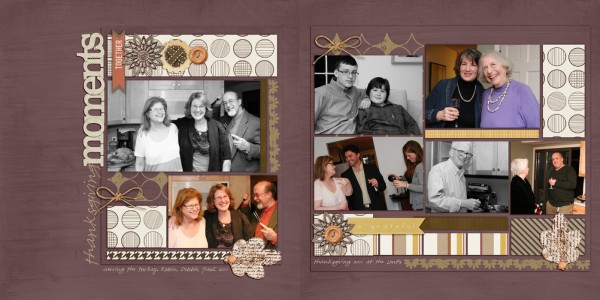
“Thanksgiving Moments” by Debbie Hodge | Supplies: Oak Tree by Sarah Gleason; Autumn Moon Elements by Sahlin Studios; Journey Back by Vinnie Pearce; Pea Olson font
geometrics are good “mixers”
Because geometrics are usually “meaning neutral,” they mix will with other prints. On “Our Road” a tone-on-tone stripe patterned is layered with a formal floral print and a map print.
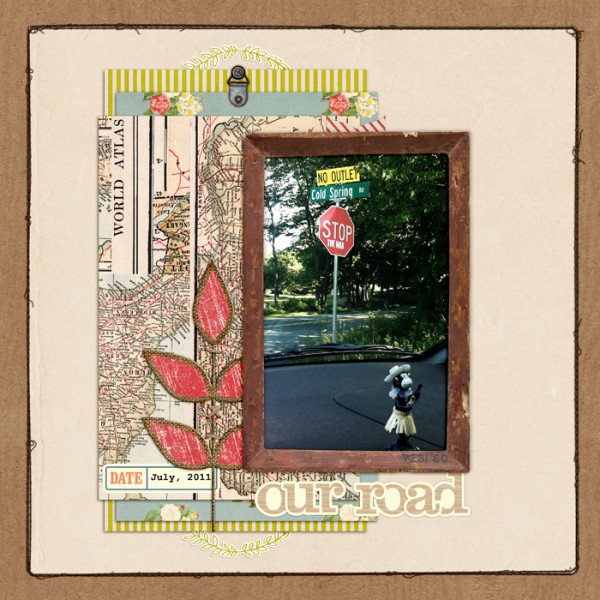
“Our Road” by Debbie Hodge | Supplies: Our Road by Debbie Hodge | Supplies: Photobooth Kit by Paislee Press; Hinge Pack by Katie Pertiet; Woodgrain Alpha, Color Set 2 Labels by Crystal Wilkerson; Stitched by Anna Borders Brown No 1 by Anna Aspnes; Westover Kit by One Little Bird; Krafted Leaves by Lynn Grieveson; Courier New font.
use geometrics to set tone and evoke mood
While stripes, dots, and checks may be meaning neutral, they are not tone-neutral. Consider how largish white dots on a bright color might look clean and lively, while small white dots on a jewel-toned dark color will look more formal.
The multi-colored pastel dots on the print on “Hello Sweet Boy” are playful and light, perfect for a page about a new baby.
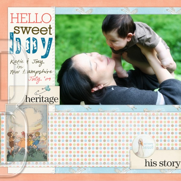
“Hello Sweet Boy” by Debbie Hodge | Supplies: Stitched by Anna Cream, Art Palette Play Out, Multilayered Fotoblendz by Anna Aspnes; Between the Lines Alpha, Basic Paper Alpha Teal by Katie Pertiet; Pearl Borders by Pattie Knox; All About Me Kit by The Digichick Collaboration; Ripped and Stitched No 4, In Distress Textured Covers by Lynn Grieveson
use stripes to manipulate space and guide the eye
Vertical stripes will add energy and height (and a formal tone) while horizontal stripes guide the eye across the page horizontally and create a more restful tone.
The radiating (and widening) stripes on “Double-Nickel Birthday” give the page energy and guide the eye right into the page’s focal point photo.
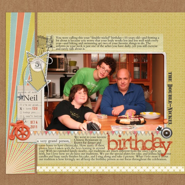
“The Double-Nickel Birthday” by Debbie Hodge | Supplies: Lemonade Stand by Taylor Made; Artplay Palette Rockstar by Anna Aspnes; Fall Fun Kit, Vintage Photo Frames No 26 by Katie Pertiet; Epic Kit by One Little Bird, Biograffiti, Paislee Press; Warm October Kit by Lynn Grieveson; Messy Slab Alpha by Cathy Zielske; Kreased Transfers by Anna Aspnes; La Belle Vie Kit, Westover Kit by One Little Bird; Photobooth Kit by Paislee Press
Motif (representational)
In visual arts a motif refers to an image, often repeated but not necessarily. There are two types of motifs: representational and abstract. The image in a representational motif is something that you recognize from the world around you: shells, clouds, stars–even airplanes and words.
Use representational motifs to support page theme and to create overall unity on the page.
straight-forward meaning with representational motif
The sheet-music print on “Jazzed” is a great complement to a page of photos from a band concert. Using themed or obvious images can immediately cue the viewer to the page subject.
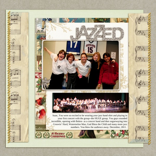
“Jazzed” by Debbie Hodge | Supplies: Krafty Canvas No 1, Words and Pictures Christmas, Pine Letter Box Brushes and Stamps, Vintage Frames No 1 by Katie Pertiet; December Dawn by Lauren Ried; Just Linens No 1 by Maplebrook Studios; Silver Glitter Alpha Number Set 1 by Anna Aspnes; Rustic Christmas by Fruit Loop Sally; Stitch Medley Borders by Quirky Twerp.
images can evoke abstract associations
I chose the airplane print on “Beauty of Life” to represent the idea of “flying high,” of being happy and moving forward.
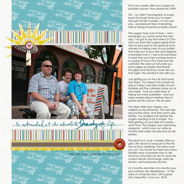
“Beauty of Life” by Debbie Hodge | Supplies: Hello Beautiful Brushes and Stamps by Ali Edwards; Stitched by Anna White No. 01 Anna Aspnes; Boys Toys Paper Pack, Feeling Good Paper Pack by Jesse Edwards; Brad Bonanza No. 03: Digital Fasteners by Pattie Knox; Gator Crossing Solids Paper Pack, Lil Bit Tags, Be Buttoned: Harvest, Scallop Strip Masks by Katie Pertiet
text prints are representational motifs
Because the photo on “Pre-Party” wasn’t obviously from Christmas time, I used a text print with Christmas words and motifs.
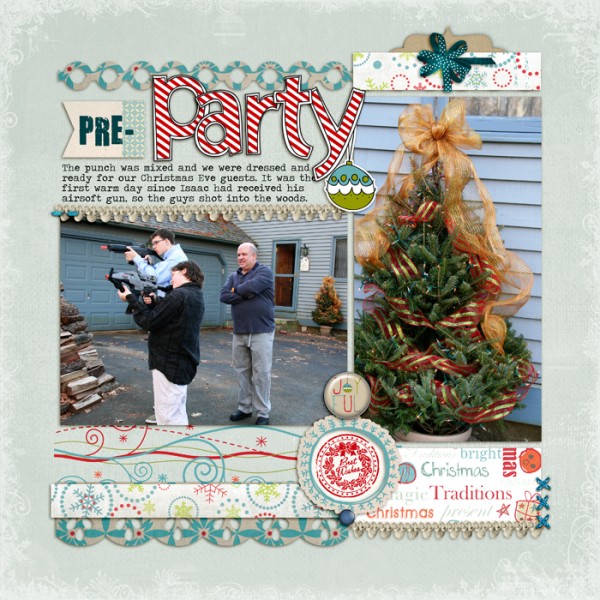
“Pre-Party” by Debbie Hodge | Supplies: Joyful by Cinzia, Edgers 2 by Amy Martin, Holly Plume Overlays 1 by Anna Aspnes; Glitter Thread Stitches, Glitter Thread Stitches 2 by Lynn Grieveson; Christmas Memories Element Pack by Katie Pertiet; Well Read Elements by Sugarplum Paperie
Motif (abstract)
Abstract motif designs are based on geometrically formed shapes, and they’ve been prevalent in carpets, tilework, and architecture for thousands of years.
While “Turn on the Lights” is a page with outdoor photos, the subject is a power outage. The background pattern is abstract motif that reminds me of home decor and that worked well with the chandelier embellishment. Notice the mix with a geometric striped print as accent.
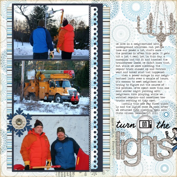
“Turn on the Lights” by Debbie Hodge | Supplies: Stitched by Anna White No. 01 by Anna Aspnes; Winter Blues Paper Pack by Jesse Edwards; Home Handyman Element Set by Lynn Grieveson; Chance of Flurries: Glittered Tinsel Snowflakes, Epoxy Extravaganza: Everyday Things, Beaded Directives by Pattie Knox; Eilon Kit, Bling Alphabet: Silver by Michelle Martin; Adalicia Element Pack, Scallop Strip Masks, Classic Cardstock: Winter Park by Katie Pertiet
“Cookie Walk” includes just one patterned paper, an abstract motif resembling a pinwheel or the design you’d find on peppermint candies. Notice the patterns IN the photos: there’s the geometric pattern of the stained glass windows and the floral print of the tablecloths. The three different prints mix well.
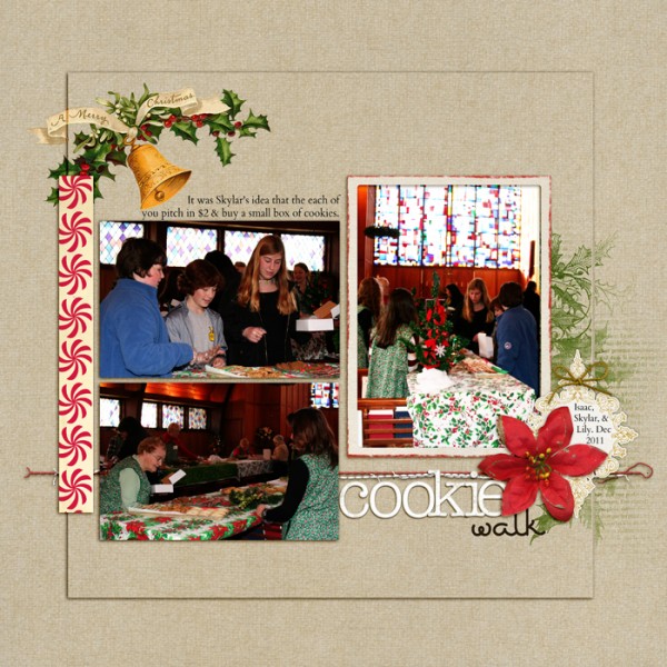
“Cookie Walk” by Debbie Hodge | Supplies: Christmas Village Kit, Krafty Canvas no 1, Chipboard Alpha White by Katie Pertiet; Masana Script font
Pictorial (scenic)
Oh, how I remember rooms wallpapered with summer country scenes – in blues and whites. My parents’ bedroom and the dining room at my aunt and uncle’s home had such scenes.
The “pictorial” pattern is similar to the representational motif–but scenic.
In interior decorating these scenic papers and textiles can anchor a style to a particular era and culture.
What about in scrapbooking? I have a large stack of patterned papers with retro images, beach scenes, maps and more that I’ve been collecting for many years. Can’t resist buying them. Can’t seem to use many of them.
On “We Love the Sunny Days of Summer” I used a pictorial print of a tropical beach in very small doses, peeking out from torn corners, to support page theme.
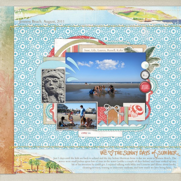
“Sunny Days of Summer” by Debbie Hodge | Supplies: Red Beach Kit, Totally Trashed and Windswept Paper Pack, Ashby Kit, Glitter Thread Stitches by Lynn Grieveson; Summer Rocks Brushes and Stamps by Ali Edwards; Artistry de Blanco Element Pack, Rimmed Framers No. 01, Flossy Stitches: White, Library Card Collection: Basics by Katie Pertiet; In the Swim Kit by Pattie Knox; Just Linens Paper Pack No. 01 by Maplebrook Studios
[patternedpaper]

