by Debbie Hodge
 When it comes to mixing patterned papers on your scrapbook pages, there are a four patterns that mix easily with the wildest of motif and color combinations. These patterns are text, stripes, ledger/notebook, and dots.
See how guest teachers at Masterful Scrapbook Design use these easy-mixer prints for well designed and appealing scrapbook pages.
1. text print patterned paper
Emily Pitts chose papers and a design to mimic the look of Chagall windows she saw in Switzerland.
She chose jewel-toned and subtly-patterned papers. She could have used a light-colored and solid cardstock to hold (and “pop”) her title but instead she used a text pattern. The result is a continuation of the texture she’s incorporated into the rest of the page. The result is a design with unity.
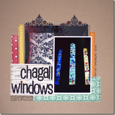
“Chagall Windows” by Emily Pitts
2. striped paper
Stripes are meaning-neutral and thus go with a variety of topics and motifs. Note, however, that they are not tone-neutral. (Check out ideas for layouts with dots and stripes.)
The colors, stripe sizes, and regularity all impact mood. Additionally their orientation on the page (will they run horizontally, vertically, or even diagonally?) ramps up or tamps down the energy of the design.
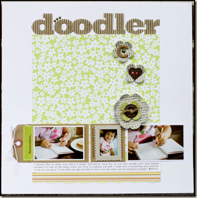
Cindy Liebel says “I love love love to mix stripes with flowers or polka dots or damask patterns, which is what I have done here…stripes & flowers.”
3. ledger or notebook patterned paper
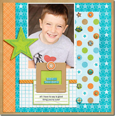
When Celeste Smith mixes several patterned papers and colors–as she’s done on “Boy Oh Boy”–she often supports the busiest paper with tone-on-tone patterns. The orange and blue prints play that support role here. Celeste is able to get yet one more pattern worked in by using the “easy mixer” of ledger paper.
4. polka-dot prints
Just as stripes are meaning-neutral (but not tone/mood-neutral) so, too, are (and are not!) polka dots. Cindy Liebel has packed five different prints onto “Excitement on a Swing.” The small white-on-black dotted paper mixes well with the other papers but also serves to define and ground the inner canvas where title, photos, and journaling sit.
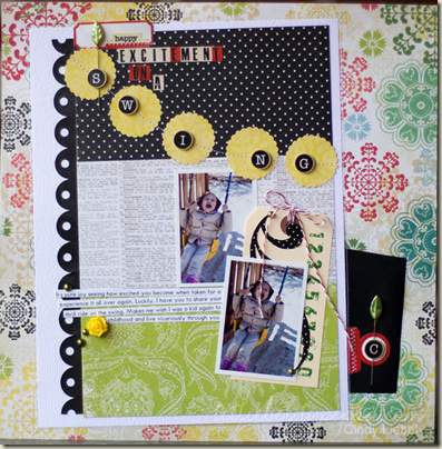
“Excitement on a Swing” by Cindy Liebel
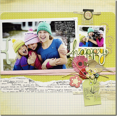
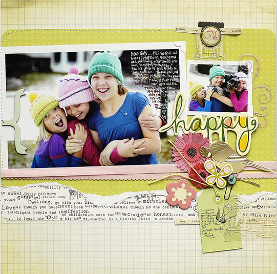
If each of these prints mixes well with a variety of motifs, it stands to reason that they mix well with each other. On “Happy,” Wilna Furstenberg built her page on a canvas of ledger, a foundation of dots, and a border of text. These papers never upstage the photos and, at the same, time, they add fabulous interest and texture to the page.
Get out there and mix! [patternedpaper]

