by Debbie Hodge | Apr 15, 2011 | Art Journaling, Color, Design Principles, DinaWakley
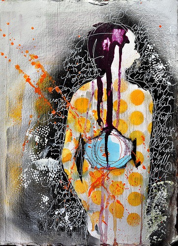
By Dina Wakley I love contrast. If you want a page element to be powerful, contrast it with its opposite and you have mega-impact. Contrast is what makes a piece of art surprising, or interesting, or even just plain good. Contrast is essentially the use of opposites...
by Debbie Hodge | Apr 7, 2011 | Art Journaling, Composition, Design Principles, DinaWakley
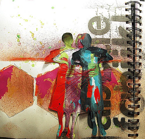
By Dina Wakley I always say that one of the reasons I love art journaling is that there are no rules. Anything goes. You can do what you want. The process of putting paint on the page is more important than the finished outcome. So, why care about composition? I...
by Debbie Hodge | Mar 1, 2011 | DinaWakley, Ideas via Product & Technique
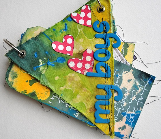
by Dina Wakley I love manila tags. I think this love stems from my affinity for office supplies. I can go into an office store and browse for hours. There’s just something about new pens, sticky notes, and shipping tags that makes me happy. Manila tags generally come...

by Debbie Hodge | Sep 14, 2010 | News
Interview by Amy Kingsford Get It Scrapped! Teacher Username: dinawakley Member Since: August 2008 Posts: 1,514 Classes Taught: Art Journaling 101, Art Journaling 102, Art Journaling 201: “Masterful” Art Journaling, and Art Journaling 301: Graffiti of My...
by Debbie Hodge | Mar 11, 2010 | Art Journaling, DinaWakley, Finding and Using Inspiration
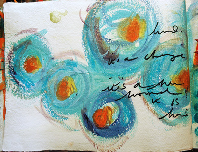
by Dina Wakley Using Brushstrokes Inspired by van Gogh Van Gogh’s directional brushstrokes are a visual force. What you don’t realize about van Gogh’s work until you stand in front of it at a museum is that the paintings are more than just visual. They have a tangible...