Hey, you, with your photos in the cloud!
Are you recording the stories of those photos you’re taking?
Are you noting the details that will trigger rich memories later on?
Or are the photos piling up, unculled and unlabeled, in your ever-growing cloud drive?

I’m Debbie Hodge, the owner of Get It Scrapped …
. . . . and I want you to make sure future generations aren’t left guessing whose house that is in the picture, or what kind of car is parked behind the kids playing on the sidewalk, or who those kids even are.
Recording memories–and breaking down and making that process accessible–is a passion for me.
Here at Get It Scrapped, I’ve combined my skills (an MBA concentration in operations management and 20+ years of study and practice of creative writing) with my passion (telling personal stories) to make a business of showing you how to organize your memories and photos and use writing and design to record the stories and events of your life.

How can we help you “Get It Scrapped”?!
Click on one of the blog categories below for your next scrapbook page idea!
BLOG LATEST [ see all ]
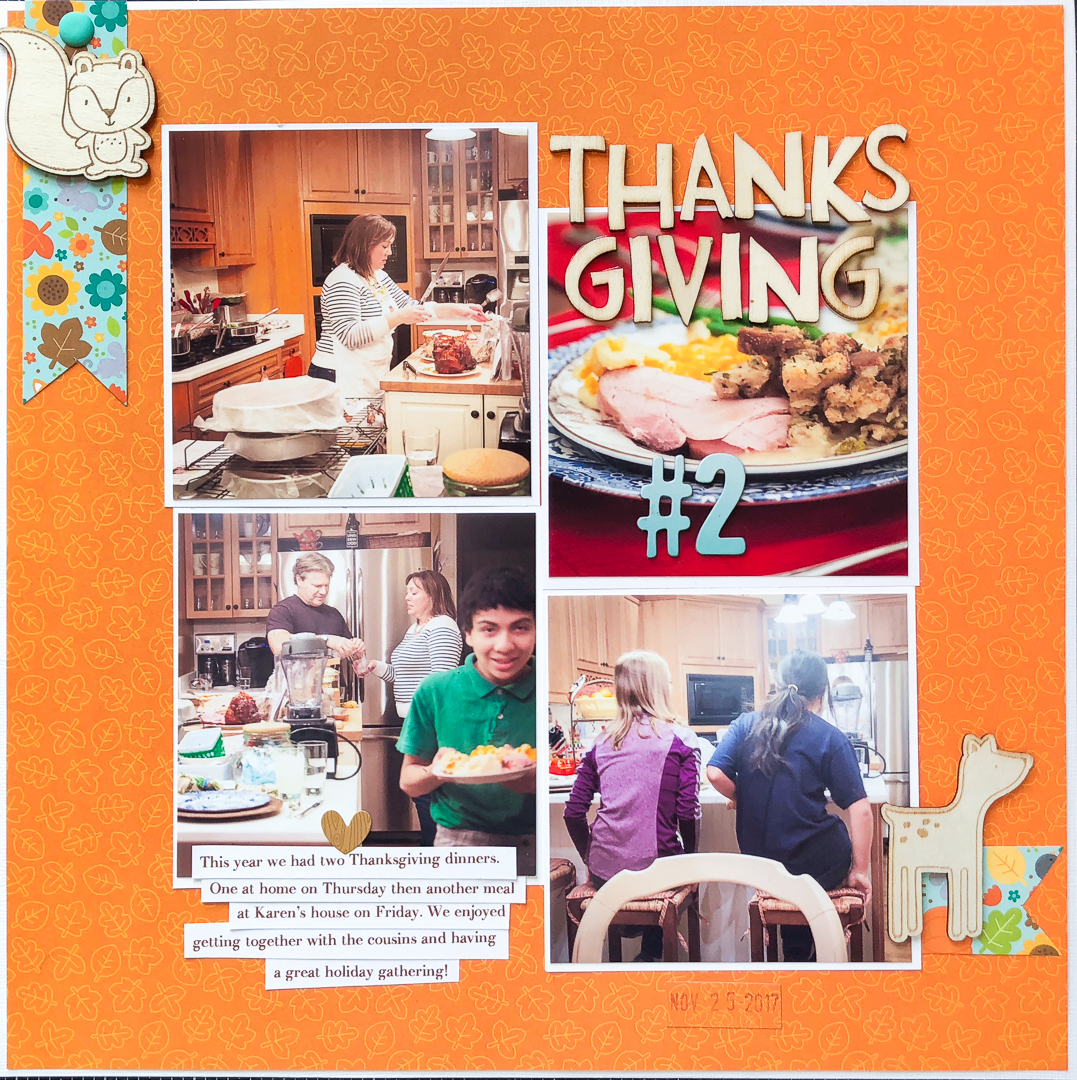
Scrapbooking Ideas for Recording Your Favorite Holiday Traditions
Before you see what we've got for you in this article, take just a moment to think of your holiday traditions. It might be Ugly Sweater Day at school or the White Elephant at work or watching "White Christmas" as a family. Now scrapbook that tradition--but go all out...
Scrapbook Page Design Using Contrast to Create Flow
Including contrasts--clear visual differences between elements--on your scrapbook page is a great way to create emphasis and hierarchies. You can cue the viewer to understand what is most important and next most important, and next after that. Not only that the eye...
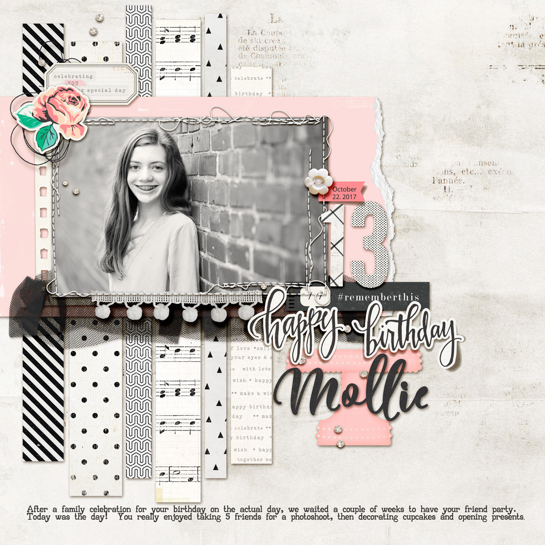
Scrapbooking with a Color Scheme of Black and White with Pastels
Pairing black and white with pastels is a currently popular color scheme in interior design, fashion, and even scrapbook page supplies. This color scheme can give your page a clean yet playful tone. See here how our creative team has used black and white and pastels...

