Including contrasts–clear visual differences between elements–on your scrapbook page is a great way to create emphasis and hierarchies.
You can cue the viewer to understand what is most important and next most important, and next after that. Not only that the eye will connect repetitions of contrasting elements. In this way you can create flow through the page.
Our creative team shows you just what that means on their pages here.
Sian Fair says, “This page is a celebration of a joyous, open-mouthed toddler: that’s all!”
“To establish a flow I made it clear where the eye should start, with a bright red strip at the top. I wanted to use circles to echo his big wide smile, but I didn’t want them to draw attention away from the photo so I stitched in white, which gives the reader something to look at but encourages the eye to move on quickly to the more important part at the bottom of the page. There I introduced lots more color, ending with a firm black title (with more O’s)”
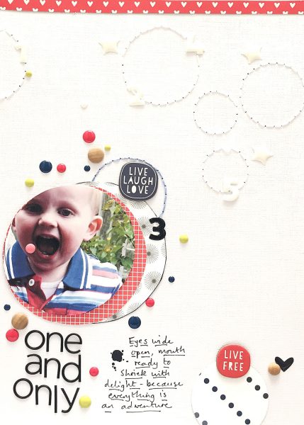
One and Only by Sian Fair | Supplies: Patterned Paper: Felicity Jane, Gossamer Blue; Chipboard:Gossamer Blue; Enamel Dots: My Minds Eye; Alpha: Felicity Jane
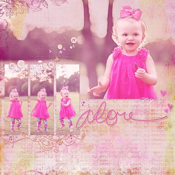
Deborah Wagner says, “This is my lovely granddaughter playing in the park. She loves to pose for the camera, especially when she gets to wear a pink dress.”
“My focal photo is the largest so my audience knows it is most important. It always has the bright pink of my grandaughter’s dress and her engaging smile. The three smaller photos are the same size and grouped together to balance it out and to draw the eye to a second spot on the page. Finally, the large pink title is where the eye goes next.”
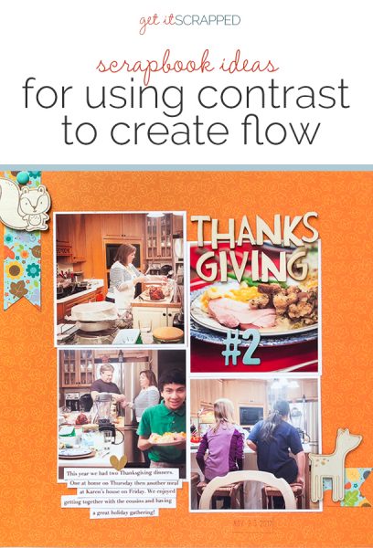
Kelly Sroka says, “Last year my family and I had two Thanksgiving dinners–one at home with just our immediate family and one at my sister’s house with our extended family. This layout documents our second meal: Thanksgiving #2.”
“I had several photographs I wanted to include, but not one that was a true focal point. In order to lead the viewer’s eye through the page, I utilized contrast of color. I chose an orange background paper then used a contrasting blue paper and letter stickers to show flow across the page. The eye is drawn first to the blue banner at the top left of the page, then to the #2 in the title, and finally to the banner at the bottom right. Using contrasting colors, I created a diagonal flow across the page, so that the viewer takes in each element of the page in order.”
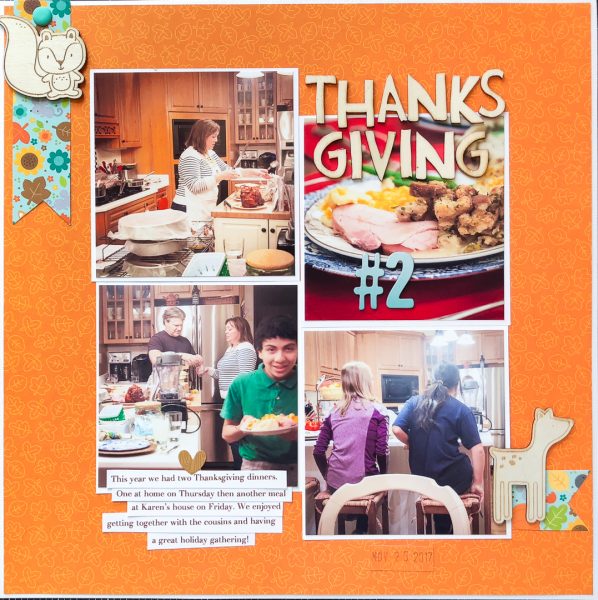
Thanksgiving #2 by Kelly Sroka – Cardstock: Bazzill; Patterned paper, stickers, and enamel dots: Doodlebug Designs; Wood shapes: Pebbles; Letter stickers: American Crafts
Stefanie Semple says, “This page is about our tradition of making hamburgers as an easy Friday night supper: something that can be made ahead of time and ready whenever the family is hungry.
“My photos show contrasting views, one overview of the kitchen and one with close-up details of my meal preparation. I used a rich neutral woodgrain and then had contrasting colors of blue and orange, black and white. I also used a mix of flat and dimensional elements, adding another layer of contrasts.”
“The viewer’s attention is drawn to the orange noted tab above the kitchen photo and then with the use of the small embellishment cluster at the top drawing the eye through that photo to the floral washi tape, and then on to the right to the glitzy large title and the second photo. The circle paper clip and heart tag lead the eye to the bottom cluster, which is also anchored by a chevron arrow again drawing attention to the white journaling card. The date tab points in from the edge of the page, stopping the viewer’s eye being drawn out of the design.”
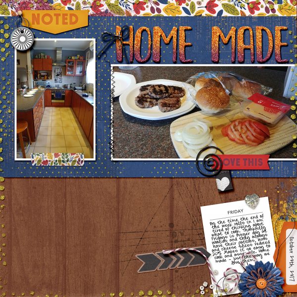
Home Made by Stefanie Semple | Supplies: This life: October by Amanda Yi Designs & Juno Designs, Fancy Neutral by Pink Reptile Designs and This Day Journal Cards by Digital Design Essentials (retired)
Devra Hunt says, “My oldest son has finally hit that age where he’s always hungry. He came home from school, went to the fridge, took out the leftovers, and ate. Barely saying hello.”
“I worked with mostly neutrals, creating contrast with the rust and green. Focus is kept on the photos being anchored by both colors in the vertical paper pieces. Flow is created with the title pointing towards the photos, also in the same rust and green colors. From there your eye should see the embellishments under the photos, moving top toward the top of the page, back again to the title area.”
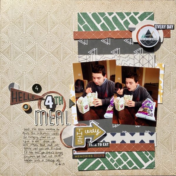
Hello 4th Meal by Devra Hunt | Supplies: patterned paper, die cuts, stinters, alphas-PinkFresh Studios, die cut -Paper Issues, Silhouette, pen and adhesive-EK Successs
Marcia Fortunato says, “This layout is about a special moment between my son and my granddaughter (his niece) as well as a rare opportunity in which my son was willing to cooperate and let me get pictures of him.”
“I used contrasts of large and small, light and dark, and script and san serif fonts. I used a large photo as the focal point of the page and mounted it on light paper against a dark background, then tucked a smaller photo behind the large one. I also used a lighter strip of patterned paper to lead to the photos. Next I cut a large title in a script typeface with my Silhouette and painted it a light color so it would stand out on the dark background. I combined it with smaller vinyl letters and stamps. I also put my journaling on the lighter paper, partly for readability, but also to draw attention to it.”
“The viewer’s attention is drawn first to the focal photo and supporting photo, then to the large light colored title and the rest of the title, then with the aid of a small embellishment to the journaling, and finally around to the rest of the layout.”
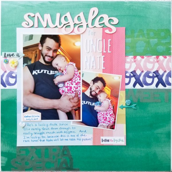
Snuggles For Uncle Nate by Marcia Fortunato |
Supplies: Patterned Paper: Amy Tangerine for American Crafts, One Canoe Two by American Crafts; Cardstock: American Crafts; Watercolor paper for title: Strathmore; Title: Slumber Party font (Silhouette Design Store), Thickers by American Crafts; Embellishments: Pinkfresh Studio, Pretty Little Studio, Fancy Pants Designs, Cocoa Daisy; Spray ink (for title): Mr. Huey by Studio Calico; Pen: Sharpie.

