by Amy Kingsford | Feb 15, 2017 | Canvas, Composition, Feature, Page Guides
The first layers you place on your page play an important role in your design’s final look. These first layers (and their shapes) create visual weight, directional pull and contribute to the balance of the design. When those first layers are shapes or...

by Amy Kingsford | Feb 1, 2017 | Design Elements, Feature, Videos
In this video blog by Christy Strickler, we’ll explore how the creative team has played with geometric shapes within their scrapbook pages. The benefit to working with geometrics is that they are versatile: You can combine and manipulate the pieces for different...

by Amy Kingsford | Jan 24, 2017 | Design Principles, Feature, Page Guides
The shape of white space in a visual design can be ACTIVE or PASSIVE. Active white is area left open on purpose. It separates content and is a design element itself. Passive White Space occurs naturally, for example in the area between words on a line or the space...

by Amy Kingsford | Jan 17, 2017 | Composition, Page Guides
Clean and simple designs endure and are light on your stash. Our team made their own clean and simple pages here. They used these three guides (or limits) to keeping it simple: Keep the focus on the photo(s), Incorporate plenty of whitespace, and Use embellishments...

by Debbie Hodge | Jan 5, 2017 | Color, Feature
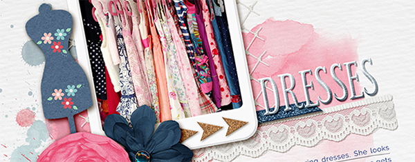
A pink and navy scrapbook page color scheme for your scrapbook pages modernizes a primary color combination, and changes the associations your viewer has with the page. Red has a color story of energy, passion, and danger. Pink, though, is a calming color with...

by Amy Kingsford | Dec 27, 2016 | Feature, Patterned Paper
One way to make color or pattern mixing work is to use proportions in gallon, quart, pint amounts. Here’s how it works: Choose a dominant color or pattern. This is your “gallon.” It will cover 70% of your layout. You can use different tints and shades of this...
