by Debbie Hodge | Dec 3, 2014 | Design Elements, Embellishments, MSD Excerpt
by Lisa Dickinson This lesson originally appeared in the Get It Scrapped Membership class Oomph & Polish. Click here to get all the lessons on this topic with an all access pass. Color, Texture, Pattern & Shine One of my favorite television shows is What Not...

by Debbie Hodge | Nov 19, 2014 | DoubleUp
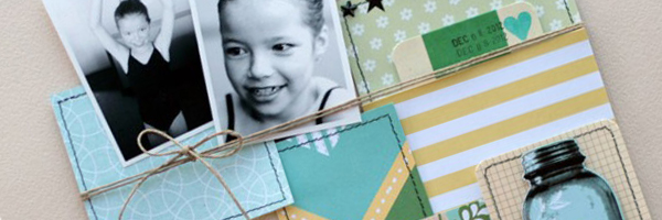
Use these 10 steps to quickly crop photos, select papers and arrange everything into a two-page scrapbook layout with a focal point and two supporting groupings. 1. Choose 7 or 8 photos from an event that can all be cropped to a landscape orientation (i.e., they are...

by Debbie Hodge | Nov 4, 2014 | Copic Markers, Ideas from Current Trends, Paper Techniques for Scrapbooking, Patterned Paper
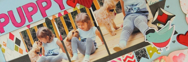
Big dots are trendy. Especially big dots rendered in fun ways with a variety of mixed media supplies. The Get It Scrapped Creative Team took the challenge to make their own “big-dot” patterns here and share their scrapbooking ideas with you. [hr] make a...

by Debbie Hodge | Oct 30, 2014 | Design Principles, Layout Design, Scrapbook Page Elements
Our free class Design Principles for the Scrapbook Page has shown 1000s of scrapbookers how to figure out just what to put on a scrapbook page and how. Take a look at the video version of Lesson 1 here. Click here to get the PDF version of the class for free | Click...

by Debbie Hodge | Oct 29, 2014 | Composition, Embellishments, Feature
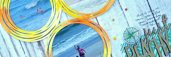
Embellishing scrapbook pages with a strong visual triangle is good because it moves the viewer’s eye through your page. While you can add eye-catching complexity with the skilled use of multiple visual triangles, a clean and straight-forward approach also yields...

by Debbie Hodge | Oct 22, 2014 | Composition, Design Your Story
Some photos and scrapbook page stories are all about place. When setting is key to your story, extend it from the photos out onto the canvas with these scrapbooking ideas. And remember: the basic building blocks of written story–character, plot, and...
