by Debbie Hodge | Apr 11, 2012 | Design Principles, Titles
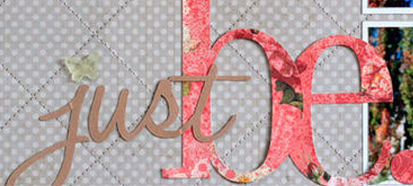
When one element is different from another, there is contrast. The bigger the differences, the greater the contrast. Greater (i.e., obvious) contrast is what you’re after to make better page designs because contrast draws the eye and makes your elements...

by Debbie Hodge | Apr 1, 2012 | Color, Design Principles
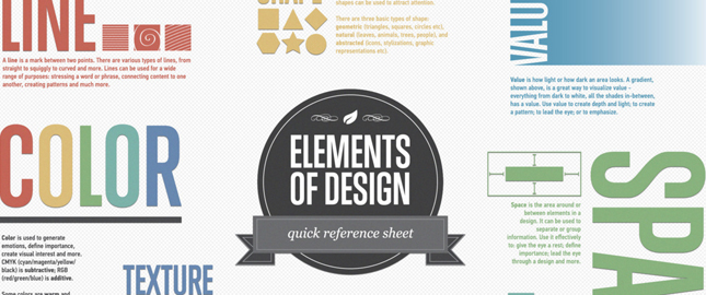
Inforgraphics are great for a quick review of things you may already have begun learning but can’t recall with perfection — or they can be an introduction of just what to study for newbies. Check out 8 infographics that cover the choices we make when...

by Debbie Hodge | Mar 8, 2012 | Design Principles, Embellishments
by Debbie Hodge Embellishments on a scrapbook page are not just great for adding interest, charm, and meaning. They are also important tools for creating a well designed page. The next time you’re choosing and placing your embellishments be sure that, in...

by Debbie Hodge | Mar 7, 2012 | Design Principles, Design Your Story, Journaling
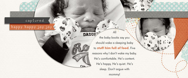
by Debbie Hodge Alignment refers to how text is arranged into blocks or columns with hard or soft edges. There are four basic approaches to alignment: 1) Left, 2) Right, 3) Centered, 4) Justified. Check them out below — as well as a fifth option. Flush Left...

by Debbie Hodge | Feb 20, 2012 | Design Elements, Design Principles, Design Your Story, Journaling
by Debbie Hodge Texture is tactile. When you add texture and dimension to your scrapbook page, you engage the viewer’s sense of touch — another sense in addition to sight. As a result you draw your viewer in on another level. It’s an obvious design...

by Debbie Hodge | Jan 26, 2012 | Design Principles
by Debbie Hodge A successful scrapbook page captures the viewer’s attention, controls the eye’s movement, conveys information, and evokes emotion. That first task–capturing the eye’s attention–is the work of making a focal point. About Focal Points A...
