by Amy Kingsford | Jun 27, 2017 | Composition, Design Principles, Feature, Page Guides
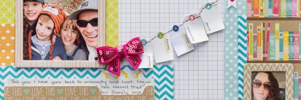
On a well-designed scrapbook page, the different pieces have varying levels of importance–and you impart that visually. Of course one piece will be the most important, “focal point” that catches the eye first and serve as the point of entry into the...

by Amy Kingsford | May 23, 2017 | Design Principles, Feature, Page Guides, Titles
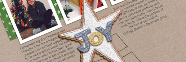
One of the easiest ways to draw attention to your title is to create tension within its type. Something as simple as a tweak to case, color, or placement with in your scrapbook page title can really intrigue the viewer – but remember we don’t want to...

by Amy Kingsford | Apr 25, 2017 | Composition, Design Principles, Feature, Page Guides
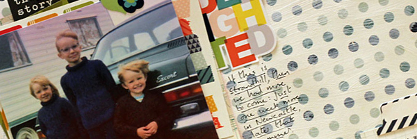
One of the primary tasks of making a scrapbook page is placing your page elements–photos, title, journaling, and embellishments–onto the scrapbook page to tell your story. The Gestalt principle of “proximity” provides a great tool for deciding...

by Amy Kingsford | Jan 24, 2017 | Design Principles, Feature, Page Guides
The shape of white space in a visual design can be ACTIVE or PASSIVE. Active white is area left open on purpose. It separates content and is a design element itself. Passive White Space occurs naturally, for example in the area between words on a line or the space...

by Amy Kingsford | Mar 1, 2016 | Design Principles
Including repetitions is a good way to work toward achieving unity in a visual design–and on a scrapbook page. Repetition without some variety, though can be dull. Check out a short video lesson on repetition below and then see how our Creative Team incorporated...

by Amy Kingsford | Feb 17, 2016 | Composition, Design Principles
The focal point is the center of a design. This doesn’t necessarily mean that it’s the vertical and/ or horizontal center (although it could be) but, rather, that it is the most important part (or parts) of a piece. One effective approach to creating a...


