by Amy Kingsford | Feb 21, 2017 | Feature, Finding and Using Inspiration, Page Guides
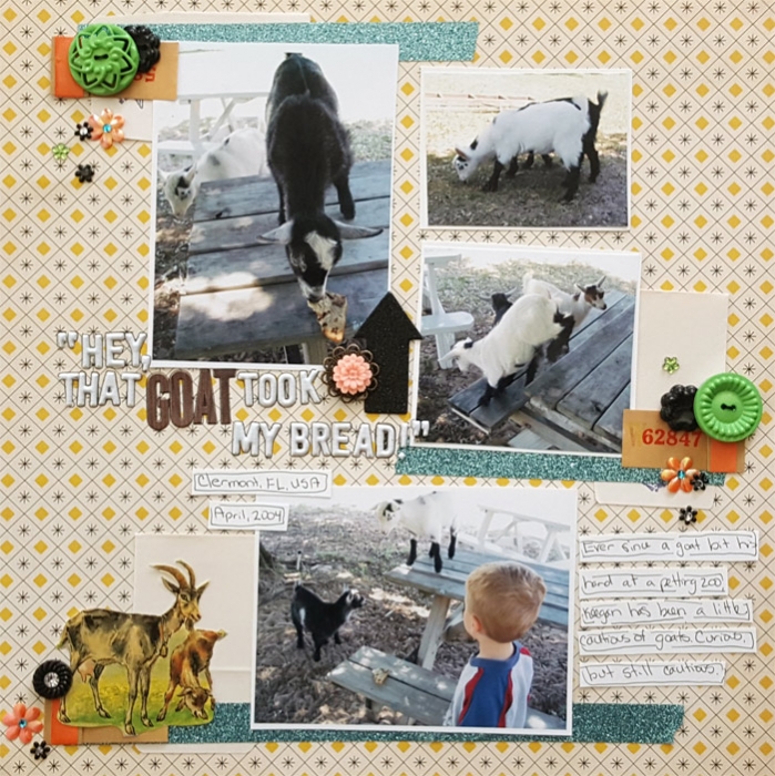
The “flea market” decor style is an eclectic one, often including a curated collection of pieces that are seemingly unrelated, each with their own story, and yet combining to tell a bigger, single story. This style incorporates objects one might find at a...

by Amy Kingsford | Feb 15, 2017 | Canvas, Composition, Feature, Page Guides
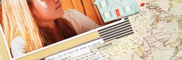
The first layers you place on your page play an important role in your design’s final look. These first layers (and their shapes) create visual weight, directional pull and contribute to the balance of the design. When those first layers are shapes or...

by Amy Kingsford | Feb 14, 2017 | Design Your Story, Feature, Page Guides
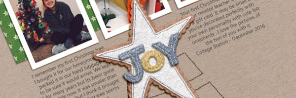
Quite often a scrapbook page comes out of the simple desire to get a story told. A “story-first” approach means you: start with your story first, writing it before you design, make room for the written story on the canvas right away, choose the right...

by Amy Kingsford | Jan 24, 2017 | Design Principles, Feature, Page Guides
The shape of white space in a visual design can be ACTIVE or PASSIVE. Active white is area left open on purpose. It separates content and is a design element itself. Passive White Space occurs naturally, for example in the area between words on a line or the space...

by Amy Kingsford | Jan 17, 2017 | Composition, Page Guides
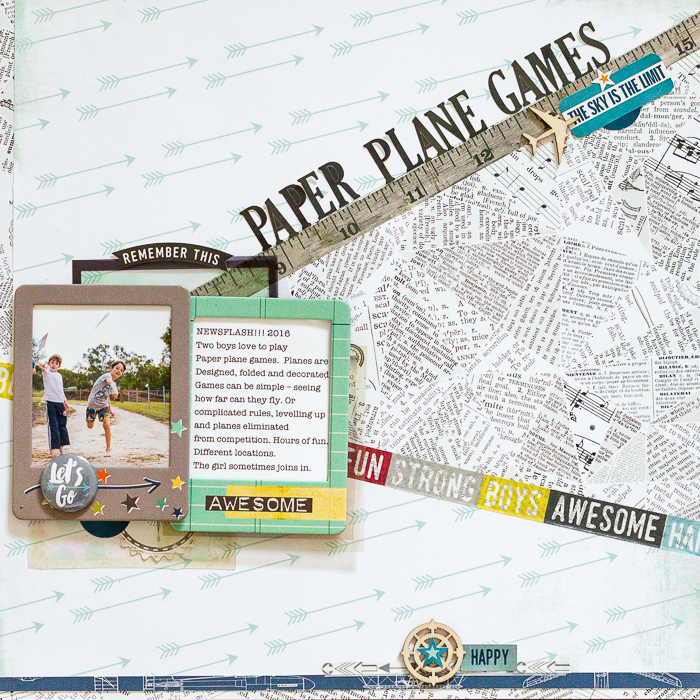
Clean and simple designs endure and are light on your stash. Our team made their own clean and simple pages here. They used these three guides (or limits) to keeping it simple: Keep the focus on the photo(s), Incorporate plenty of whitespace, and Use embellishments...

by Amy Kingsford | Jan 10, 2017 | Finding and Using Inspiration, Ideas from Current Trends, Page Guides
The Wabi-Sabi style comes out of the Japanese aesthetic and idea that “nothing lasts, nothing is finished, nothing is perfect–and that is a good thing.” The style limits itself to the essentials, but at the same time focuses on the imperfections,...
